VDS Digest
A weekly roundup of the visual press.

audiodesignwriting
March 18, 2024
[Visual Data Storytelling #29] You Have One New Message
Is audio a relevant medium to create knowledge? Is there a chance to turn every reader into a creator of audiobooks? What can we learn from the Bible app? These are some questions I will try to answer in this week's VDS newsletter.
February 19, 2024
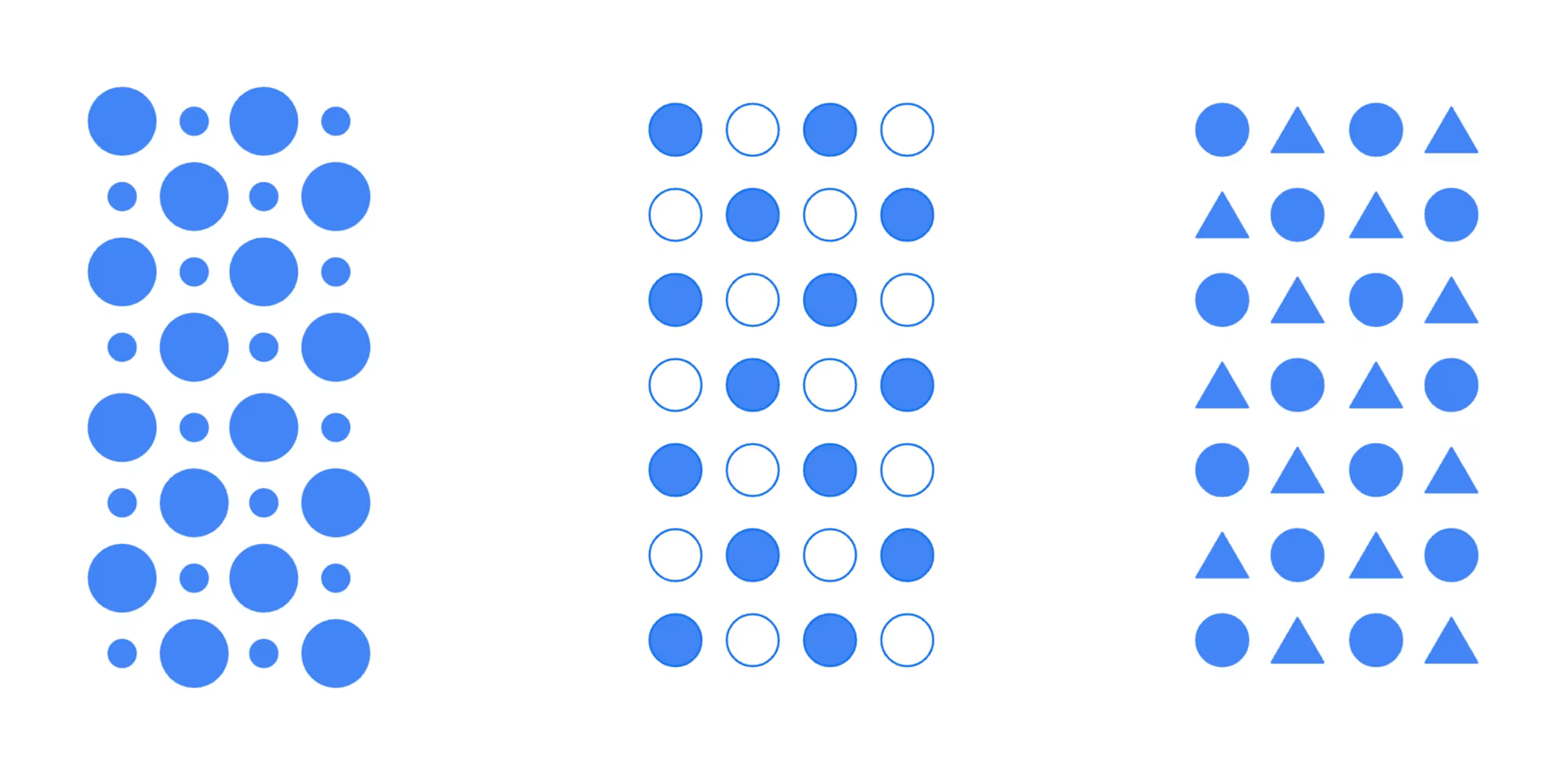
Empower Your Charts With Accessibility Standards
Accessibility standards often comes as an extra step or a burden to web development. However, it can and should be a first step to create both more engaging and better experiences.
gamessimulationbayes
February 14, 2024
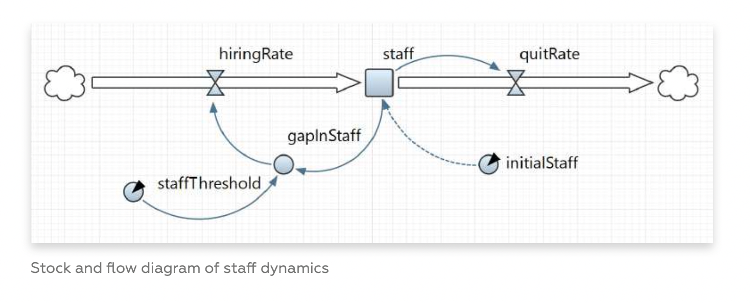
Simulated Worlds, Experienced Knowledge, and Simpson's Paradox
This is the third installment of a reflection about games in humanistic data storytelling. It will focus on causal models and simulations.
#chartcrime#trees#climatechange#gaza#mckinsey
February 5, 2024
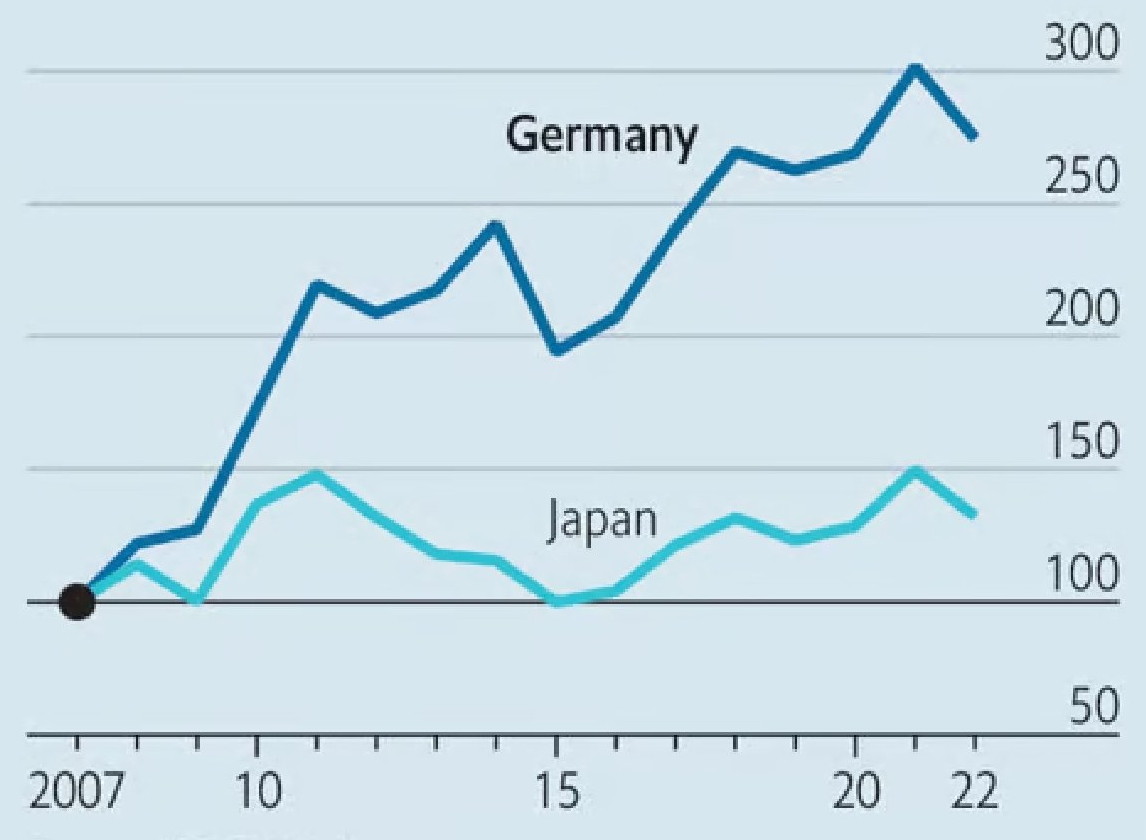
How Indexed Charts Are Used to Tell Lies
The Economist published a bad chart; two pieces by two prominent information designers, who also turns out to be women; Climate Change, doctors in Gaza, or accessible visualizations.
January 29, 2024
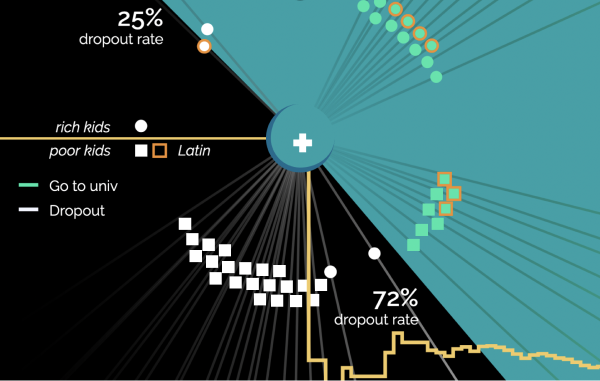
[VDS] French Schools Amplify Inequalities. Play It Yourself.
In France, only 3 out of 10 poor kids go to college, against 7 out of 10 for rich kids. I use this proportion to continue the exploration of "quest charts"—interactive and humanistic data visualizations.
mapsnetwork
January 22, 2024
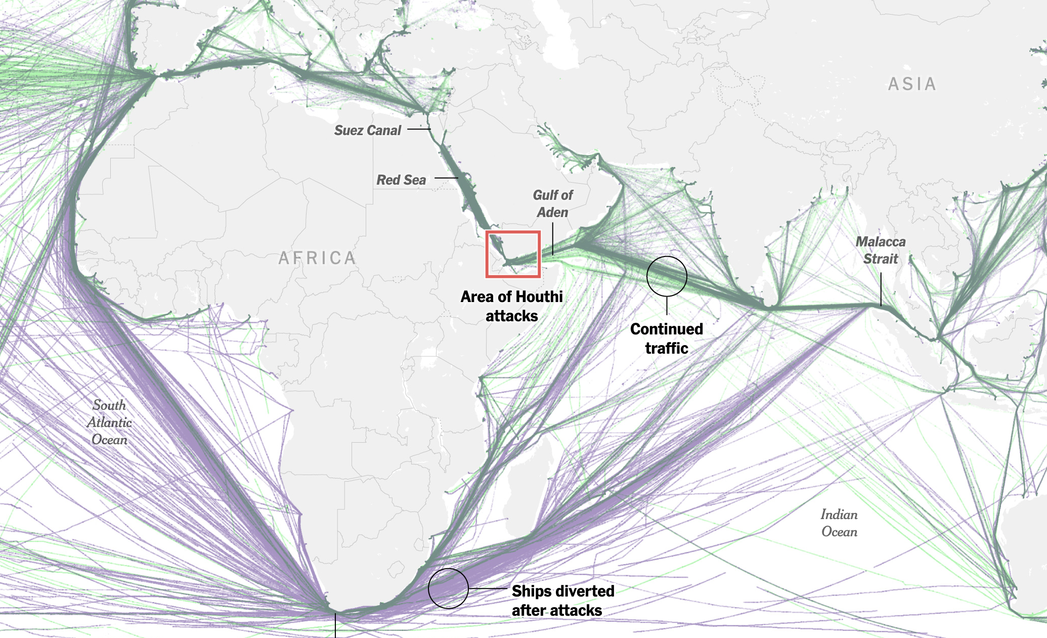
How Houthi Attacks Rerouted Maritime Trade
In this week digest: Houthi attacks in the Red Sea, the decline of birds, a door that went off, some good news and more.

games
January 15, 2024
[VDS Quest Chart] Introducing Quest Charts
Quest charts are a paradigm shift in dataviz in which the reader-player can feel the data.
January 8, 2024
[VDS Digest] How the Terminal Influences Bloomberg's Visual Identity
The Terminal is one of Bloomberg's core products, and it essentially drives the whole visual feeling of most of Bloomberg's charts.

datascience
January 1, 2024
[VDS] 7 Tips I Would Have Given Me In 2023
7 software engineering tips every data scientists should know about in 2024.
December 25, 2023
[VDS Retro] 24 Charts Before 2024
This has been a rollercoaster of a year, to say the least. 24 charts to get ready for 2024.
nytimesaxiosbloombergeldiario
December 18, 2023
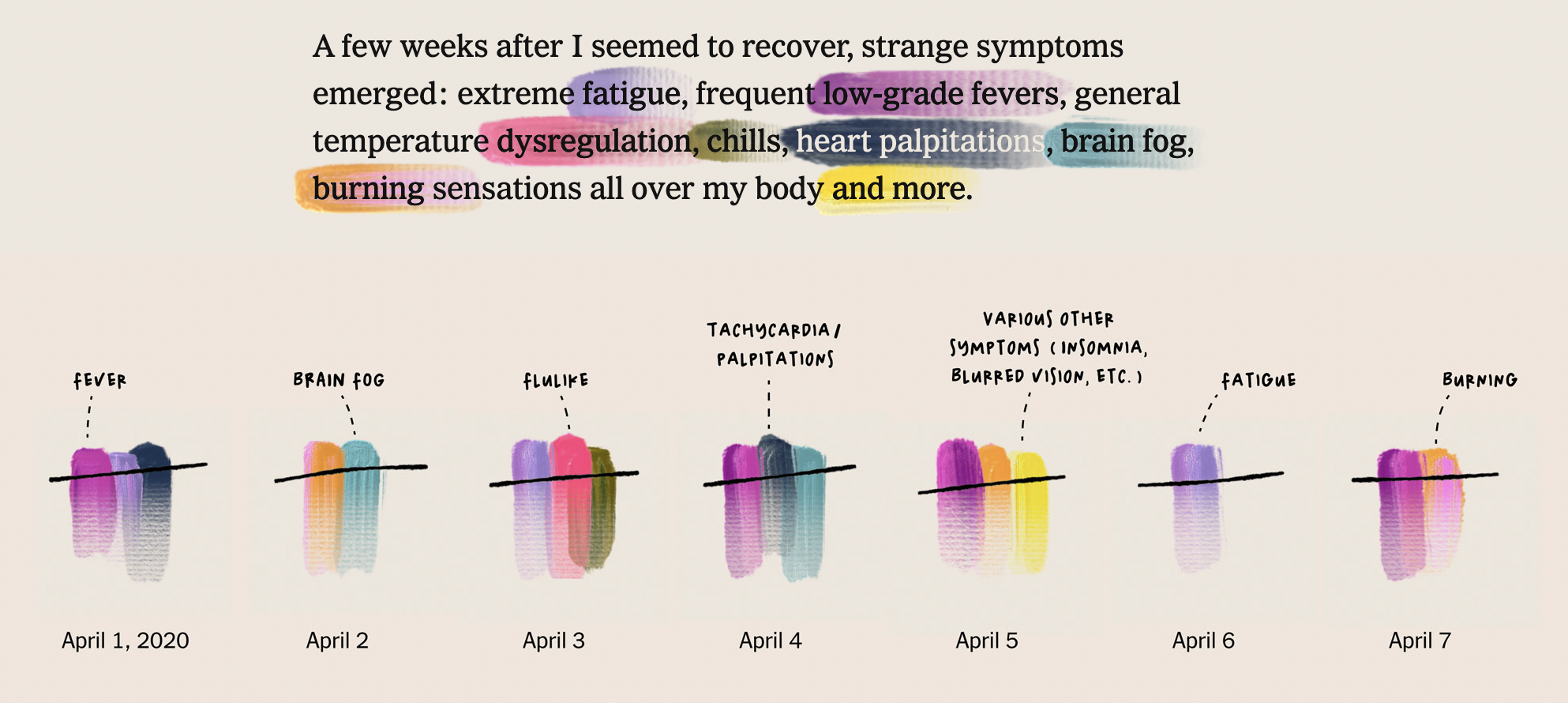
My Life With Long Covid (VDS Learning 3/4)
Giorgia Lupi is the voice of data humanism, and has been a vocal advocate of finding visual ways to display our "messy lives". After three years of long covid, she explores her journey through pain, medical bills, and hope, in this very personal visual essay for the New-York Times.
thestraitstimes
December 11, 2023
The Nested Blocks and Guidelines Model (VDS Learning 2/4)
Tamara Munzner is one the most influential scholar in infovis. Her "nested blocks" model is a 4-layers method to start a data-driven project:
visualanalytics
December 4, 2023
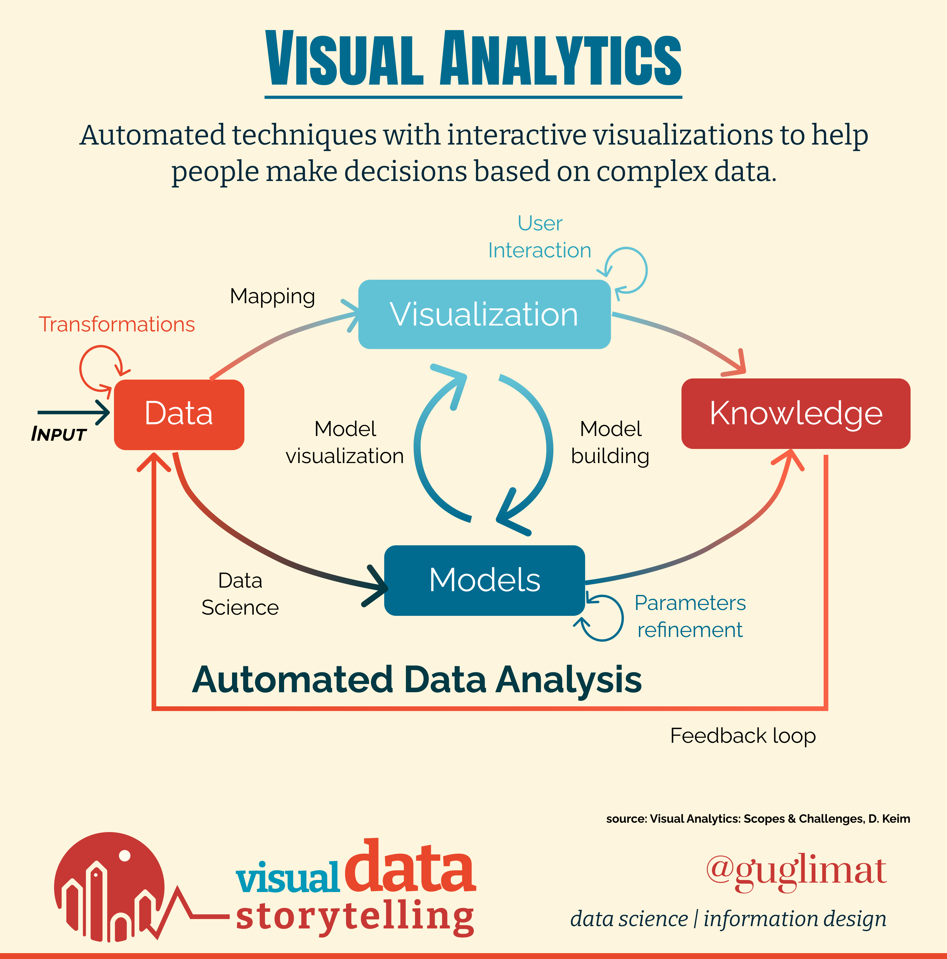
Design and Data Science for Visual Analytics (VDS Leaning 1/4)
The first week of this 4-weeks series will focus on the concept of visualization research and Visual Analytics.

unepnytimesbloombergft
November 27, 2023
Broken Record
An impactful image can leave a lasting impression. This cover from a report of the UN Environment Program is a blast.

#lemondebloombergwashingtonposttheeconomistfigaro#voronoiheatmapBertingazaanthropographics
November 20, 2023
Vanitas Vanitatum et Omnia Vanitas
Like in a Baroque painting, this Washington Post story about the deaths of Palestinian children emphasizes the fragility of life with smokey visualizations.
#washingtonpost#elpais#reuters#ft#bloomberg#unitchart
November 13, 2023
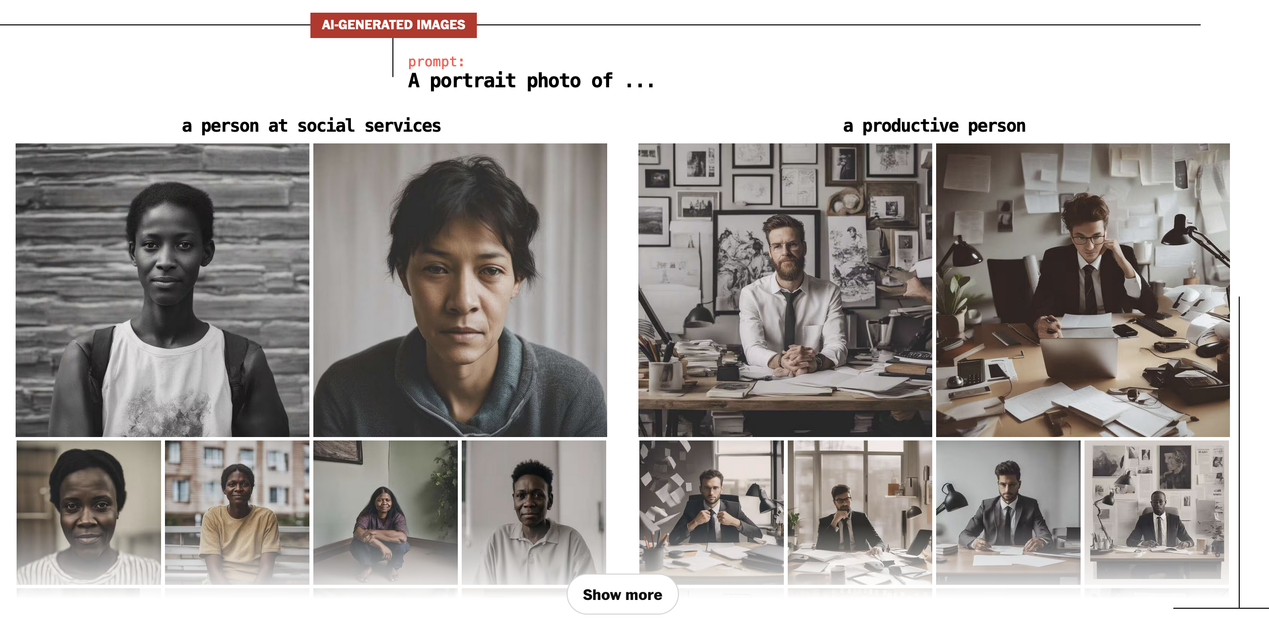
The Shadows of Bias in Generative AI
Bloomberg and The Washington Post explore the profound impact of bias on the mental frameworks that underpin AI.
#scmptheeconomistreutersnytimes
November 6, 2023
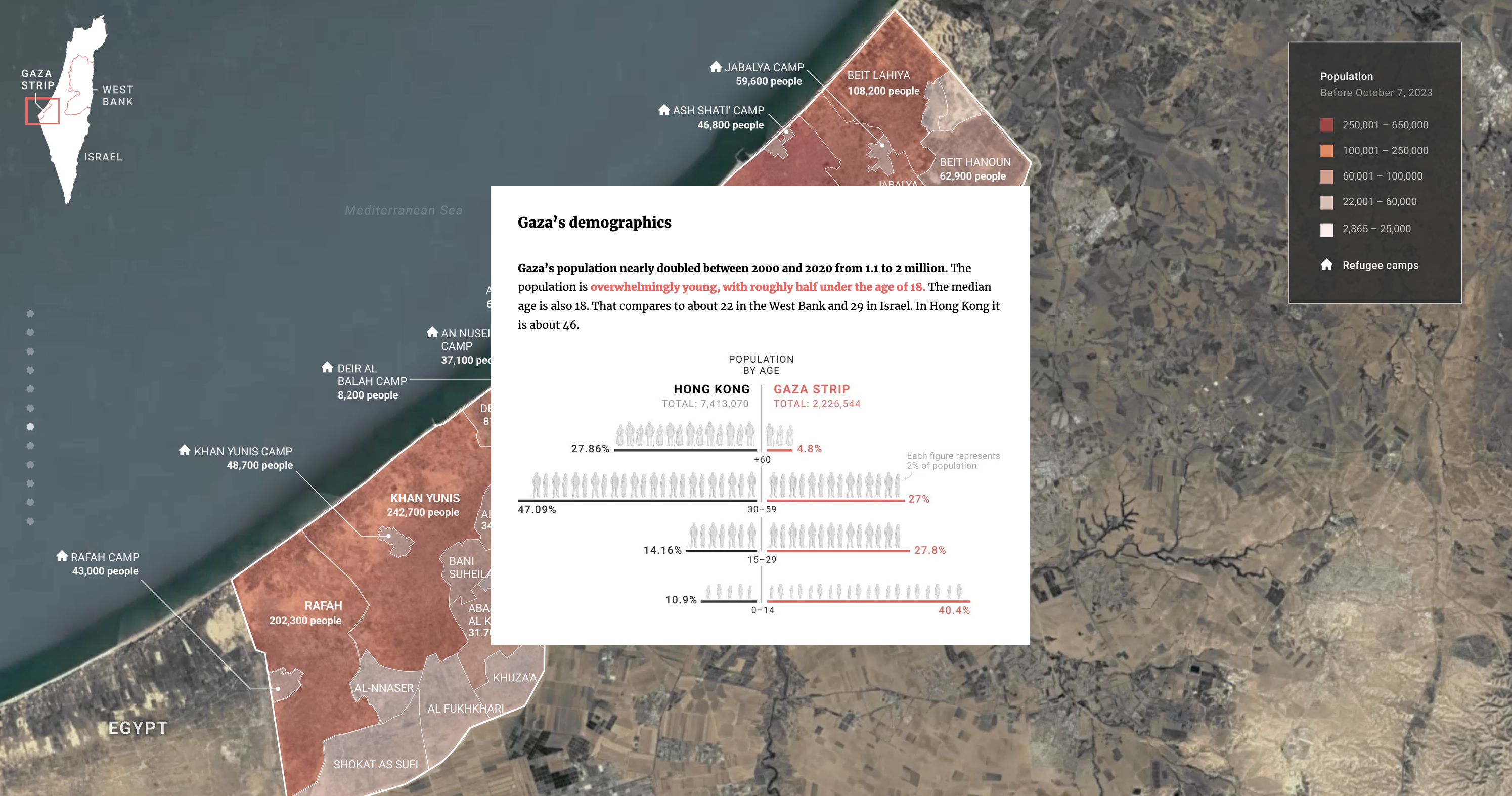
[A Closer Look] SCMP's 'Israel-Gaza War Explained'
How can narrative design patterns be used to understand the structure of SCMP's 'Israel-Gaza War Explained'?
bloombergwashingtonpostreutersftnytimes
October 30, 2023
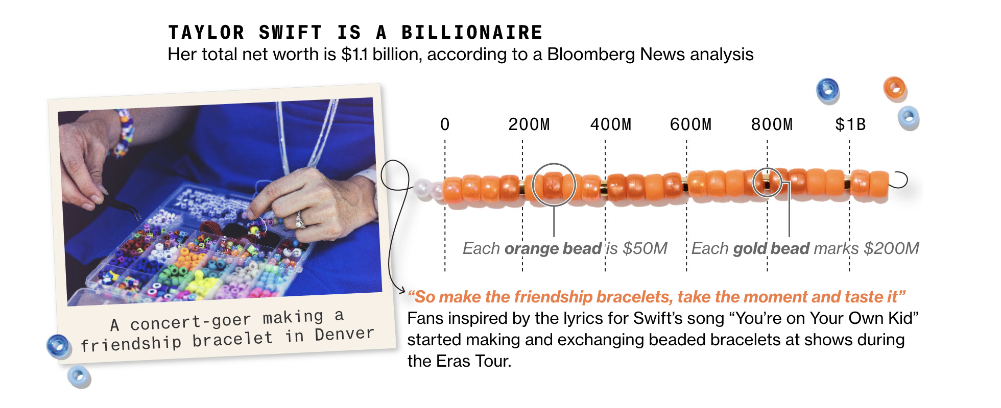
Visual Semantics & Friendship Bracelets
How to create a handmade piece of data storytelling? An example from Bloomberg's analysis of Taylor Swift's billions. Also charts about global warming, guns, demography, Disney, and Brazil.
October 23, 2023
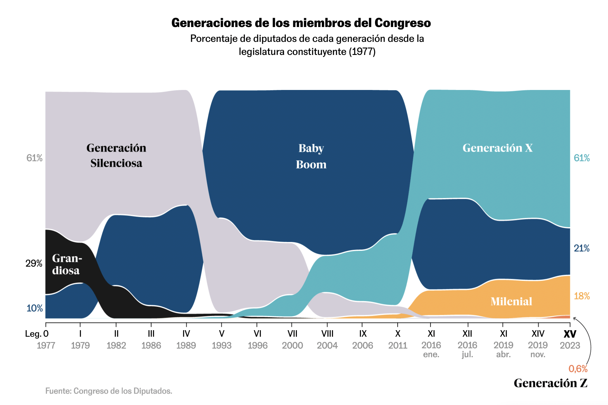
Area Chart vs Area Bump Chart
Two approaches on demographics visualization this week. The first comes from The Economist, the second from El País, and both deal with an aging Congress. However, the focus shifts between the two.

nytimeswashingtonpostreutersftlemondeaxiosnobel
October 16, 2023