Area Chart vs Area Bump Chart
By Mathieu Guglielmino, Oct 23 2023
As I am sitting in the lobby of my Moroccan hotel at—jeez, already—past 2 am, fresh from celebrating the wedding of a dear friend of mine yesterday, I find myself torn between the desire to delve into what was this week intended topic, and the urge to wrap it up swiftly, as exhaustion looms.
So, without further ado, let’s talk about some charts, shall we?
What the difference between these charts?
 The Economist
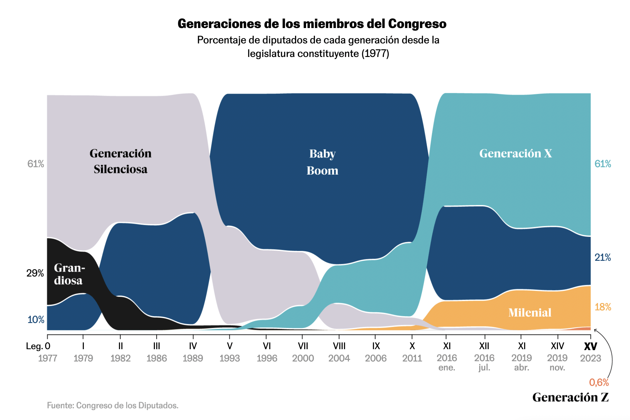
 Laura Navarro, for El País
At first glance, these two charts bear a striking resemblance. They both feature horizontal axes displaying dates (1977-2023 for El País and 1800-2023 for The Economist) and employ colored areas to represent parts-to-whole relationships on the vertical axis.
But can you spot the difference between these charts?
In The Economist’s rendition, the areas represent a constant age range (e.g., 50-59), whereas in El País, they represent a constant date of birth, signifying generations. For instance, in 1977, baby boomers were roughly aged 20-40, but by 2010, they were around 50-70.
The Economist’s chart immerses us in the Congress’s shifting demographics, spotlighting a 220-year transformation that is nothing short of astonishing. In 1800, 75% of Congressional members were under 50, a stark contrast to the mere 25% falling into that category in 2023. Meanwhile, El País takes a different path, prioritizing the identification of which specific group holds the reins of power at a given time. Here, age assumes the role of an incidental player. Each charted area represents a cohesive cohort of individuals, allowing for a distinct examination of the interplay between generations and their influence on power.
The Economist’s approach involves a continuous influx and efflux of individuals from the age category, represented by a colored area. On the other hand, El País takes a more holistic perspective, considering entire generations. This methodology, although less precise, benefits from its alignment with culturally recognized generational definitions, albeit requiring occasional date verification (who knows exactly when boomers are born??).
Yet, it is essential to underscore that while both charts converge on the central theme of who wields authority, the visual approach and displayed dataset are quite different!
Cause of Death
Yet, it is essential to underscore that while both charts converge on the central theme of who wields authority, the visual approach and displayed dataset are quite different!

Interestingly, Karim Douïeb shared his own work from a few years ago (code on Observable):

Both these talented individuals sparked my interest in visualizing demographics. A 2017 article by Jonas Schöley proposes four techniques to visualize group compositions on a period-age grid, among which the “qualitative-sequential scheme” used by Yau:
 or a small multiple approach:

Demography and visualization share a long history, and contributed some best-sellers in the chart inventory, such as the age pyramid, …
There are a few things going on here:
- irregular scale: starting from 2017, every age represented (groups of 4 or 10 years starting at 40)
- focus on more recent data
Yau uses a “qualitative-sequential scheme”, which can be found in an article by Jonas Schöley:
Other interesting techniques in the article are:

Grid Cartograms and Alphabetical Ordering???
Check out the following diagrams:
 The Financial Times
![]() Reuters
Reuters
 Can you spot the difference?
Answer (highlight to reveal): ==The ordering in the first is alphabetical, while it is data-driven in the other ones.==
#nytimes

A Matter of Scales
Feeling numbers is hard, but the following examples do a very good job at it:
#scmp #gaza
 #reuters #density #gaza
  #cnn
#cnn
 #washingtonpost
  #scale #3d

Miscellaneous
Some challenging charts in a story about water exports (Bloomberg):


Feelings about Work
#theeconomist
 #thestraitstimes

The Map and the Territory
The matching of borders and political affinity in populations is stunning #theeconomist:

Solar Eclipse
#nytimes

Yes, this week you can call me Ikea, because this week’s newsletter absolutely was DIY. I hope you won’t hold it against me.
I’ll try to make myself forgiven by sharing the links and identify the talented designers behind them on Twitter, so be sure to follow me if you don’t already!
See you next week, Mathieu Guglielmino