Design and Data Science for Visual Analytics (VDS Leaning 1/4)
By undefined, Dec 4 2023
Design and Data Science for Visual Analytics
Since I’ve started writing this newsletter, most of my energy has been dedicated to data storytelling and its specific instantiation in the news, which only answers to one precise function of visual representations:
 Among the three functions of visualization, “communicate” is best exemplified in the news
As 2023 comes to an end, I would like to use the few remaining weeks til the holidays to reflect upon the lessons learnt from these past months I spent as a PhD student at the frontier of computer networks and visual analytics.
Visual Analytics
I have noticed how hard it was for different research communities to share findings outside of their zone of influence, and many of my ex-colleagues at the CS department did not even know there was research being done in visualization.
 Since 2021 the Area Model for VIS groups different research topics in Visualization and Visual Analytics into six areas
Schematically, one of the umbrella under which can fall visualization research is information visualization, another is visual analytics. If the focus of information visualization is on the spatial layout, visual analytics is interested in developing interactive systems in real-world context. One major output from such research are design studies, a thorough report of the design rationale from observations in the wild.
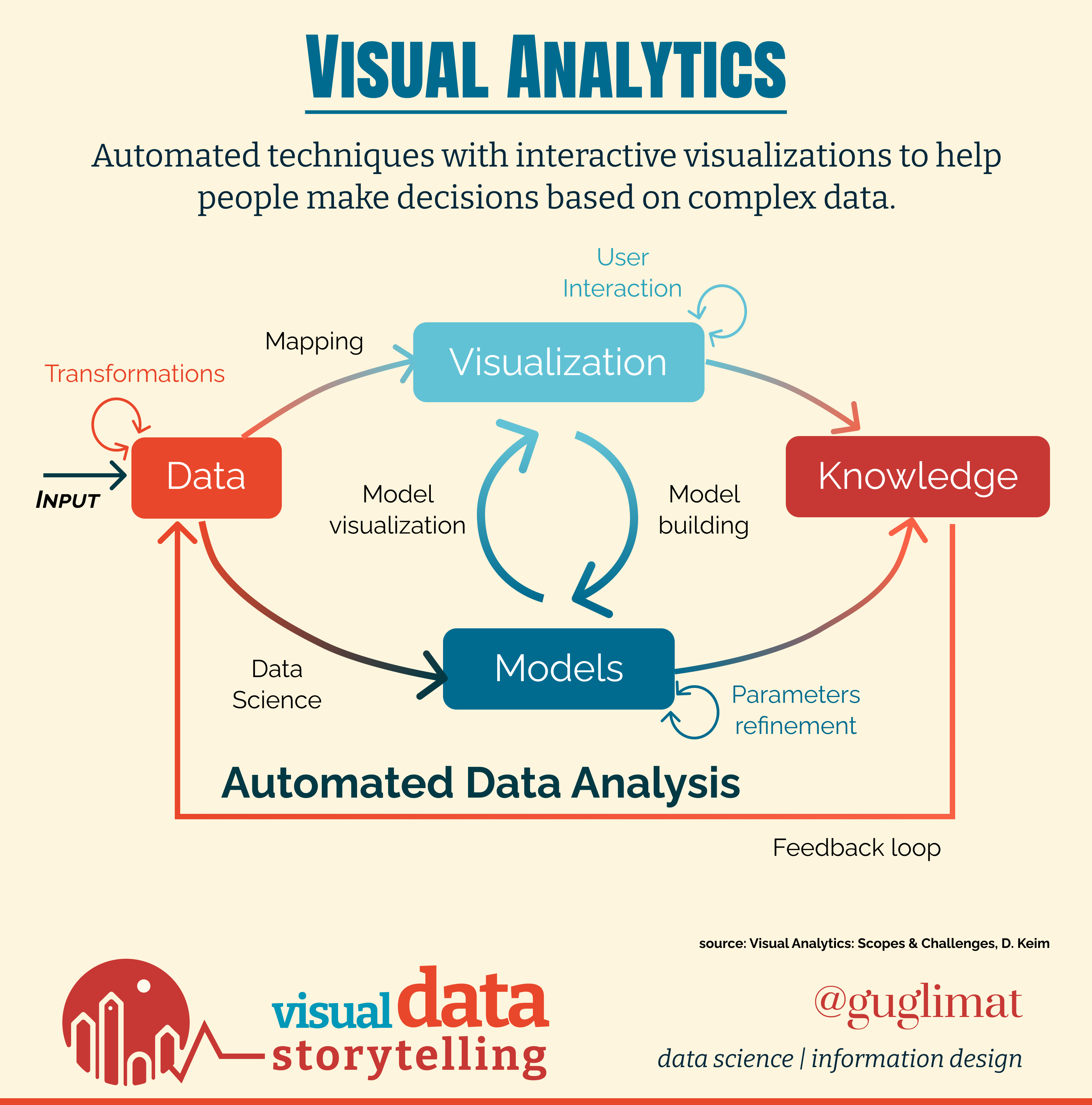
The formal model for Visual Analytics was first formalized in “Visual Analytics: Scope & Challenges” (D. Keim, 2015), with a broad scope:

Such breadth may partly explain the limited success of Visual Analytics beyond the academic community, which is usually limited to dashboards or business intelligence.
At the time of writing, Jacques Bertin did not have a clue how the software revolution would transform the way we question the data. This additional layer of interactivity made “processing”, or ordering, grouping, creating new categories, is not
In the research community, this merging of analytics capabilities with visual support has been called Visual Analytics and spans a broad scope:
 Visual Analytics, Scope and Challenges
Information Design is a cornerstone of Visual Analytics and provides many guidelines. Such guidelines are useful for the proper choice of visual marks depending on the data and task at-hand,
One of the major contribution from infoviz researchers are design studies, and report how a real-world problem was solved.
Chemograph
 Yesterday on X, I mentioned “Chemograph”, a visual analytics system presented at Eurovis 2023. It provides a good example of what a visual analytics system may be in the context of chemoinformatics and drugs discovery.
To help chemists explore an otherwise intractable chemical space (10^60 compounds!), it innovates on traditional parallel views for network visualization and provides
What are the steps in developing such a project, in a specialized domain with only few experts? One
Data + Design = Visual Analytics
Recent advances in artificial intelligence (AI) and other analytics have led decision makers to increasingly question the underlying data. However, data are produced and consumed by humans, and a discipline which has always focused on the end-user needs is design.
 Design leverages insights and creativity, and is the process to transform qualitative observations into a problem to solve before finding solutions. This broad definition has made design an elusive concept to understand, because what is the common characteristics of system design, information design, graphic design, or interaction design?
All these disciplines abstract a set of problems into useful concepts which form basic blocks to solve problem.
 Everyday objects like digital softwares should present some attributes to be interacted with (The Design of Everyday Things, Don Norman)
Interaction Design is the general abstraction to think about user interaction in the context of digital solutions.
If a visualization were to be interactive, what should it be able to do?
Does it relate to data storytelling?
Interactivity in the news is perhaps best exemplified by the short-lived hype around the concept of “newsgames”, birthed and dead in the 2010s.
Much energy was given to mimicking the aesthetics of 8-bit computer games of the 80s, which otherwise feature only a flat range of interactions. The limited agency of the reader/player made them basically irrelevant to data exploratio Like many of this kind, the Uber Game (Financial Times) is question-based.
Nonetheless, playful design is much more subtle, and among a few successful attempts are the following by the New-York Times, such as “You Draw It!”:

This haunting Voronoi to predict the election outcome:

Or the popular “Flashback” game:

Read list:
- Visual Analytics-Scope and Challenges (D. Keim, 2008
- What does the user want to see? What do the data want to be? (Pretorius and Van Wijk, 2009)
- A Design Space of Visualization Tasks (Diehl et al, 2009)
- Characterizing Grounded Theory Approaches in Visualization (Schulz et al, 2013)
- Visualizing Group Structures in Graph: A Survey (Vehlow, Beck, Weiskopf, 2017)