Vanitas Vanitatum et Omnia Vanitas
By Mathieu Guglielmino, Nov 20 2023
Judith Beheading Holofernes—Caravaggio
Who’s your favorite Baroque painter? Let me know!
VDS MakeoverMonday
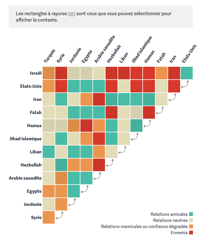
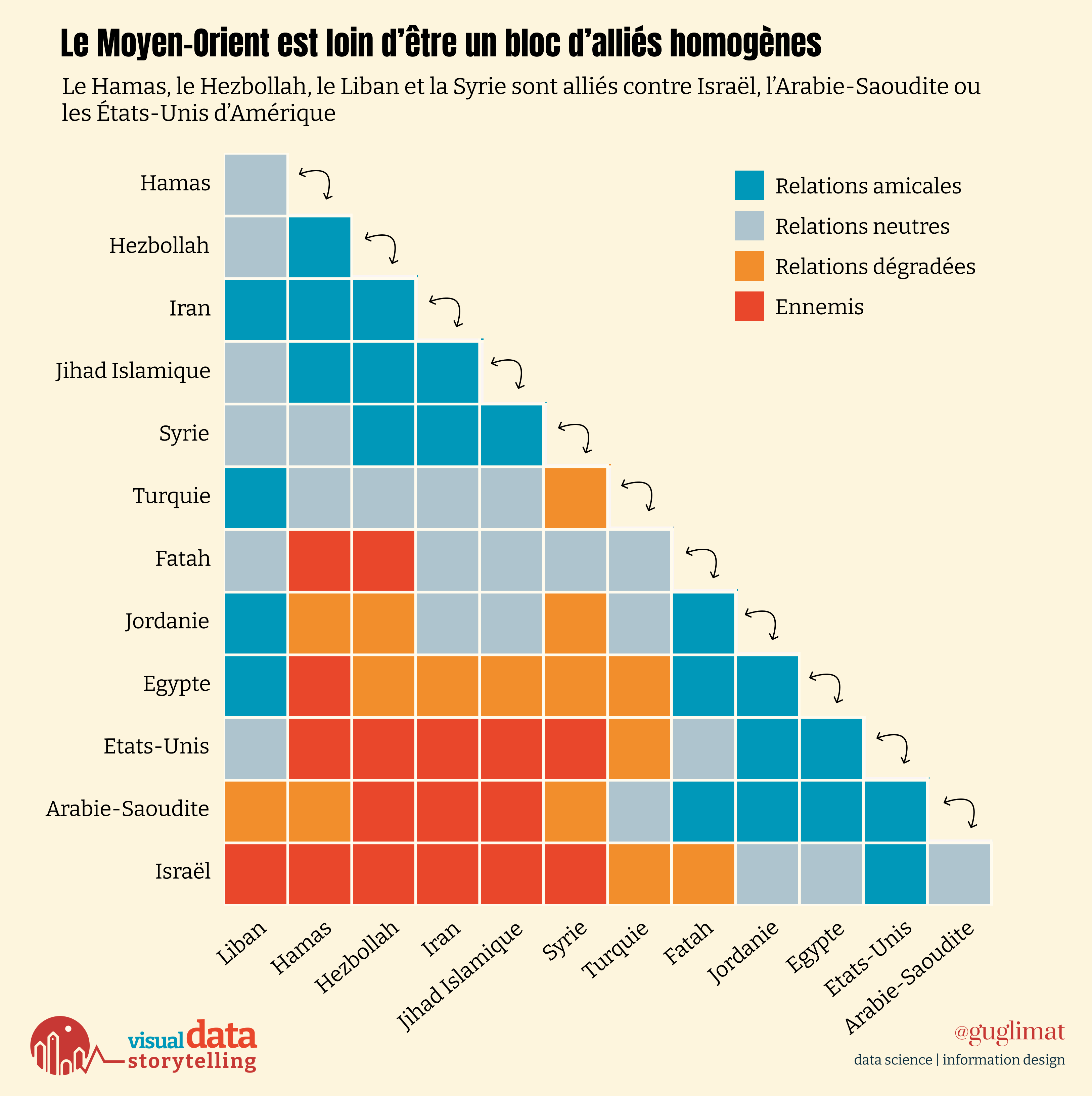
The elegance of matrices lies in their simplicity, yet a crucial consideration demands our attention—how to order the rows and columns. The essence of a message hinges on this arrangement, especially when the narrative revolves around clusters.
Otherwise, it may look like a random patchwork of colors:
 (chart by Pierre Breteau)
But Le Monde’s version is noisy, and noise makes it hard to remember anything.
So, let me offer a suggestion which may seem cosmetic at first but is actually really important: the strategic grouping of labels based on affinity. This will ensure spatial proximity for closely related elements:
What do you think is more similar in the following? Left vs right, or red vs grey?

Gestalt’s law of proximity tells us proximity indeed is first-and-foremost when grouping things visually.
Visualizing relationships poses a formidable challenge, particularly when scalability is the essence. Networks of nodes and edges excel in simplicity, but as elements multiply, matrices prove more efficient.
Jacques Bertin’s timeless wisdom, outlined in “Semiology of Graphics” (1963), remains my guide on this topic and many others:
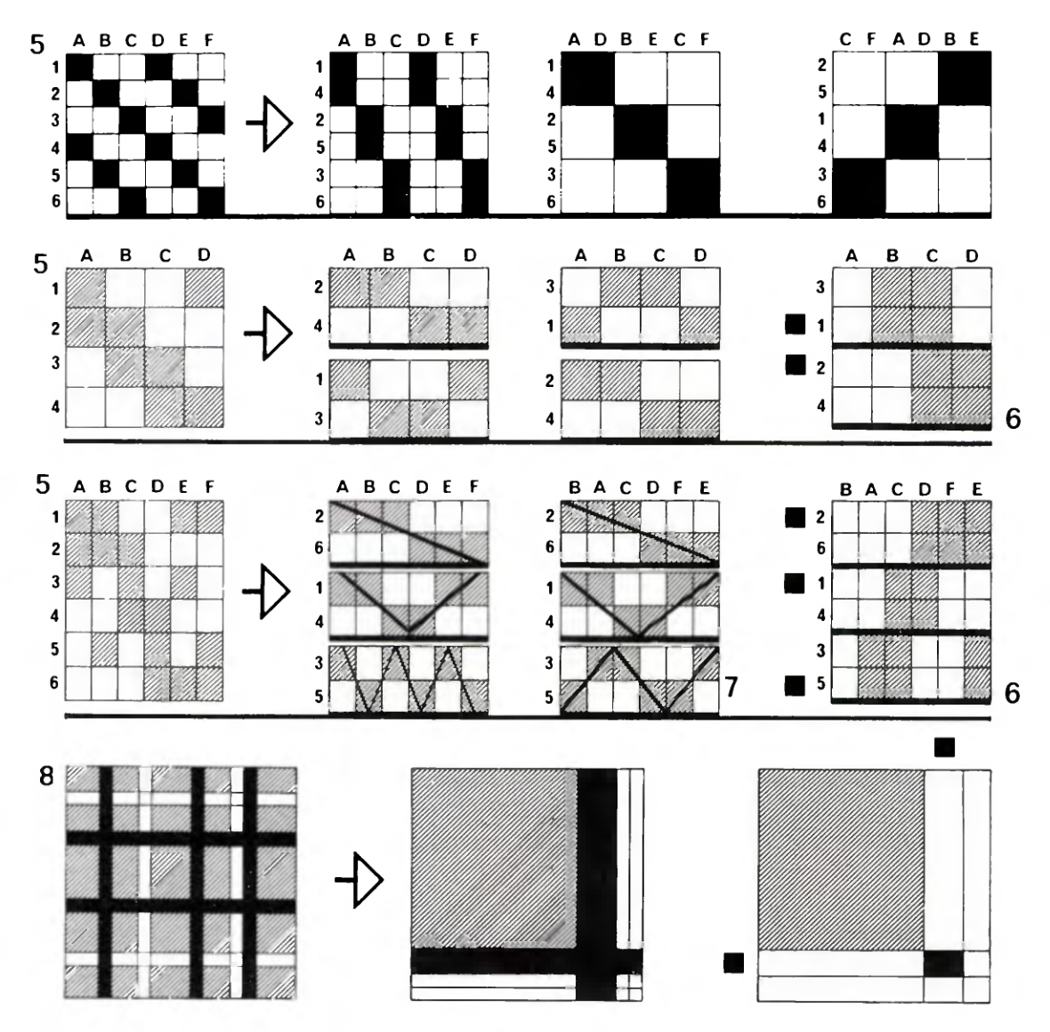
While there are many clustering algorithms (too many?), I’ve seen a lot of sub-optimal matrices.
Consider a simple hierarchical clustering approach:

Only half of the matrix is actually necessary to convey the complete information since it’s symmetrical. Yet, this introduces a challenge as reading it requires alternating between rows and columns.
To address this, I adopted Le Monde’s solution: incorporating arrows as indicators to guide readers in better comprehending this narrative. They act as signifiers—or triggers—to tell you how you can use this chart.
 Triggers should be explicit (from Dan Saffer, Micro-interactions)
Voronoi Treemaps
Visual Capitalist has embraced Voronoi treemaps with such frequency that one might jest about the onset of “Voronoi fatigue.”
Yet, this technique stands out as both engaging and memorable, capable of yielding spectacular effects when wielded with precision.
So what are Voronoi treemaps? This week unveiled no less than three of them:
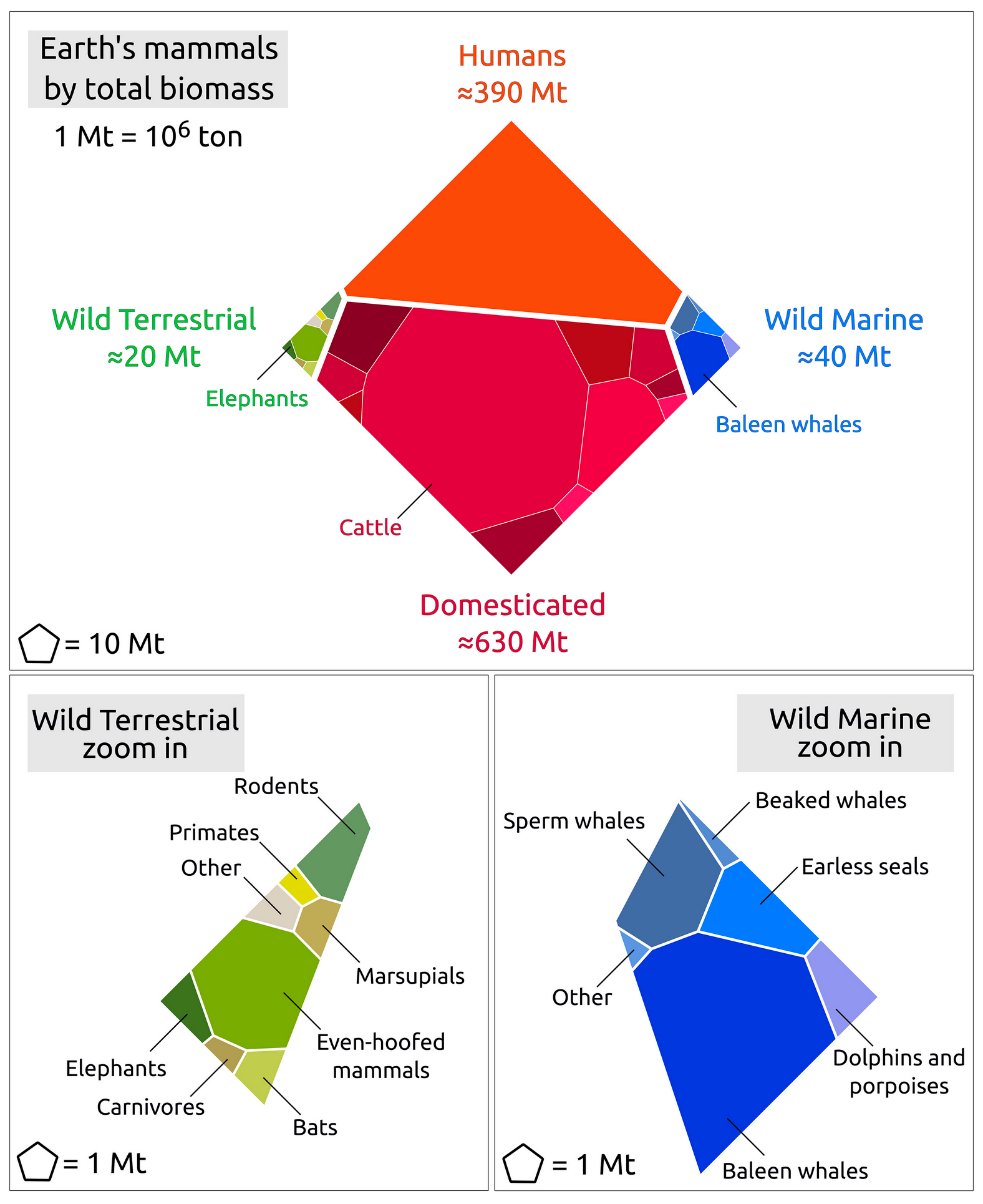 The global biomass of wild mammals, PNAS
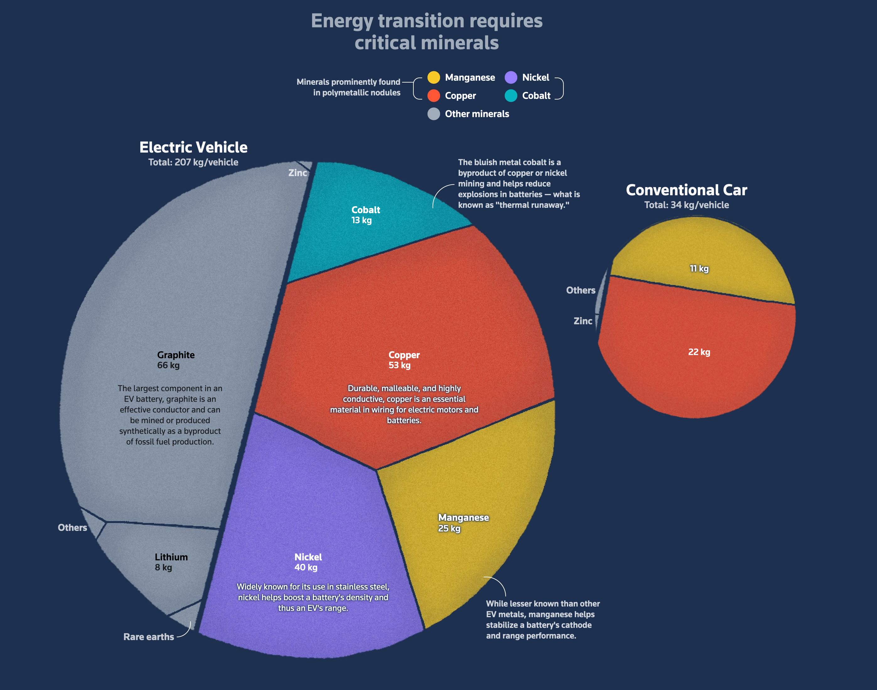 Mining Deep Sea, Reuters
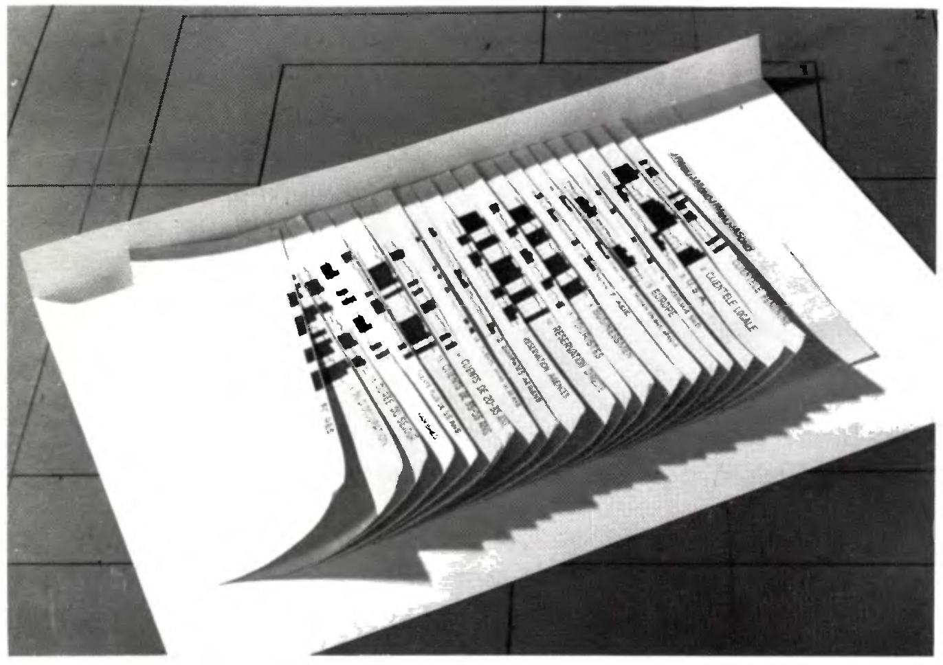
Not Voronoi but an interesting tetris-map (did you get it? did you get my pun? it was a Tetris-Treemap pun. Did you get it? Please let me know how much you did actually get it.)
Not Voronoi, but behold, an enthralling Tetris-map (catch the pun, anyone?). Yes, that was a Tetris-Treemap jest—did it land? Drop me a note and spill the beans on your pun appreciation scale!
 Le Figaro (Arthur Bijotat)
War Room—Vanitas vanitatum et omnia vanitas
In the 17th century, Europe witnessed the flourishing of a dark still-life genre known as vanitas, using symbolic objects to highlight life’s brevity and the futility of earthly pursuits. Smoke, watches, and hourglasses became poignant reminders of mortality.
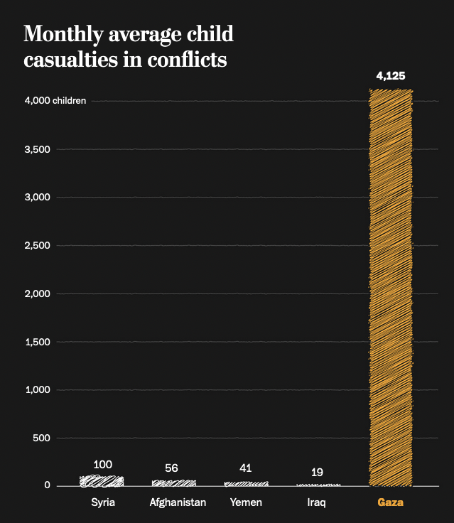
Fast forward to the present, and the following hand-drawn smoky silhouettes depicting children casualties in the Gaza-Israel conflict, as seen in the Washington Post. They draw a compelling parallel to historical vanitas, as symbols of the fleeting nature of life and the harsh realities of conflict, creating a nuanced dialogue between art and the present.


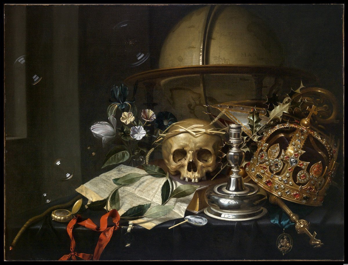 Hendrick Andriessen, Vanitas Still Life (ca. 1650)
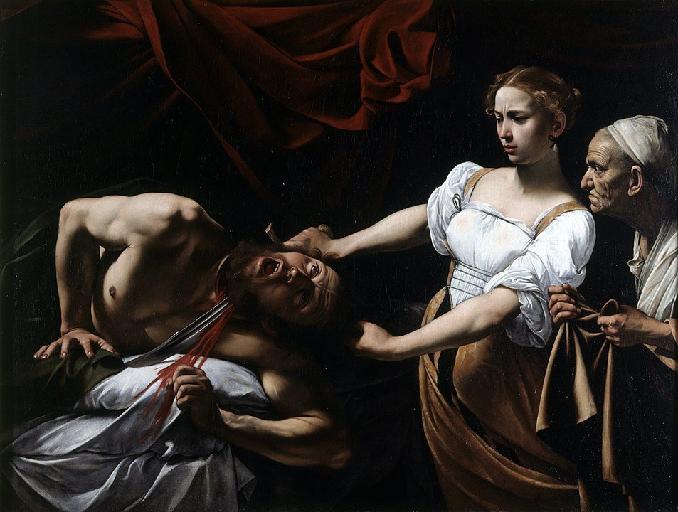
In this contemporary chiaroscuro, as stark as Caravaggio’s “Judith Beheading Holofernes”, the contrast between innocence and conflict becomes a timeless tableau:


 Judith Beheading Holofernes—Caravaggio
Chartpourri
Do I have the right to steal the chartpourri idea from Philip Bump’s newsletter, or is there a copyright on it? I’m getting bored of the surgical “miscellaneous” (a word basically no French person can pronounce correctly).
glowing
stories about energy are well-advised to use a glowing effect:

 By Vernon Silver, Eric Fan and Sam Dodge.
unbelievable
bicolor
Bloomberg’s bi-color strategy for the win.
 By Paige Smith, Scott Carpenter and Rachael Dottle.
behind-the-scenes

interesting
If you’ve ever tried to use this kind of layout for a chart about elections, you know what a pain it can be, especially if you don’t rely on any external library to do the calculations for you.
So this one is even more pleasant since it also encodes some data using the size of the circles:
 Le Figaro (By Nicolas Medon)
Welcome to last week’s subscribers! It’s so great to see many people I’ve been admiring for a long time peeping through my door 🙂 Hope you’ll find the reading enjoyable.
See you next week,
Mathieu Guglielmino