The Nested Blocks and Guidelines Model (VDS Learning 2/4)
By undefined, Dec 11 2023
The Nested Blocks and Guidelines Model
Structuring the design process may be the hardest part of any data project.
Last week, I introduced this 4-parts series about research & information design with Daniel Keim’s seminal paper, “Visual Analytics: Scope & Challenges”:

Defining Visual Analytics is a daunting task, as its scope is as vast as human knowledge and spans from biology to automotive design.
However, Visual Analytics is first-and-foremost a design process, and as such aims to place the user at its center. The “nested blocks” model first proposed by Munzner has turned to be one of the most influential paper in infovis, for it provides a systematic framework for tackling ill-defined real-world problems with a focus on visual representations.

This model for visualization design and validation comes with four layers, most useful in the conduct of data-intensive projects with a focus on visual representations:
- characterize the task and data in the vocabulary of the problem domain,
- abstract into data types and operations,
- design visual encoding and interaction techniques, and
- pick algorithms to create the visual layout
 From Visualization Analysis and Design (Tamara Munzner, 2014)
Munzner’s original work has been cited over a thousand times, attesting to its significance in academia. It serves as a crucial framework
Meyer et al (2015) extend Munzner’s model by introducing the concepts of blocks and guidelines between and within levels:

- Blocks are the concrete outcomes of the design process at each layer,
They are a task description, a data schema, a visual encoding, or an algorithm.
- Guidelines are the relationships between blocks How a task informs the data abstraction, or how a visual encoding supports an interaction technique.
This framework can help structure the design process, communicate the design rationale, and evaluate the design quality.
An exemplary illustration offering a comprehensive account of a Visual Analytics project in the automotive domain is “RelEx: Visualization for Actively Changing Overlay Network Specifications”, by Sedlmair et al. (2012, see on IEEE).

However, delving deeper into this topic would be preempting next week’s discussion on “design studies” and the invaluable lessons they offer.
Stay tuned for more insights!
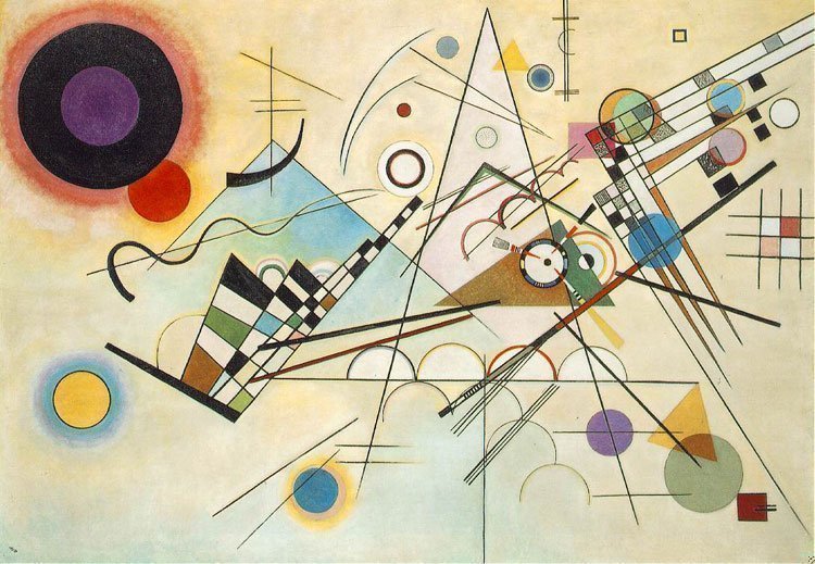
On the Spiritual in Art—Wassily Kandinski
Such notions of “blocks” and “guidelines” I have met in numerous fields, whenever one problem can be abstracted and typical solutions provided for reuse.
Since “A Pattern Language” by Christopher Alexander, many fields built upon this notion of “design patterns”, a few of them being game design, typography, information design, screenwriting, journalism, harmony analysis…
 illustration of Christopher Alexander’s ‘Positive Outdoor Space’ by Matt Noiseux
Such building blocks or design patterns can be reassembled at will.
One artist akin to finding them in his field was Wassily Kandinski (1866-1944). Like Mayan hieroglyphs are composed from individual components arranged in a square, Kandinski’s pieces are made of shapes and colors he used to speak what he intended to be the language of the soul.
 Thirty (Wassily Kandinski, 1937)
 Maya glyphs in stucco at the Museo de sitio in Palenque, Mexico (Wikimedia)
 In the annals of human knowledge, no artist delved as enthusiastically into the profound connections between music and visual art as Wassily Kandinsky.
Ever since his synesthetic encounter with Wagner’s Lohengrin, Kandinsky has elevated music to the pinnacle of his artistic vision. Regarded as the least material of the arts, music transcends superficial representational objectives and instead articulates an innermost truth.
Kandinsky’s deep connection to music is underscored even in the titles he bestowed upon his most renowned works: ‘Impressions,’ ‘Improvisations,’ and ‘Compositions.’
 Kandinski’s obsessive search for a visual vocabulary was driven by the spiritual resonance that music imparts to the human soul.
Analogous to a musician mastering scales, Kandinsky adeptly mastered forms and colors, drawing from this rich palette to fuel his creative endeavors.
Every work of art comes into being in the same way as the cosmos-by means of catastrophes, which ultimately create out of the cacophony of the various instruments that symphony we call the music of the spheres. The creation of the work of art is the creation of the world.—Reminiscences, 1913

 Principle of opposition in logotypes (from “The Art of Typography”, Martin Solomon, 1986)
The Principles of Design
Diving into “The Art of Typography” by Martin Solomon (1986) revealed a surprising similarity in the vocabulary shared across different design practices.
Solomon outlined six “Principles of Design,” including Relationship, Transition, Repetition, Opposition, Priority, and Position.
The list bears strong resemblance to the “rules of harmony” outlined in a 1896 book on image composition. Opposition, transition, repetition, and subordination (or relationship) appear in both.

 (Principle of Symmetry: top) Cathedral Notre-Dame de Paris. bottom) Correspondance between Marx and Engels, Federica Fragapane)
In essence, whether in visual arts, music, typography, or information design, there exists a common thread—a set of foundational principles that transcend disciplinary boundaries. Recognizing these shared elements can deepen our understanding and application of design across diverse creative fields.
Sources
- Composition: A series of exercises in art structure for the use of students and teachers, Dow, Arthur Wesley (1897)
- A Nested Model for Visualization Design and Validation, T. Munzner (2009)
- The nested blocks and guidelines model, Meyer et al. (2013)
- RelEx: Visualization for Actively Changing Overlay Network Specifications, M. Sedlmair et al. (2012)
- On The Spiritual in Art, Wassily Kandinski (1911)
- The Art of Typography, Martin Solomon (1986)
VDS Digest
Brazil’s history was been shaped by a violent process of “whitening” (branqueamento) in the 19th century, an ideology which sought to erase black features from the Brazilian population.

This chart by Diana Yukari, featured on A Folha de Saõ Paulo starkly illustrates how the 19th-century eugenic ideology metamorphosed into a system aimed at erasing African features.
This racialist politics in Brazil is recorded by the painter Modesto Brocos (1895). This portrayal amounts to a negation of African culture, not only in the European attire worn by the female characters, but also in what looks like relief from the grandmother seeing the child white.

Opening Sequence
A glorious gradient in Reuters:
(By Gloria Dickie, Travis Hartman, and Clare Trainor)

Journey back to the vibrant days of Web 1.0 with a nostalgic flashback featured in The Straits Times—no Bloomberg, but a vibrant tapestry of fully saturated colors. By Alex Lim and Stephanie Adeline.


War Room
In Reuters, always a wide range of visual forms to illustrate the conflict between Gaza and Israel.
By Prasanta Kumar Dutta and Mariano Zafra


In the Washington Post, an elegant detail in the opening where Gaza’s shape is animated like an audio wave. by Carson TerBush.

The New-York Times [1, 2] used an isotype visualization to report about the prisoners and hostages situation (by Elena Shao & Lazaro Gamio)
The New York Times, through isotype visualization by Elena Shao and Lazaro Gamio, reported on the Palestinian prisoners’ release and the hostages’ situation in Gaza. You can explore the detailed coverage in their articles from November 28, 2023 and December 1, 2023.


Energy & Global Warming

This advancement of renewables must be accompanied by a slowdown in the exploration and production of coal, oil, and gas, as shown in this area bump chart by Laura Navarro for El País, with absolute values, has smoother curves than this article by Harry Stevens for The Washington Post.

Fascinating correlation between fast food restaurants and revenues (Le Monde):

Bloomberg used familiar grocery displays as shop windows or a ticket to charge them with quantitative meaning. By Reade Pickert and Jennah Haque.
%% by Reade Pickert and Jennah Haque @readep @JennahHaque %%


Next week will be penultimate episode of this installment and I will a the methodology of “design studies”, how it relates to design thinking, and how it spans beyond the limits of academic circles.
Mathieu Guglielmino