Visual Semantics & Friendship Bracelets
By Mathieu Guglielmino, Oct 30 2023
This week is an unintentional Bloomberg special, but a well deserved one.
For a long time the New-York Times held a special place to me with all the innovations they brought to data storytelling.
But Bloomberg kept on producing good stories, visually appealing, and I have to say unexpected humanity. Not less than three pieces published this week were really well done and as such deserves the spotlight.
Visual Semantics, Friendship Bracelets, and Taylor Swift
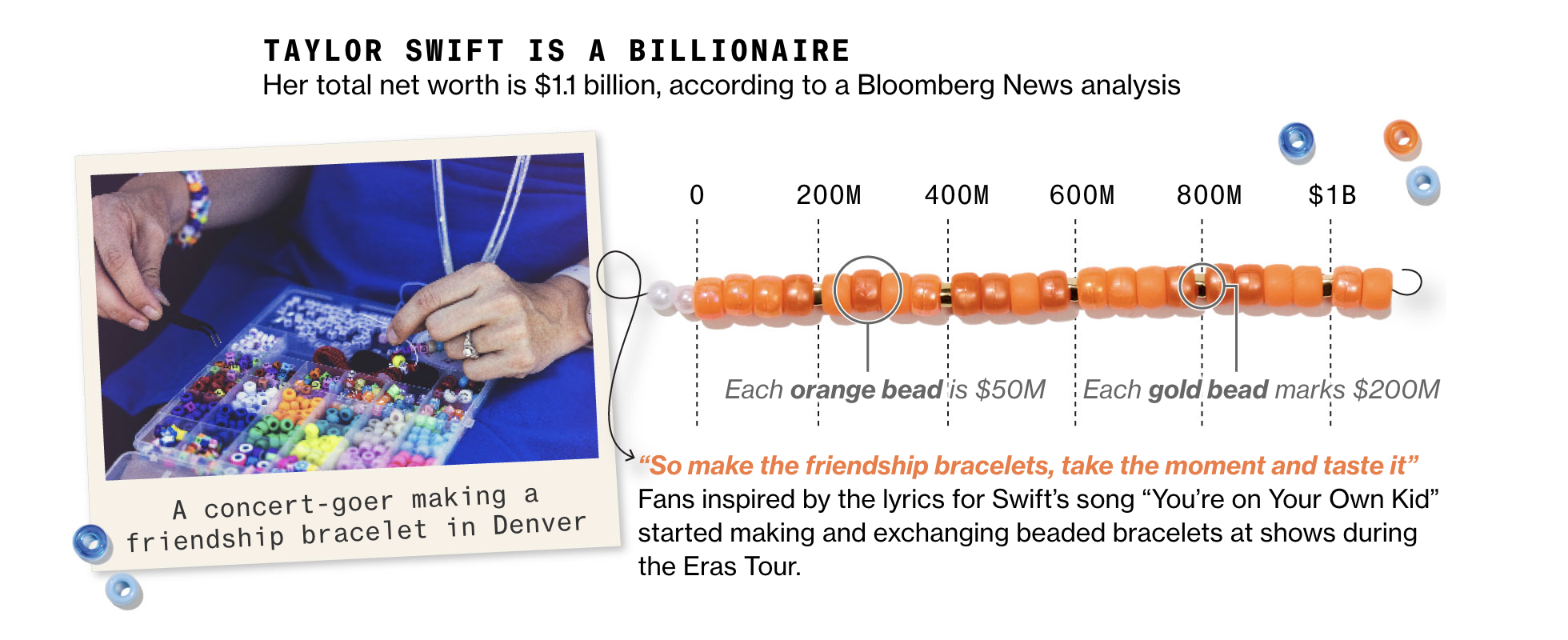
The one who absolutely stole the spotlight was the story about Taylor Swift’s success, whose entire design revolves around the metaphor of friendship bracelets.
This is tasteful handmade visualizations, and peak elegance. It makes you curious to know more about the data, and keeps you in a cohesive visual mood from start to end.


This technique of “visual semantics” is powerful to make a visualization more elegant and powerful. There are 4 steps in using a semantically powerful symbol (here, friendship bracelets) for the quantitative display of information:
-
- Introduce Your Symbol With Grace
-
- Create an Affective Association
-
- Create Fresh Visual Affordances from the Symbol
-
- The Devil Is In The Details
Be sure to check my X thread if you want to know the details.
Miscellaneous
Another Bloomberg piece will surely make it to my pantheon of global warming related viz, with this ridgelines plot by Denise Lu:

You get the message even if you don’t understand how to read this chart immediately. The temperature scale soon pops out, and colors nicely show how each decade turned hotter than the previous ones.
The New-York Times published a similar shift-in-distribution plot, though only on summer temperatures and with animation:

If you want to tell us which one you liked best, I have an ongoing X (ex-Twitter) poll going on.
Finally, still in Bloomberg, a map you cannot “simply look”. It is one of these compelling designs, with an attention to details, that leaves a memory.
 A story about immigration is always involving humans, and the biggest risk of data visualization is to dehumanize its subjects.
But two charts in the article show how this was a preoccupation to authors.
The first one uses stylized bar charts, with realistic and inclusive human images.
 This is a popular technique many outlets have used recently, such as the Wall Street Journal:
 Now check out the trip of Rodrigo:
 I instantly thought about “Stories behind a line” by Federica Fragapane, though here the duration of the stay isn’t translated visually:

Well done Bloomberg, this was a nice week indeed.
By the way, the same Bloomberg is recruiting 40 profiles for data-storytelling, among which journalists, designers, developers… It seems Bloomberg is putting its money on visual reporting becoming a cornerstone of its content!
Hamas-Israel War
Complex or simple, two devastating charts on the Gaza situation (Financial Times):


But why are there so many children in Palestinians victims of the conflict? If you wonder, I found an answer The Economist, regarding Palestine usual demography:
 Before you move on to another image, ask yourself: would your understanding of the message change if the baseline was to change? What if we change “income” with “Human Development Index”?
A surprising mix between Voronoi diagram and a beeswarm plot, seen in Le Monde:

Another semantically coherent article about Disney (Reuters), where most charts have a retro-style reminiscent of old movies:

I’m a big advocate of interactivity and gameful design, and I remain convinced such mechanisms are still underemployed in data storytelling, or visual analytics.
So it always make me happy when some articles do have some interactivity, such as this somehow cynical piece by Philip Bump (The Washington Post).
 After playing for a while with it, it seems very hard to find a date where you can talk about guns. This type of “one-at-a-time trial” to get a sense of the distribution is something I find very human and that I’d like to see more.
See you next week, Mathieu Guglielmino