
The Shadows of Bias in Generative AI
By Mathieu Guglielmino, Nov 13 2023
A newsletter soon-to-be delivered by pigeons?
 Janice Kai Chen @janicekchen for the The Washington Post
Side by Side—The Fentanyl Epidemic
Last week, I used some narrative patterns to explore the structure behind SCMP’s “Gaza-Israel War Explained”. Some of these patterns included using a physical metaphor, and is once more exemplified in this story about the fentanyl epidemic by the Financial Times:

A similar idea was seen in the Reuters’s story on the subject, though not using the tip of a pen but a penny for comparison:


While both articles deal with similar data, I’ve found the most striking chart in FT’s story (with absolute quantities):
 not as striking as the most striking chart in Reuters (part-to-whole):

And while the opening by FT is a rather classical photo montage:

Reuters provides an hand-drawn comparison of the magnitude of the seizures between 2014 and 2022:


FT employs a visually abstract and surgically rational visual rhetoric, whereas Reuters embraces the limitations of human cognition, specifically our difficulties in grasping vast scales. The utilization of subjective hand-drawn illustrations exemplifies this approach.
💡 Tip: Heavy Marks = Strong Signals
The human brain is wired to process visual information quickly and efficiently, but only if the right visual cues are given.
I take the following charts by Barney Jopson, published in the Financial Times, as great examples of where a visualization can sometimes send mixed signals.
The main problem in these charts is that the signals associated with the heavy visual marks—the lines—are not related to the message:

 (The shape of the lines has no semantic meaning)
The eye is inevitably drawn towards the heaviest visual marks, in this case the black lines, so it is unfortunate they bear no meaning. For example, a line “going up” would naturally mean that a quantity increased.
It turns out that for you to know how the climate changed over the years, what you should actually be looking at in the charts are not the lines but the dots, and their relative positions. If the red dots are above the grey dots, then summers got hotter (and more wet). But this is a much more difficult visual signal to catch!
A simple and elegant solution is this cycle chart from El País. Here, the lines clearly indicate whether the temperature has gone up or down compared to the previous decades:
 (In this cycle chart, the signals associated with the the lines match the intended message)
 Visual features such as color, lightness, or curvature are processed in a fraction of a second (adapted from “Visual Thinking for Information Design” by Colin Ware)
Gaza-Israel War
Two memorable charts in El País making a strong point (by Daniele Grasso, Laura Navarro Soler, and Luis Sevillano Pires)
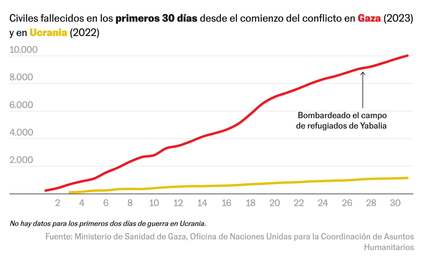 (Comparison of the two major conflicts of the year)
 (Great use of grey)
And a really affect-oriented story in Al-Jazeera, “Know their names”:


Chartpourri
Every other interesting things from last week!
Generative AI And Bias—The Washington Post & Bloomberg
AI is as good as the dataset it’s been trained on, and it’s been shown repeatedly current models reproduce racist, sexist, ableist, LGBT-phobic biases we daily observe in society.
Last week was the Washington Post’s turn to explore such AI bias, with a design reminiscent of how these systems actually display their creations:
 By Leonardo Nicoletti and Dina Bass
This “exemplar” approach completes Bloomberg’s recent exploration of the same topic by Leonardo Nicoletti and Dina Bass:
 And a combination of example / generalization:
 Two different design decisions. The Washington Post selected a few representatives (with interactivity to “show more”), while Bloomberg aggregated the outputs and used unit charts to suggest the scale of the phenomenon.
Tropical Cyclones
Tropical cyclones have swept across the globe in recent weeks, leaving behind them a trail of immense destruction and loss of life, as exemplified in Derna, Libya.
This piece written by Luis Sevillano Pires and Laura Navarro for El País is a great contextualization of these extreme events.
By Luis Sevillano PiresLaura Navarro


A Global Superpower At Sea: China’s Maritime Silk Road—The Washington Post
I’m not yet tired of hearing about the many facets of the Chinese threat to Western leadership, as recently about EV batteries (Bloomberg):
 In a recent article for The Washington Post, Júlia Ledur examines China’s methodical construction of a maritime silk road over the years, illustrating its evolution into a crucial component of the global trade network.
 Multiple techniques used to compare the effects of Chinese investments:


Maui Devastating Fires—The New-York Times
Yet another great opening sequences by The New-York Times:

- Videos in context,
- Satellite view,
- Scrollytelling…
%% By Mike Baker, Malika Khurana, K.K. Rebecca Lai, Riley Mellen, Natalie Reneau, Bedel Saget, Elena Shao, Anjali Singhvi and Charlie Smart #nytimes %%
How do people of New-York call the places of New-York 🗽?—The New-York Times
The alluring pastel color palette in this map really is what I perceive to be the Times distinctive design elegance: #nytimes


Giraffes and #30DayMapChallenge
https://twitter.com/MapsbyW/status/1722329140337217667
