How Indexed Charts Are Used to Tell Lies
By Mathieu Guglielmino, Feb 5 2024
Calling Out Bad Charts
There are inoffensive bad charts, like this one published in an article by Kenneth Field about cartograms, which I know was intended as a joke:
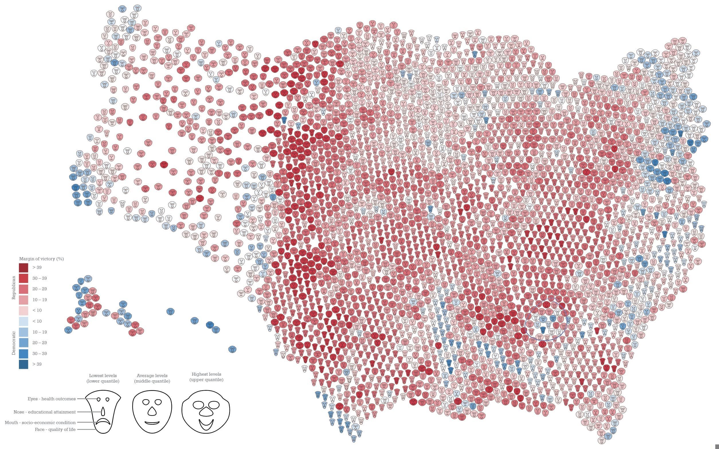 Chernoff Faces are not great, check out this article by Michael Correll (Tableau Research).
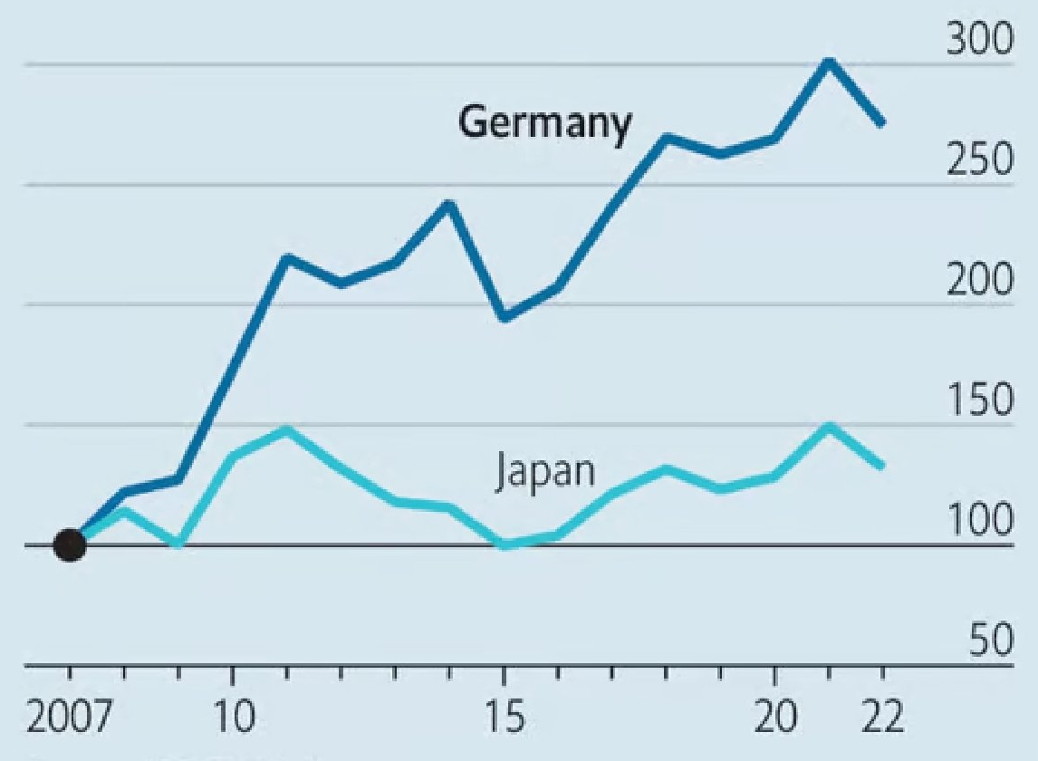
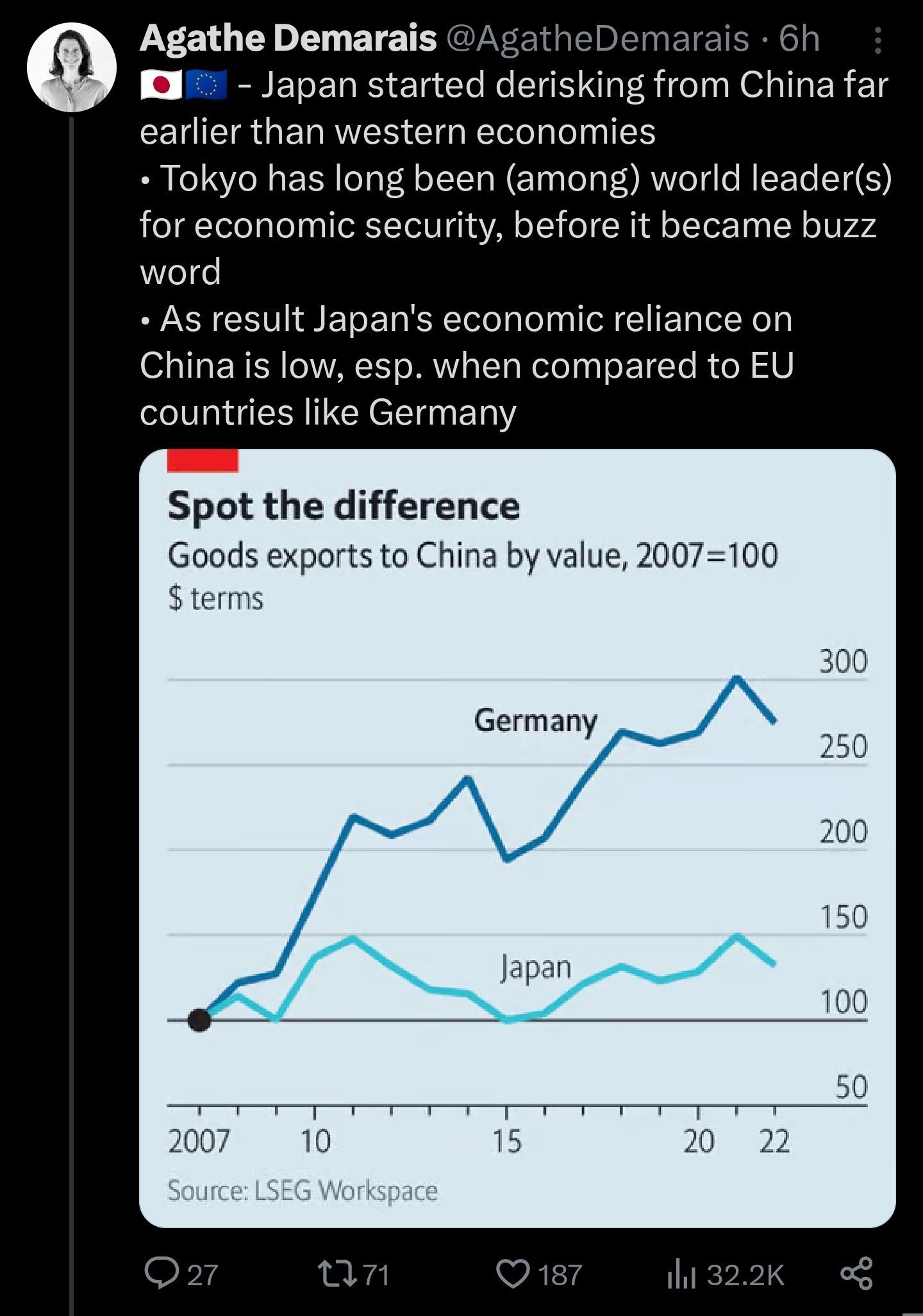
And there are intentionally misleading charts, like this one published in The Economist:
 It was spotted by @nikstankovic_ and @RnaudBertrand on X who called off the chart for what it is: at best misleading, at worse a deliberate twist of reality to fit a narrative.
You, me, and probably many other readers people understood the chart as: Japan’s economy does not depend on China’s to export its goods, contrary to Germany.
But the “truth” is actually the opposite, and Japan exports more to China than Germany does:
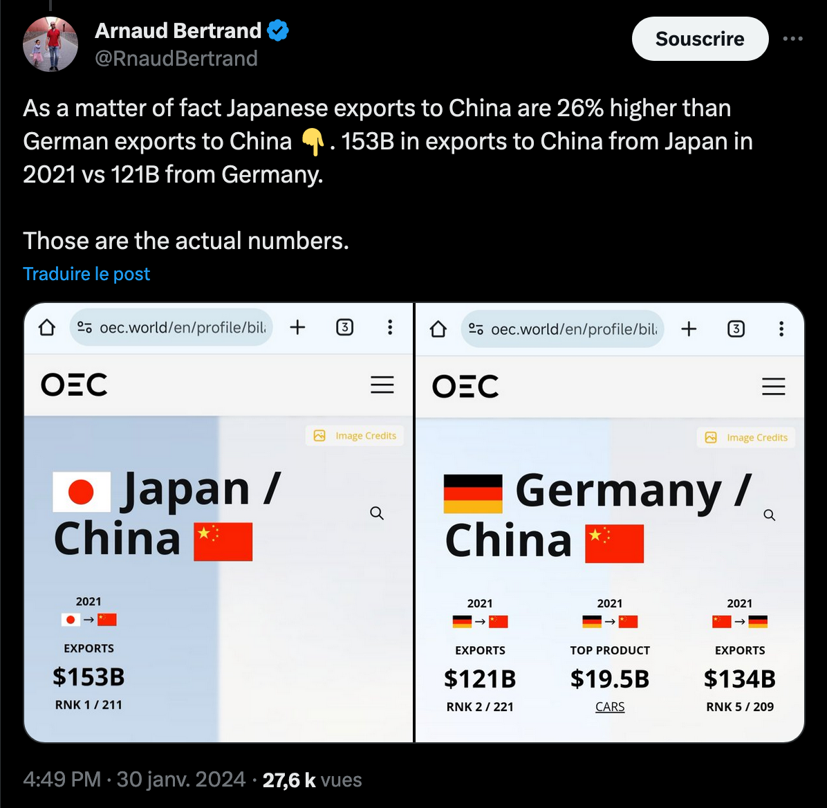
Where is the trick? In The Economist chart, 2007 is chosen as date origin, which is also the year for which Japan exported the most goods.
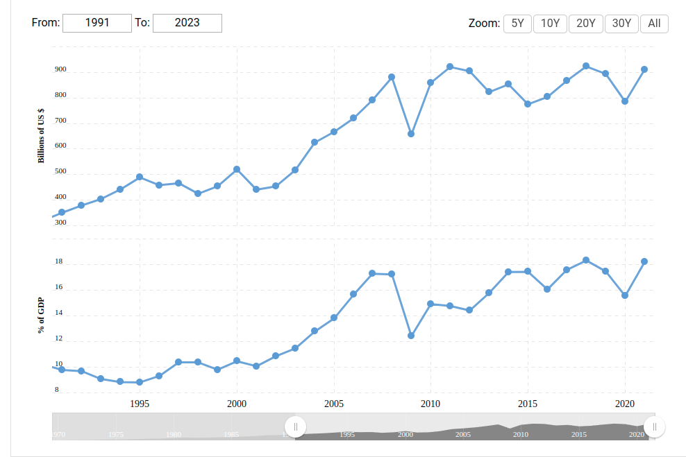
Text book data manipulation. You should read Arnaud Bertrand’s thread as enlightening as it is worrying.
The lesson here is : indexed charts (assuming the starting values are the same) can have a deceiving effect. To use with caution.
Trees, Remembrance, and Cascading Hazards
Last week, two visual projects using tree data were published by two of the most prominent faces of information design.
Nadieh Bremer, from Visual Cinammon, created a visualization about what it takes to remember the Holocaust:
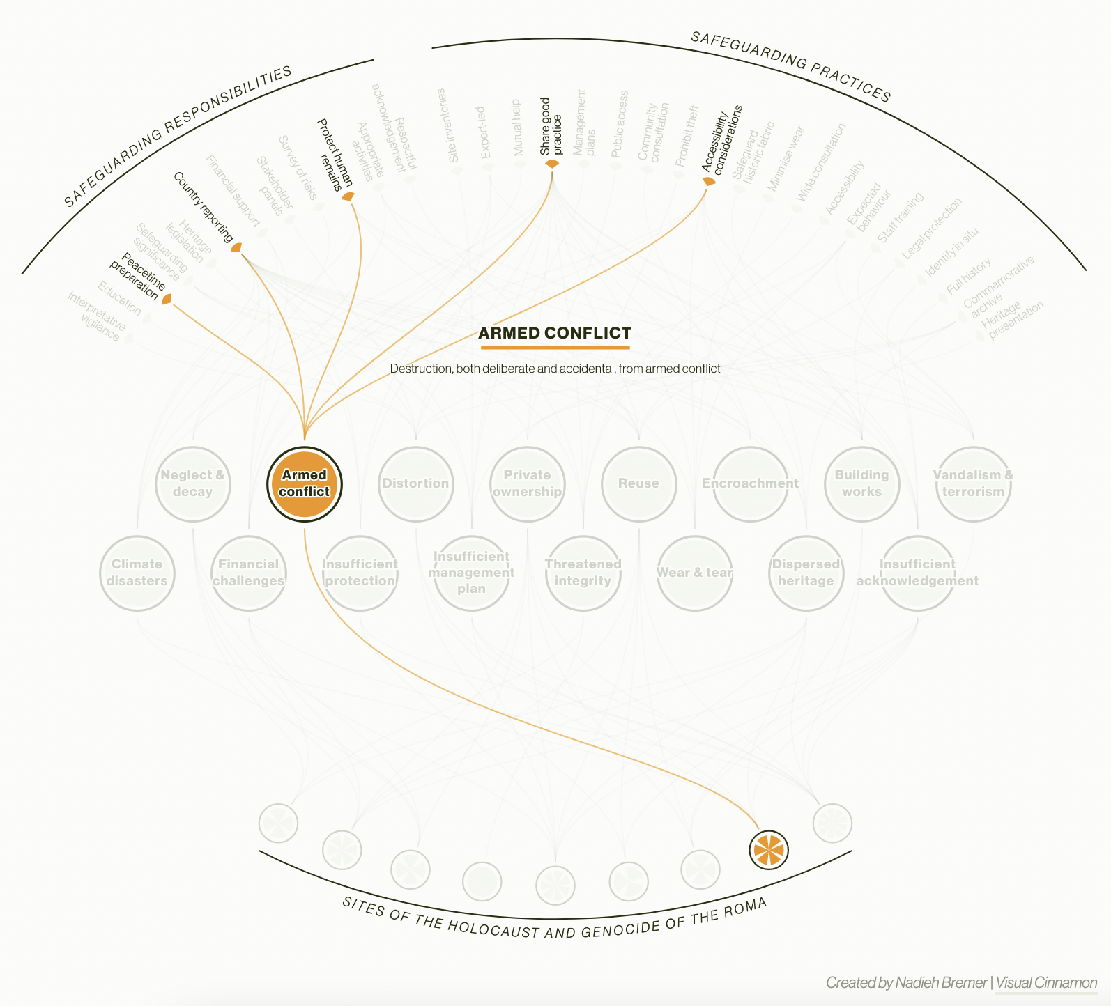 IHRA Charter for Safeguarding Sites
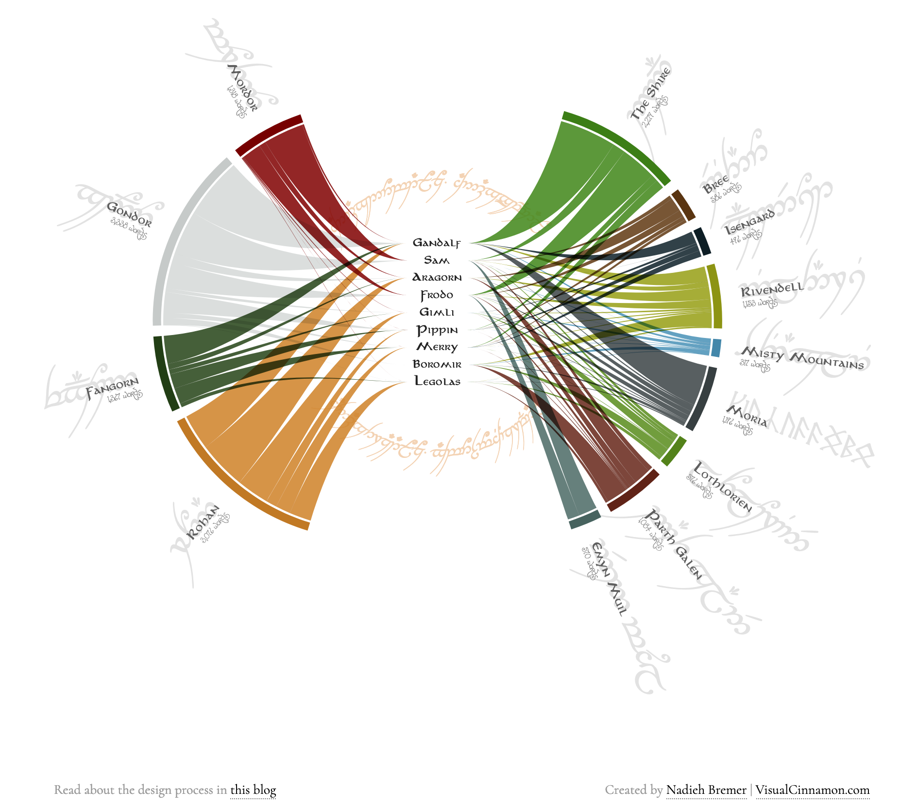
This mix of a radial and tree layout is reminiscent of “Who’s speaking of Middle Earth”, a piece Bremer described in the book she wrote with Shirley Wu, Data Sketches:
The second talented woman I wanted to talk about this week is Federica Fragapane, another distinctive visual language, whose artwork is permanently displayed at the Museum of Modern Art of New-York (MoMA). She was also featured in Alberto Cairo’s latest book, The Art of Insight: How Great Visualization Designers Think.
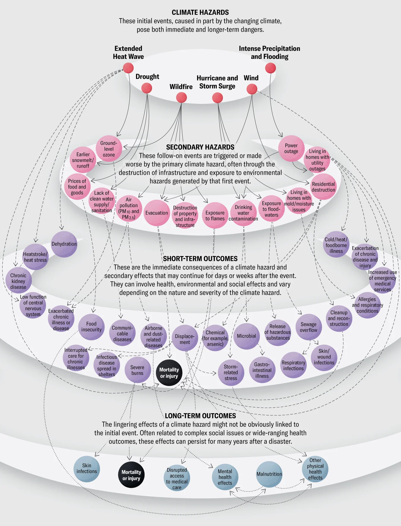
This data rich cascading tree was published in Scientific American, and shows how unreliable would be any predictions regarding climate change because of the intricate network of dependencies.
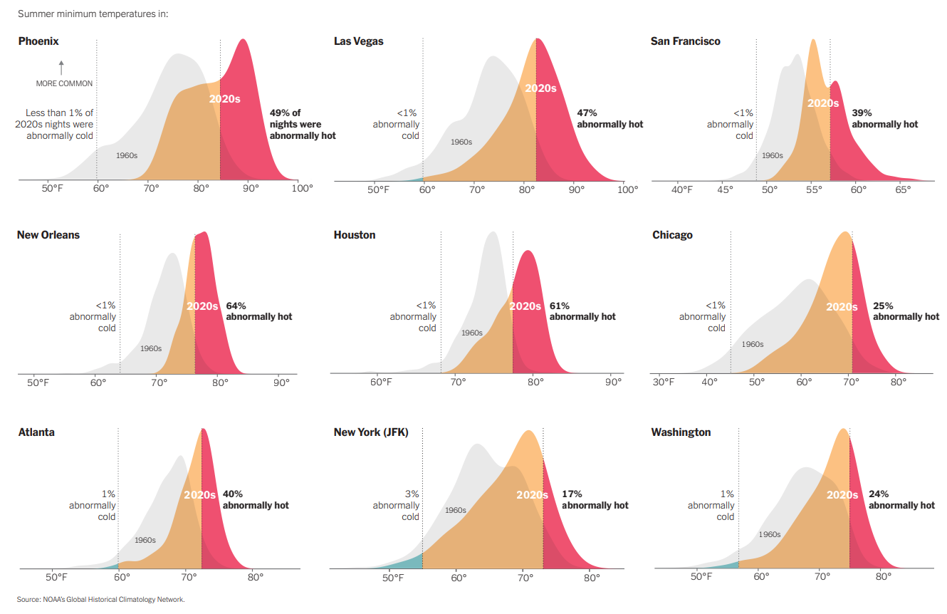
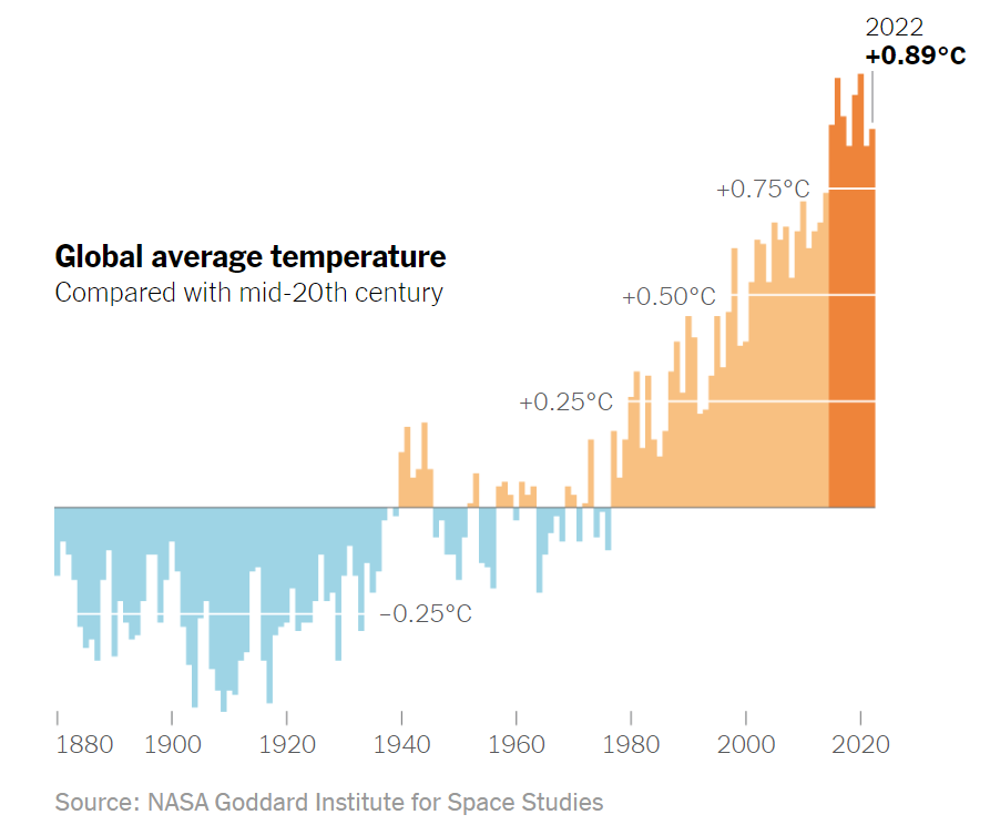
Yes, climate change will have many unforeseen consequences, and numerous articles have been delving into the topic. Most recently, the New-York Times’ “What’s Going On In This Graph?” published a retrospective in 30 charts, many of them I mentioned here last year but a good collection to bookmark would you ever have a question about 2023 extraordinary weather.
Miscellaneous
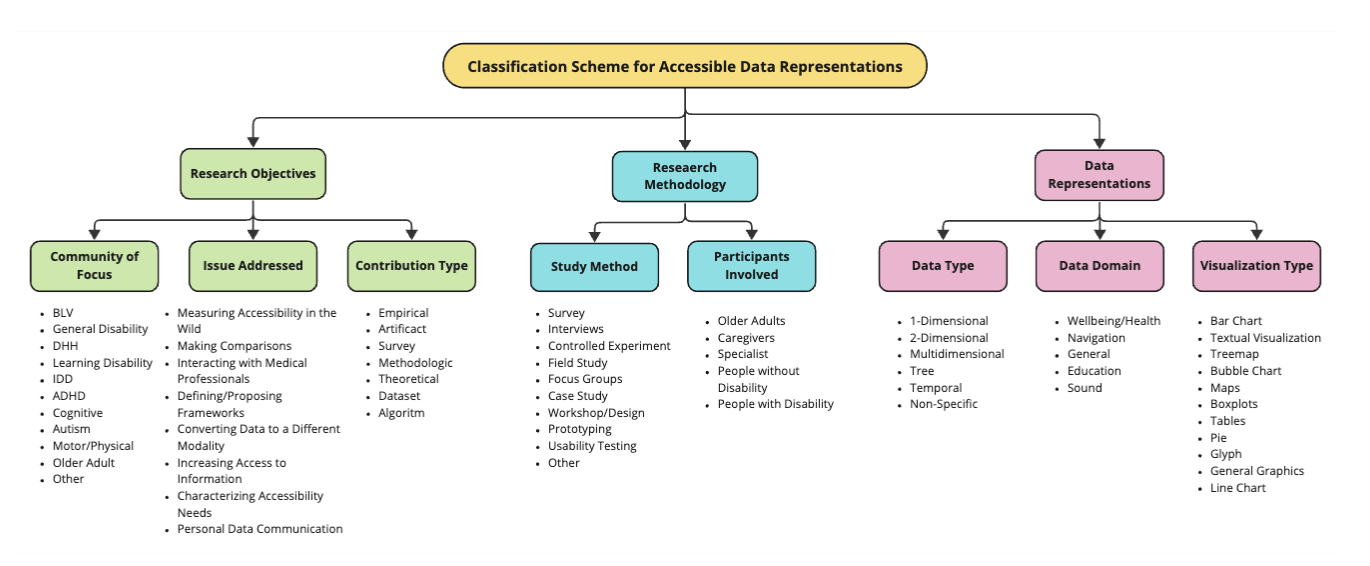
- “Beyond Vision Impairment” (Brianna Wimer et al., 2024, in IEEE Transactions on Visualization and Computer Graphics) (link to pre-print). The article contributes a taxonomy of accessible data representations:
- Plottable is a Python library to plot tables
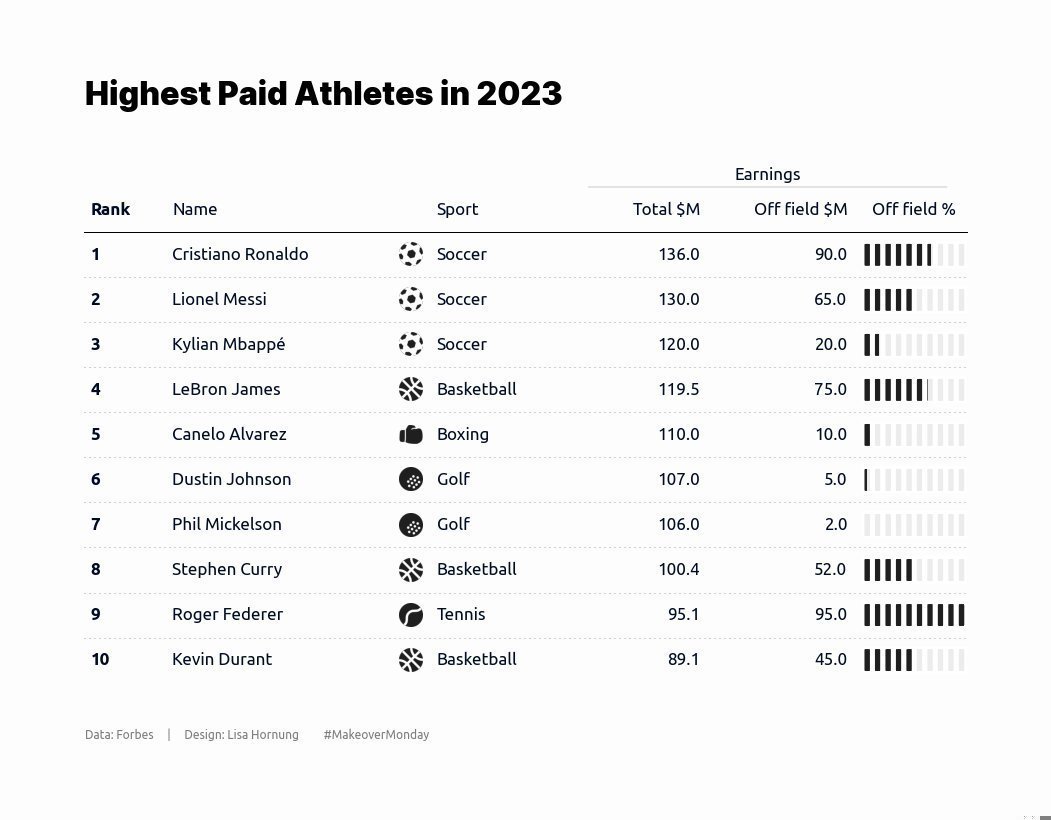 By @LisaHornung_
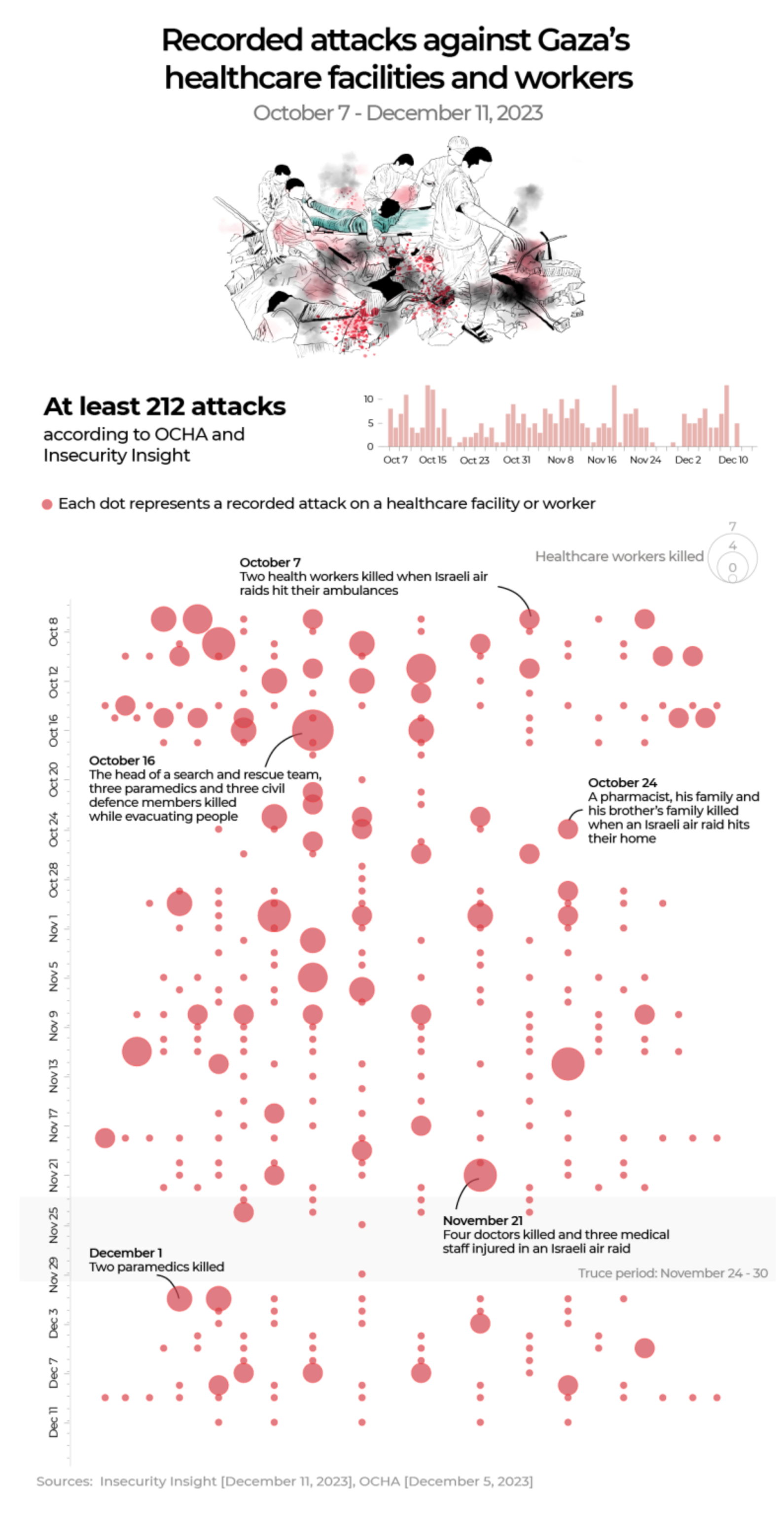
 - There’s still two a war going on in the Middle-East, had it leave the “Breaking news” cycle to rejoin Ukraine in the “let’s talk about it time to time”. Shoutout to Al-Jazeera for a visual piece about doctors in the Gaza Strip. “No doctor wakes up in the morning and says: ‘I’m going to amputate a child’s leg without anaesthesia.’” I guess gruesome illustrations are justified.


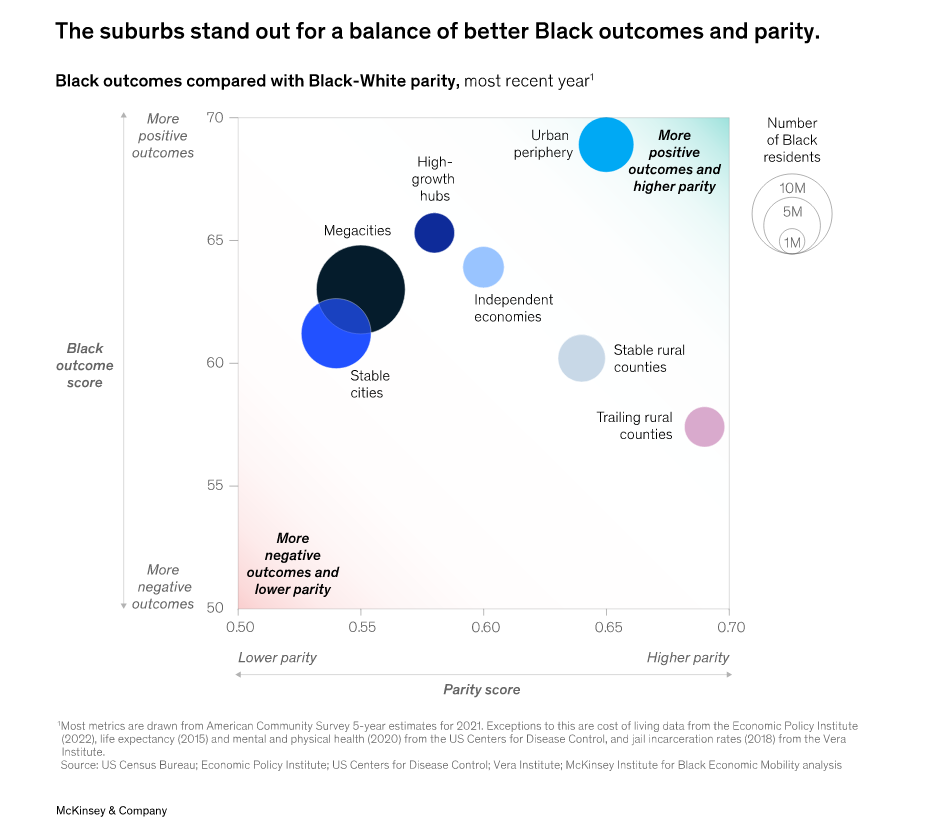
- “The State of Black residents”, a McKinsey report about places and racial equity outcomes in the United-States
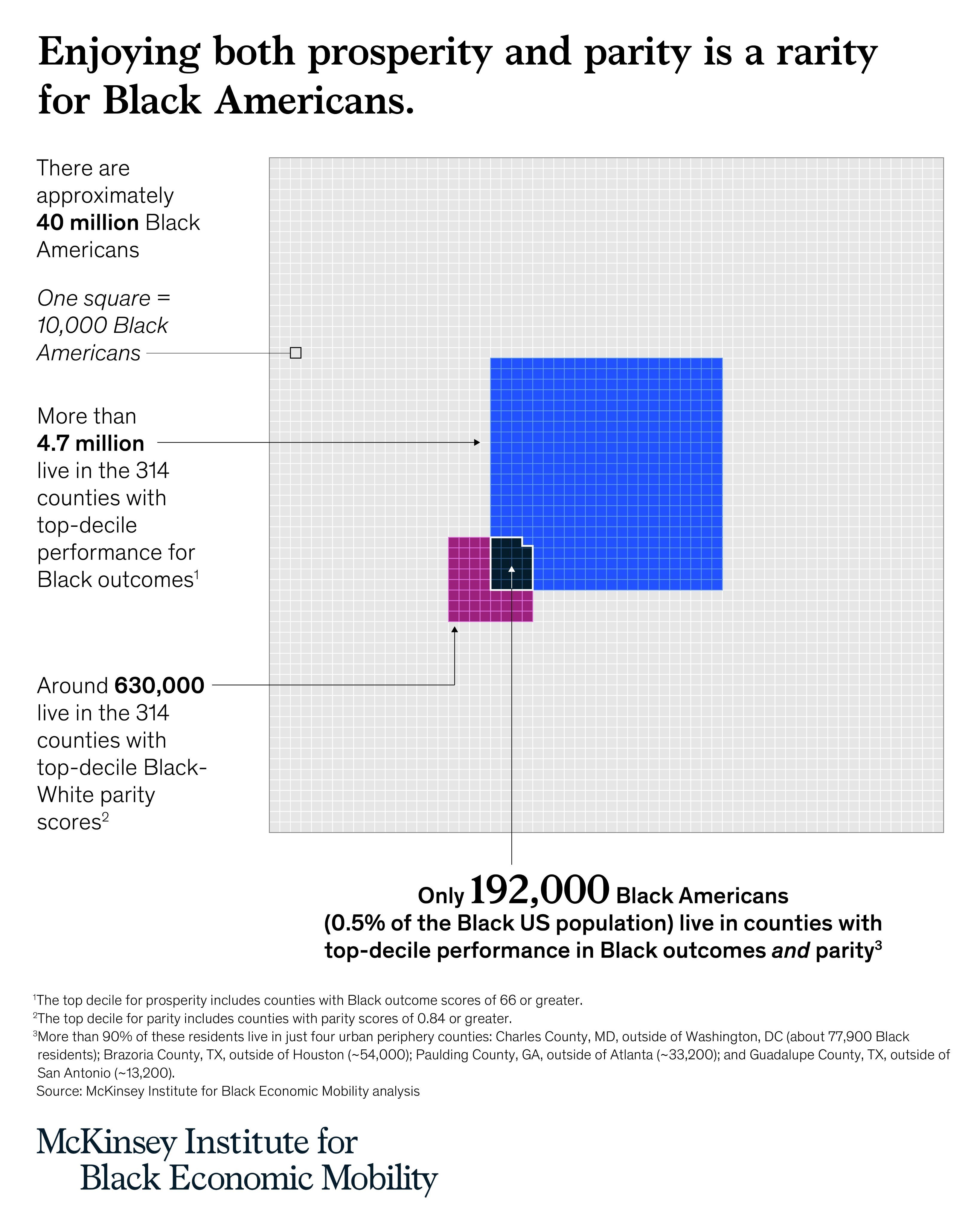 Venn diagram & Unit Chart
 Gradients are visual cues to help reading the chart
- The French media Contexte published a scrollytold map of “the islands of ecological planification”, to explore the government plan for climate change. It comes even more relevant now that former prime minister Elizabeth Borne was replaced by Gabriel Attal, she who was in charge in the subject until now.
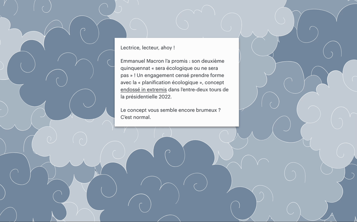 by Victor Roux-Goeken, @Victor_RG
See you next week,
Mathieu