6 Empathetic Ways To Visualize Conflict
By Mathieu Guglielmino, Oct 16 2023
6 Empathetic Approaches to Visualizing Conflicts
The images that have emerged from this decade-long conflict cannot leave us entirely unaffected.
However, as I was preparing this week’s edition of VDS Digest, I was struck by the difference in emotional impact as I saw more and more photos supplementing various maps of the initial attacks.
It took time for me to truly feel something.
Intellectually, I had an opinion on the matter, of course, but something visceral deep within? No, everything remained abstract.
This disparity between the emotional effect of maps and photos, as well as the level of information they can convey, is what I wish to discuss today.
The abstraction of the former – streams of icons amidst colored polygons – cannot compare to the realism of the latter – people weeping, crying out, collapsing amid ruins over the lifeless bodies of their loved ones strewn in the streets.
Therefore, I wanted to contemplate ways to narrate these tragedies that have the potential to be closer to what we are as humans.
1. The Reasons for Empathy
A good story gives the reader a reason to identify with the characters.
 CNN
CNN
This design choice seems more effective to me than a comparison with a map alone, but less effective than using isotypes.
Comparison can also be made over time, with potentially less emotional impact when used on a map:
 Reuters
On the other end of the spectrum, it seems to me that The New York Times, while the message is that Gaza is “one of the most densely populated places on the planet,” relegates density in the background and visually emphasizes Israel.

 The New-York Times
2. From Abstraction to Figuration
The most sensitive representations include a photographic element, whether satellite (The Financial Times):
 The Financial Times
or combining a geographic and photographic component (Reuters, after the earthquake that struck Turkey and Syria):
 Reuters
3. Before/After
Without a point of comparison, it’s impossible for us humans to truly understand. To know, yes, but to understand and feel we need to be able to concretely evaluate a before and after.
A common solution, sometimes with a slider, is placing two photos side by side:
 The New-York Times
A graph can be just as effective in conveying the horror it tells, but can the following diagram truly leaves as lasting an impression?
 The New-York Times
4. Icons and People
The further I delved into my readings, the more I found these small, jagged icons meant to represent an attack or explosion to be trivial.
This dissonance between the representation and the represented is glaring when it comes to human tragedies. Here, The Financial Times speaks of “targets,” not real people:
 FT
FT
Euphemisms are taken to the extreme in The New York Times, where there is no talk of victims but of “targets” and “cities”, not terrorists but “militants”.
We rarely ask the question, but are these small squares of color well-suited for this situation?
 The New-York Times
5. A Distant Flat Screen
The flat, smooth, and cold illustration of a map printed in a newspaper or displayed on a screen carries in its DNA an emotional distance that makes it so effective for sharing information.
But this efficiency comes at the cost of emotional detachment.
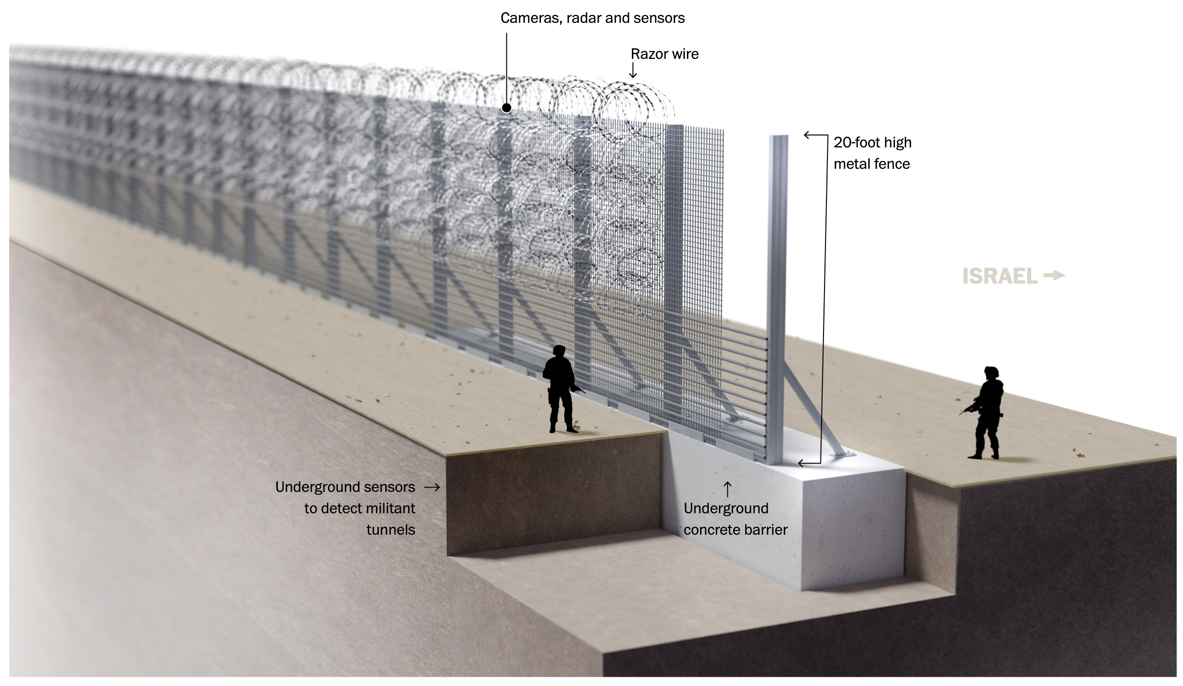
To depict the reality on the ground, I found that these 3D illustrations literally added a new dimension:
 Le Monde
The Washington Post
Le Monde
The Washington Post
6. Words Are Sometimes the Most Effective
Gaza is now surrounded, and its inhabitants are trapped with nowhere to go. How can we convey the terrible consequences of such a confined space in which 2 million people live?
I looked to Al-Jazeera for a different perspective, and I found that the title of the following map speaks for itself: “nowhere to go.”
 Al-Jazeera
It’s interesting to compare how different media outlets depict the cramped space. For Reuters, Gaza is surrounded both by the sea and Israeli borders, with checkpoints closed:
 Reuters
But again, with The New York Times, the emphasis is on Israel:
 The New-York Times
For more examples about the conflict, I’ve found this article by Sylvain Genevois (in French) quite thorough.
Illustrating Nobel Prizes: An Impossible Challenge?
Creating an image that captures the essence of Nobel Prize-winning discoveries in highly specialized fields such as attosecond lasers or quantum entanglement seems like an insurmountable task.
Ideally, the image must:
- Be clear,
- Be simple,
- Be memorable.
Otherwise, the information may be disseminated, but it won’t truly stick in people’s minds, becoming just another forgotten Nobel laureate in the annals of history.
 © Johan Jarnestad/The Royal Swedish Academy of Sciences
It is likely with this objective in mind that Johan Jarnestad chose to illustrate the Nobel Prize in Economics, recently awarded to American economist Claudia Goldin for her groundbreaking research on the labor market for women in the United States.
This graph stands out for three key reasons:
- Visually Simple: Its elegant U-shaped curve is organic and easy to remember.
- Counterintuitive: The rate of married women in the workforce has not been steadily increasing over the past two centuries, contrary to common belief.
- Reasonable Explanations: Phrases like “expanding education” or “contraceptive pills” could even become societal goals, as indicated by the arrows of progress.
Of course, this image represents a deliberate choice made within the extensive body of a researcher’s work. It doesn’t encompass the myriad other aspects that could have been addressed, but it is an effective representation.
Climate Change
This year has been an eye-opener for many people, as the world swirled in massive and regular heatwaves. Speaking of heat, a typical heatmap found in the Financial Times:
 FT
FT
or the global anomalies in Axios:
 Axios
Axios
Or a rotating global in the New-York Times:

 The New-York Times
It’s hot, hot damn (call the police and firemen).
Any war carries within it a struggle to control the narrative, who are the villains and the heroes. In this ongoing confrontation, images are essential elements for the mental models we create of a conflict. Far from being objective, maps, presented from an omniscient viewpoint, “seen from above,” are, in fact, instantiations of a worldview. A relevant chapter of “Data Feminism” by and Catherine D’Ignazio, Lauren F. Klein deals with that exactly.
This perspective cannot be achieved without considering the human lives it aims to discuss. It’s hard to empathize with a square.
My thoughts today go out to the direct victims of this conflict and to all our innocent Jewish and Palestinian compatriots whose future consequences will be devastating.
Until next week, Mathieu Guglielmino