[A Closer Look] SCMP's 'Israel-Gaza War Explained'
By Mathieu Guglielmino, Nov 6 2023
Disclaimer: This week will not be the 11th edition of the VDS Digest, but the 1st of Visual Data Storytelling: A Closer Look.

This week, SCMP published “Israel-Gaza war explained”, an outstanding recap of the conflict written by Rocío Marquez and Marcelo Duhalde, edited by Andrew Thomson.
Wait, don’t leave so fast!
I am well aware that we are all quite fatigued by the specter of warfare, death, and the ominous unfolding of the climactic catastrophe. I know we could all use a break.
However, trust me when I tell you this really is as good visual reporting as it gets, and if you stay a bit longer you’ll get state-of-the-art data storytelling. As a teaser, Rocío and Marcelo were also behind this heatmap of temperatures in Hong Kong:

There is beauty in things well-done. And just to make it a bit more grounded in scientific literature, I kept in mind the framework suggested by Benjamin Bach and Moritz Stefaner in Narrative Design Patterns for Data-Driven Storytelling, so you can as well to come up with your own understanding of the narrative structure of the story:


Compare
The compare narrative pattern is very effective to make a point, and there’s not much left to say after:
- a series of map showing the decline of Palestine land (repetition),
- superposition of maps at scale (comparison with familiar city of Hong Kong),
- isometric density plots (juxtaposition),
- aerial image sliders of before and after Israel retaliation (interactive)…
#repetition #comparaison


Concretize
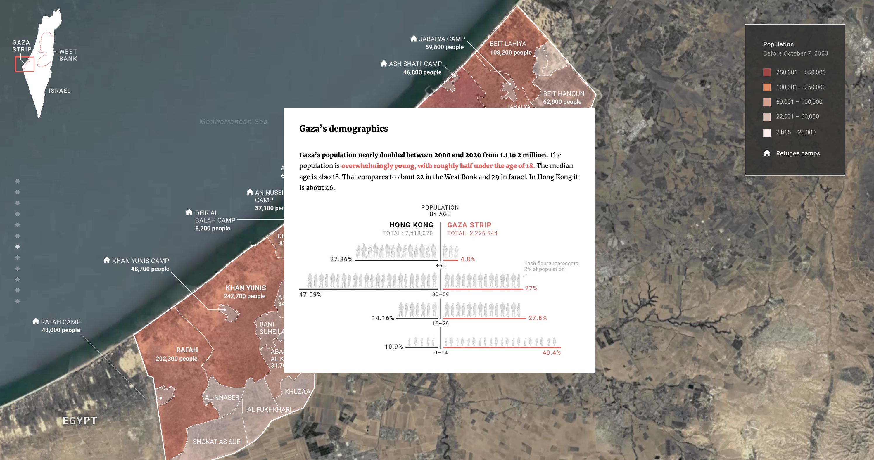
The compare pattern is intertwined with the concretize pattern, where each data point is represented by an individual visual mark. Anthropographics (the design space of humanistic isotypes) are used whenever possible, such as in this age pyramid:
#humansbehinddots #comparaison #demographics
This chart is actually very effective, both emotionally and analytically. It highlights Gaza’s uncommon demographics by comparison to a familiar place (Hong Kong), and aims towards empathy using human pictograms, each tailored to their own category (authenticity and specificity). For contextualization, it is overlaid on top of a satellite view.
I find it fascinating how design choices can so drastically change the focus. This most classical bar chart published in The Economist does not compare Palestinian demographics to a familiar distribution, but to a “similar income” average, much more abstract. Abstract shapes, abstract ideas, it all remains intellectual: #theeconomist #pyramid #demographics
 I argue that both charts do not appeal to the same level of processing.
A convenient model of emotional processing would place The Economist in a “reflective” cognition, while SCMP appeals to a more “visceral” brain:
 The concretize pattern can also have higher physicality, as on isometric maps of density:
 This visual solution had proven effective before, and was one of the examples I talked about in Empathetic ways to visualize conflicts. The version by Mariano Zafra for Reuters, after evacuation orders, was striking indeed:
 Back to a flat screen, there is a noticeable difference in the map by Rocío, with emphasis on the attackers, with corresponding icons:
 and this early map by The New-York Times, with an emphasis on the towns (squares):
#nytimes
and this early map by The New-York Times, with an emphasis on the towns (squares):
#nytimes
 On the mobile version, the map is even more tightly integrated with the satellite view and photos:

Gradual Reveal
Another category of narrative design patterns controls the flow of information. A typical solution is scrollytelling, when some visuals can be updated as the user scrolls:
#gradualreveal #slowdown
#focus #flow #enlarge (note: added transparency )
 To explore Israel’s retaliation, the story gradually reveals the damage on parts of the map. On the mobile version, the rectangular shape of the strip fits the screen nicely:
#mobile
To explore Israel’s retaliation, the story gradually reveals the damage on parts of the map. On the mobile version, the rectangular shape of the strip fits the screen nicely:
#mobile 
Depth of Field
 This pattern I haven’t found in Bach et Moritz, though it keeps on occurring:

If you have an idea to which pattern this technique may belong to, drop me an email, I would be happy to hear your opinion about it.
Well, that sure took longer to write than I expected!
Initially, I had planned to talk about other things, such as this recent article in Le Monde about “carbon bombs” (design by Thomas Steffen and code by Raphaëlle Aubert, Elsa Delmas et Léa Sanchez):


 %%
%%
 to general (context):

 The whole structure of the article is a back-and-forth between a particular example and the context. Also a “glowing” effect on all the charts, with the black background, are reminiscent of energy, light.
 %%
%%
Or the game “Flashback” (The New-York Times), in which you have to chronologically order events (did I already tell you I love games?):


Or this immersive 3D experience directly into the combat zone, by Der Spiegel:

 (A bit video game-y, but in the end quite useful)
But I guess it will be when I see you next week?
See you next week,
Mathieu