Empower Your Charts With Accessibility Standards
By Mathieu Guglielmino, Feb 19 2024
Empower Your Charts With Accessibility Standards
Accessibility standards are a set of guidelines designed to empower people with disabilities on the web. The current version of Web Content Accessibility Guidelines (WCAG 2) focus on the web experience, and as such is by no means specific to information design.
Information design relies upon the visual system to record, process, or share information. But the difficulty lies upon designing charts for everyone, even with an impaired visual system, as is for 300 million people worldwide with color-deficient vision.
This poses two main challenges:
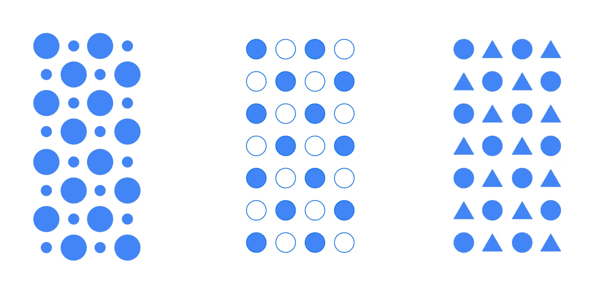
- Color Contrast: visual marks should all achieve a minimum 3:1 contrast ratio with their neighboring elements,
- Dual Encodings, Or Conveying Meaning Without Color: may be a pattern, texture, icon, text overlay, or an entirely different visual encoding
In an article filled with insightful examples, Google lead designer Kent Eisenhuth reflects on the past three years he explored techniques for creating useful and accessible visualizations.
The approach in the article gives birth to inspiring visuals, which are by far better than the original made without these guidelines in mind. The main take away message is that accessibility should not be conceived as an alternative but as a core feature, for it gives overall better visualizations for everyone.
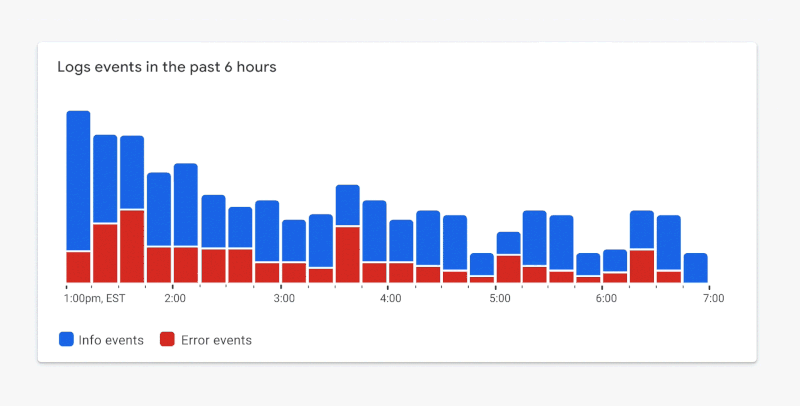
- DO: Use a combination of fills and borders that achieve the minimum contrast ratios to improve the readability of your chart.
- DO: Consider using a combination of outlines and fills to meet contrast requirements while maintaining a focal point.
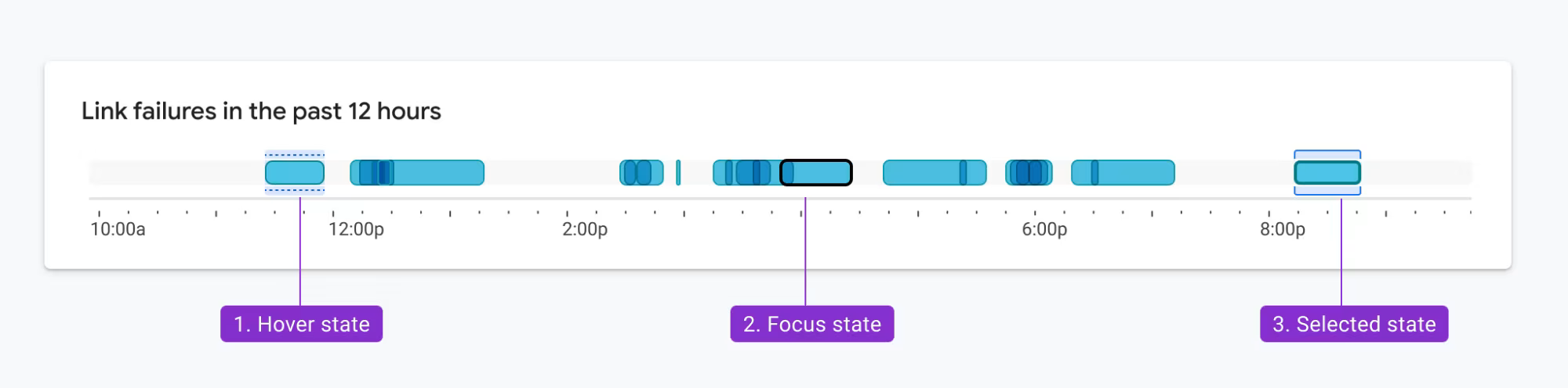
- DO: Consider how the requirements apply to interaction states.
Before:
- DON’T: use low-contrast colors on your chart
- DON’T: let color be your only encoding for identifying categories and metrics.
After:
- DO: consider using labels as a second encoding.
- DO: Consider a dark theme which will enable you to use a wider range of shades that meet contrast requirements.
Readings
- Accessibility on MDN
- Do No Harm Guide: Centering Accessibility in Data Visualization
- Web Content Accessibility Guidelines (WCAG 2)
The Week In Charts
The Unstoppable Destruction of the Gaza Strip by Israel’s Forces—FT
When you have both destroyed the North and the South, what does it remain? In a 3 hour call to her last words before being shot to deaths by Israeli soldiers, 6 years old Hind Rajab testifies her powerlessness under Netnyahou’s will of complete destruction.
Benyamin Netnyahou claimed he would fight until complete victory, and urged the population to leave combat zones. This can only but leave us wondering where, where are these people supposed to go?
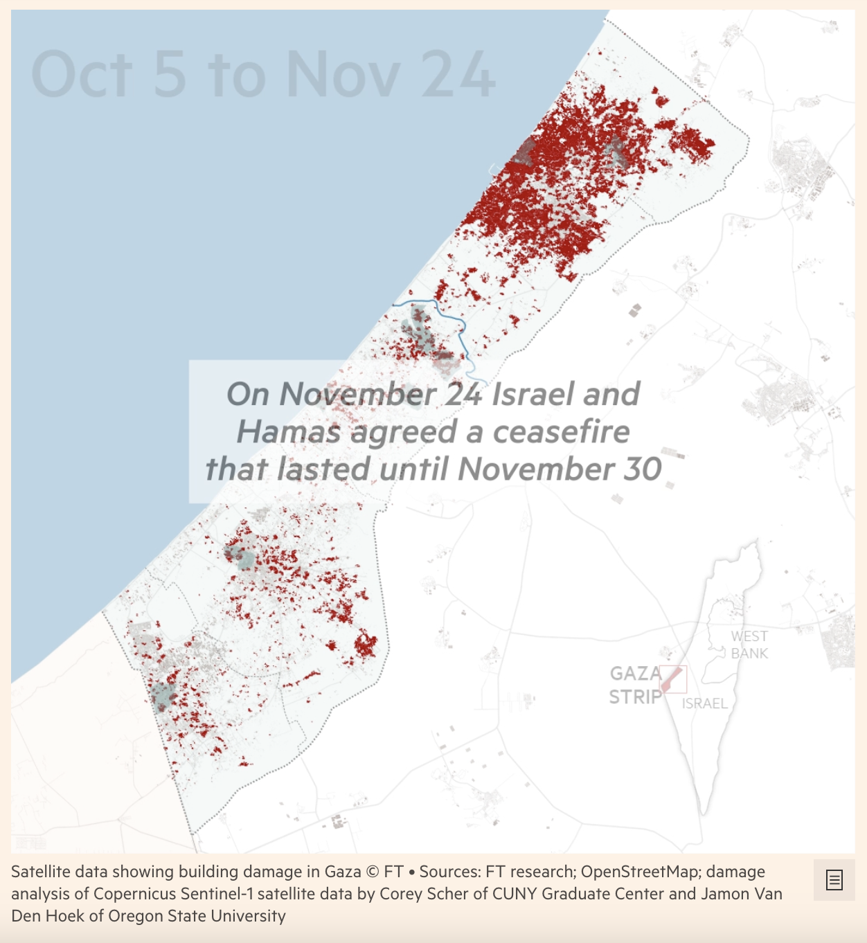
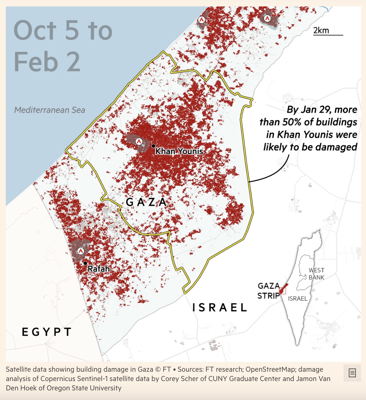 Visual analysis: Gaza’s last refuge becomes Israel’s next target, FT
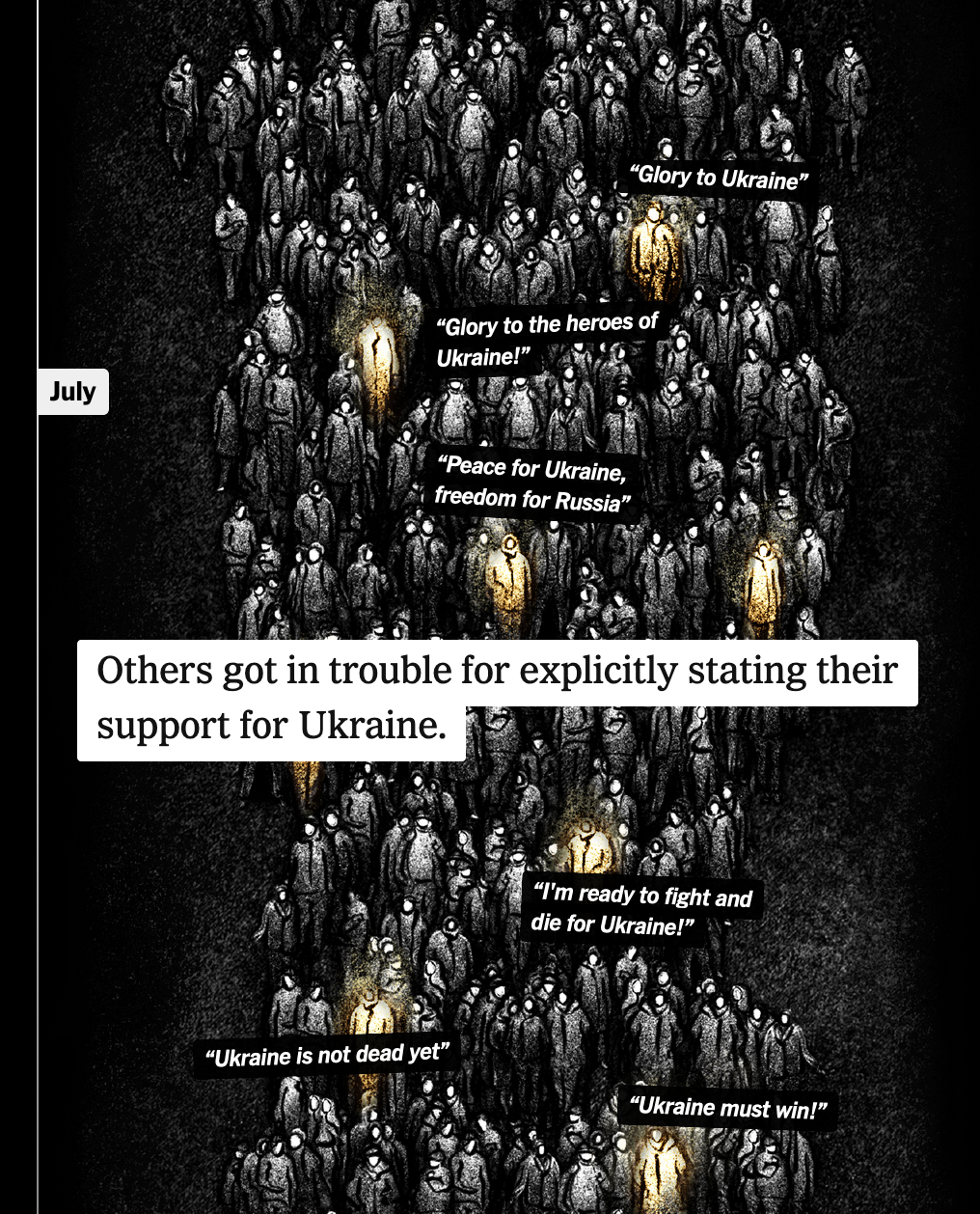
Russia’s Censorship of Dissidents—New-York Times
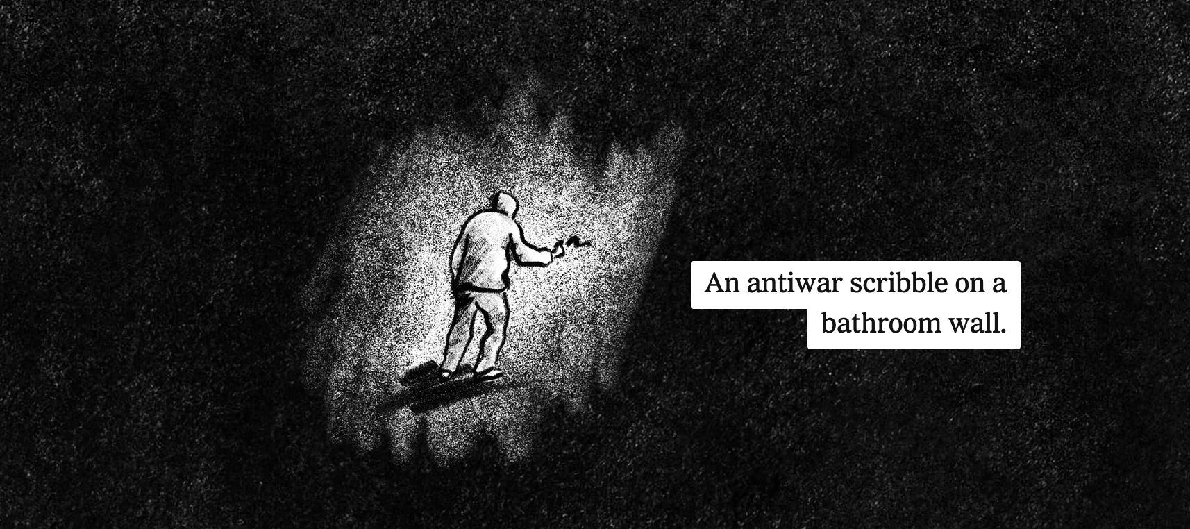 How the Russian Government Silences Wartime Dissent
In a parallax intensive story, the New-York Times shows how the Russian government censors wartime dissidents.
- Individual and specific marks, with scrollytelling to switch the focus of attention,
- Beeswarm chart as timeline,
- hand drawn illustrations and parallax,
 I could see how these type of charts could leverage genAI, as the New-York Times announced they would lead a cross-company effort on the topic.
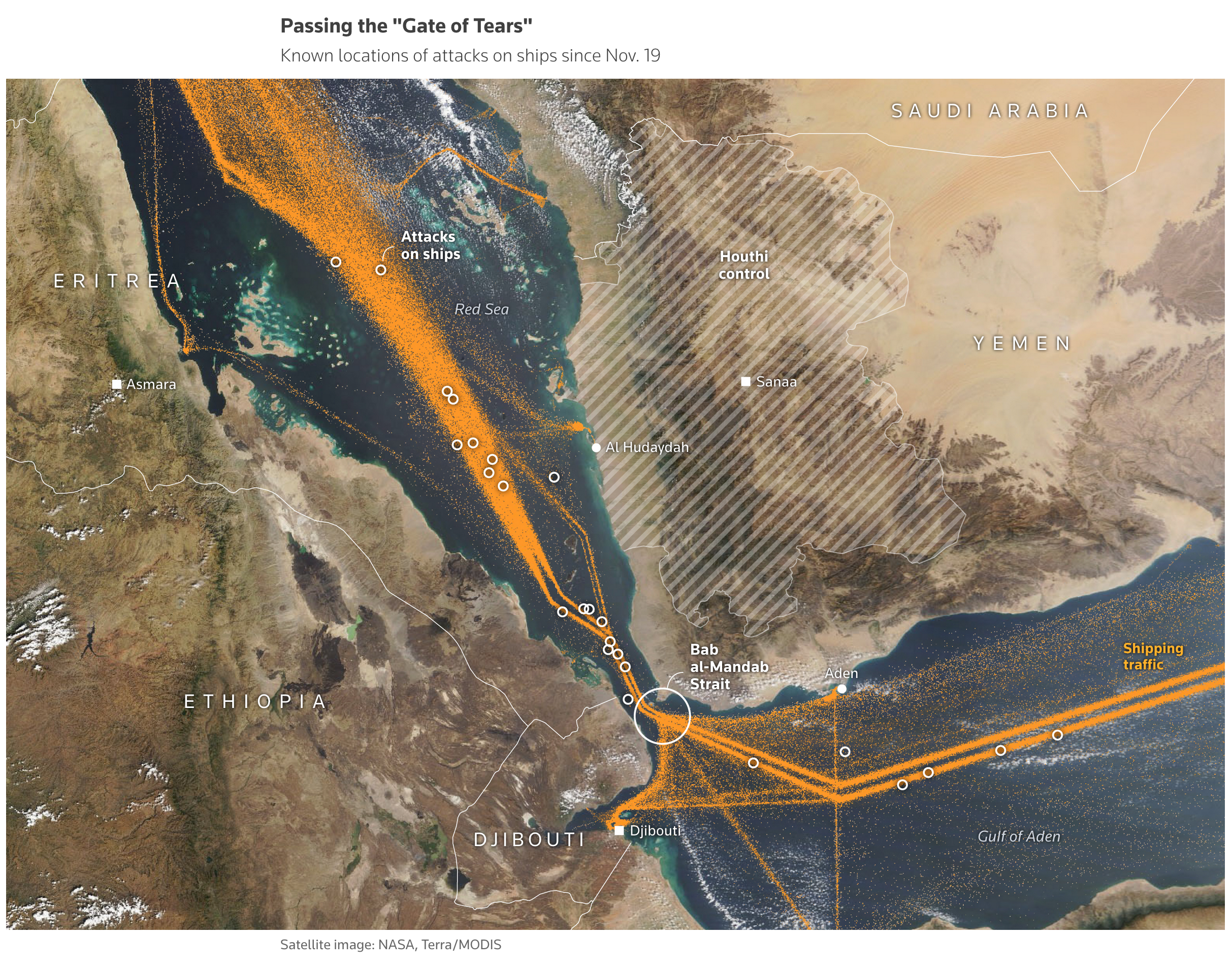
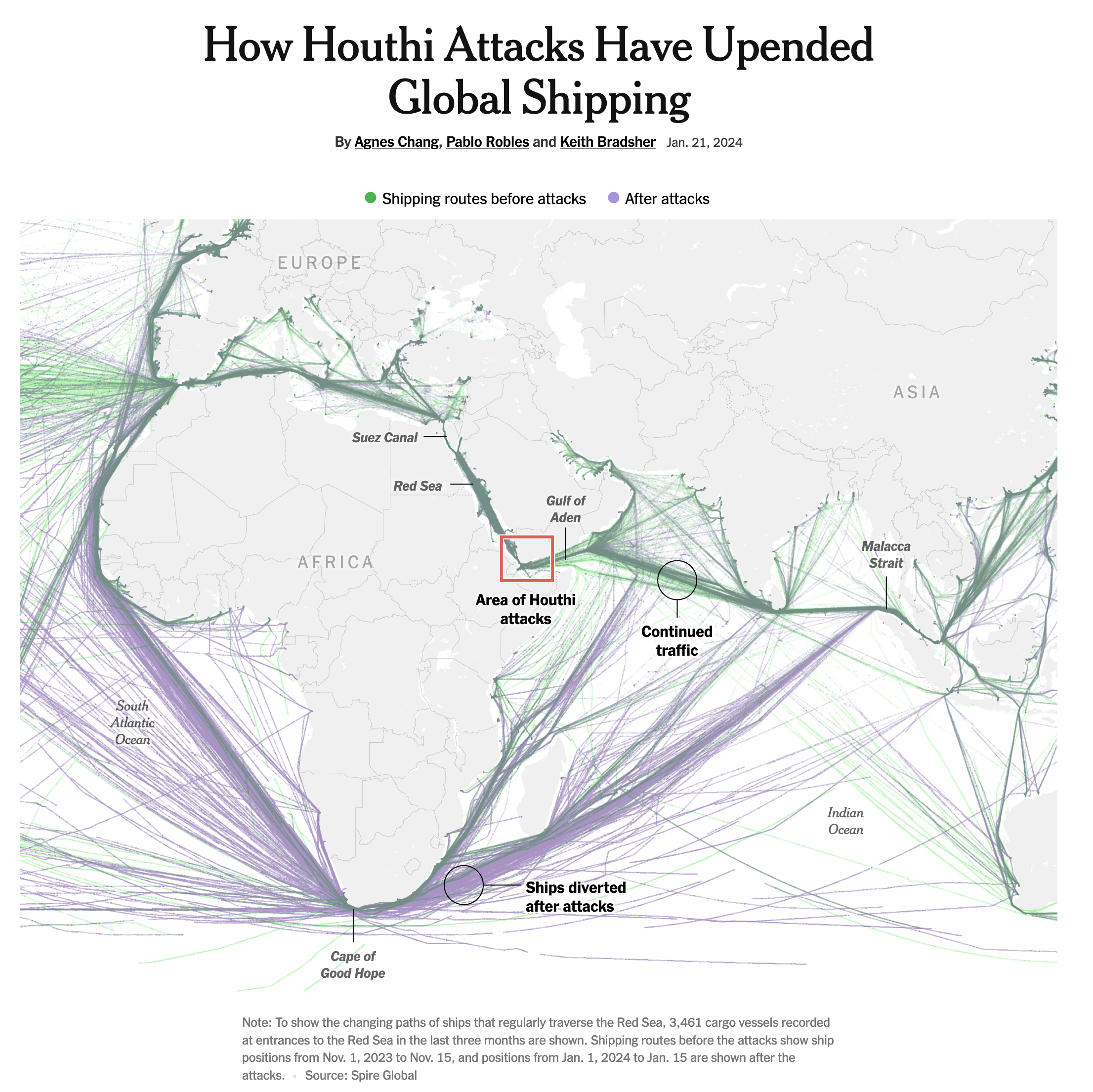
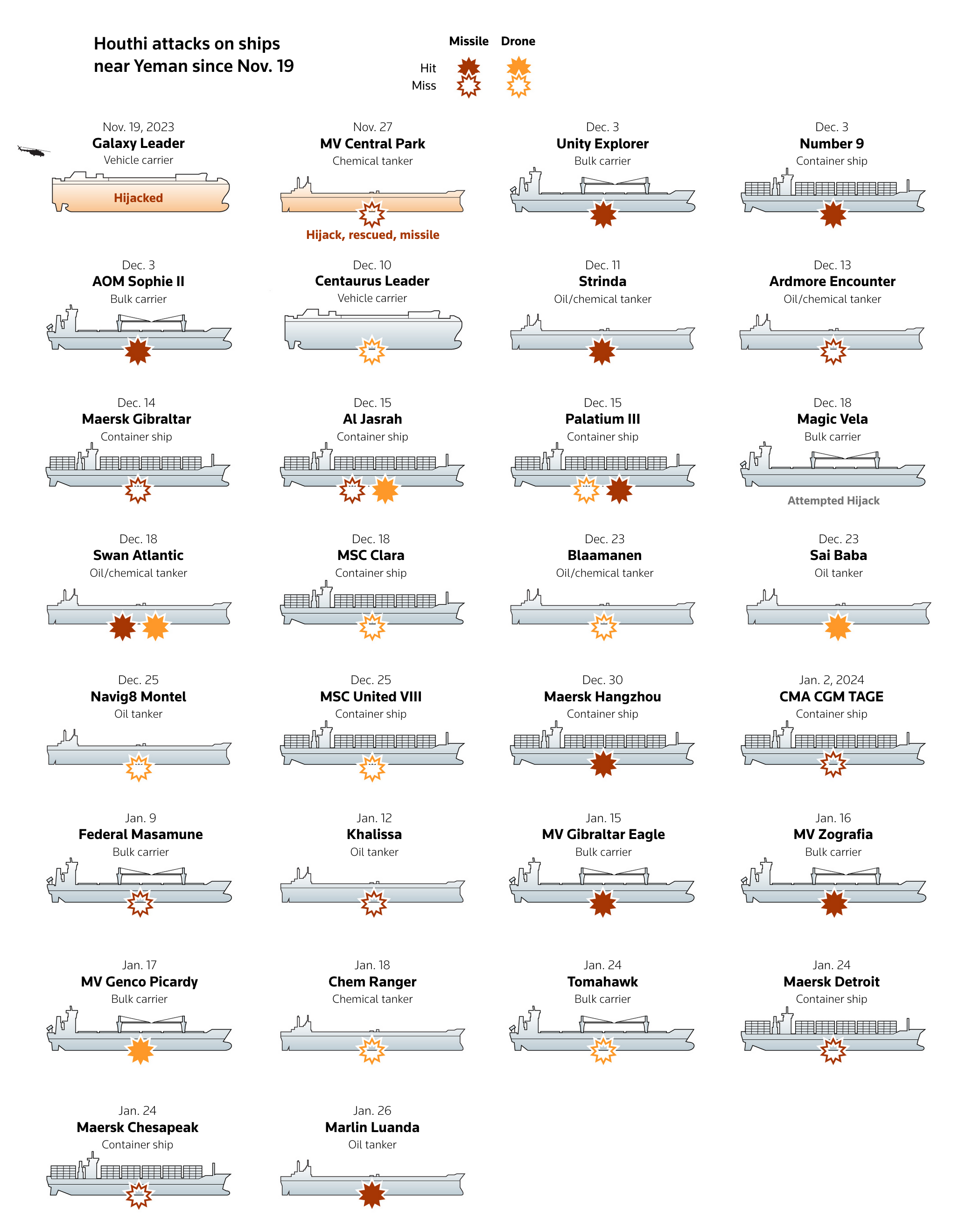
Red Sea Attacks—Reuters
After the New-York Times (How Houthi Attacks Have Upended Global Shipping), Reuters published a detailed story about Houthi attacks in the Red Sea.

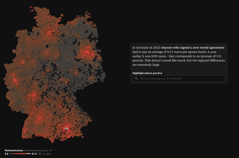
Rents in Germany—Die Zeit
Die Zeit with transition charts, between maps to bar charts, with always impressive effects:
![]()
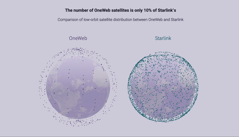
The Battle for Low-Orbit Satellite Supremacy—CW
CW used 3D on large scale with the visualization of low-orbit satellites in space:
 The battle for low-orbit satellite supremacy, CW

The space race between the US and China
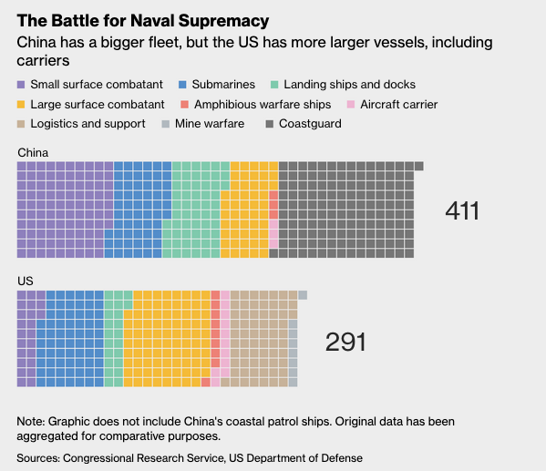
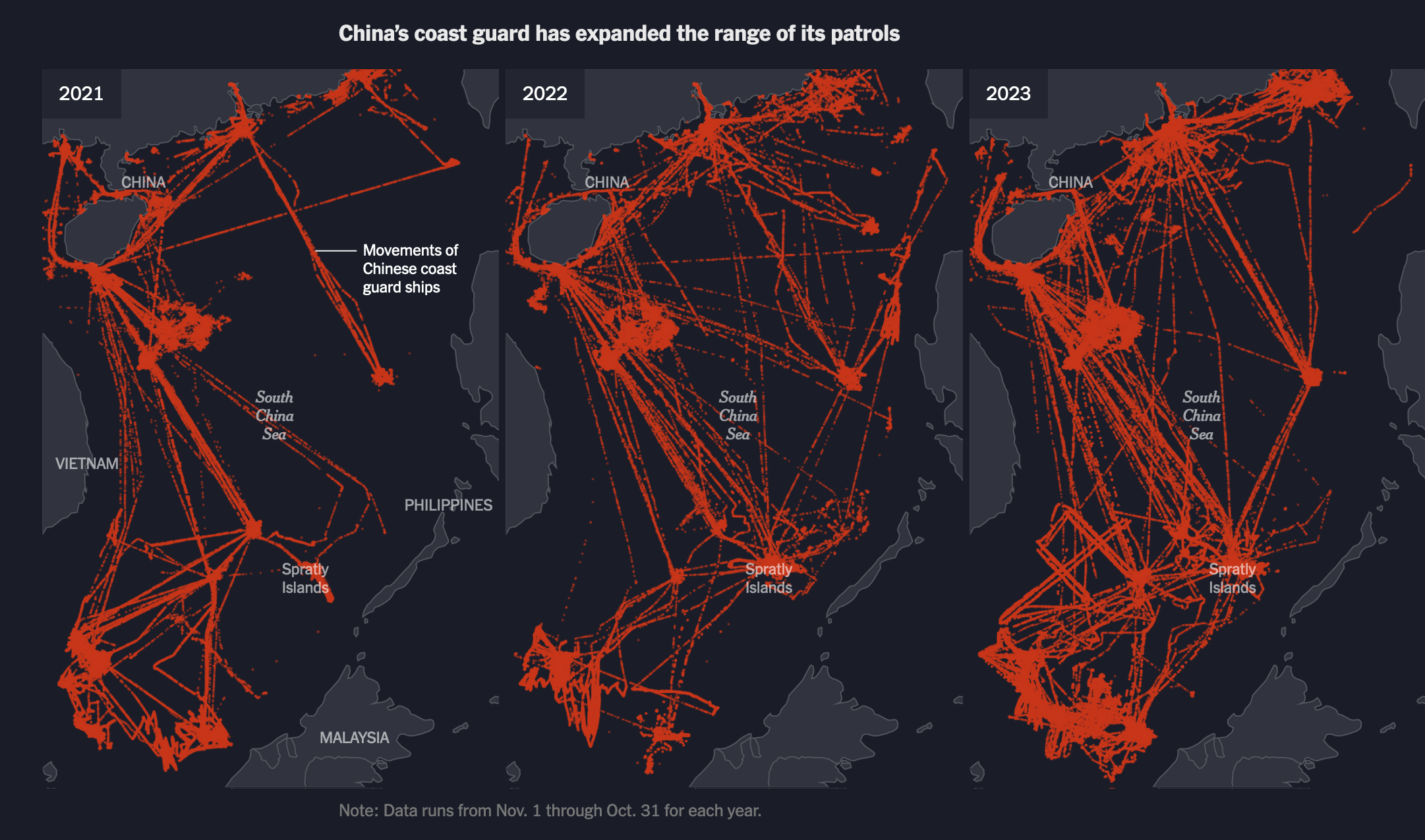
Chinese efforts to increase their military presence in the South China Sea to prepare for an eventual invasion
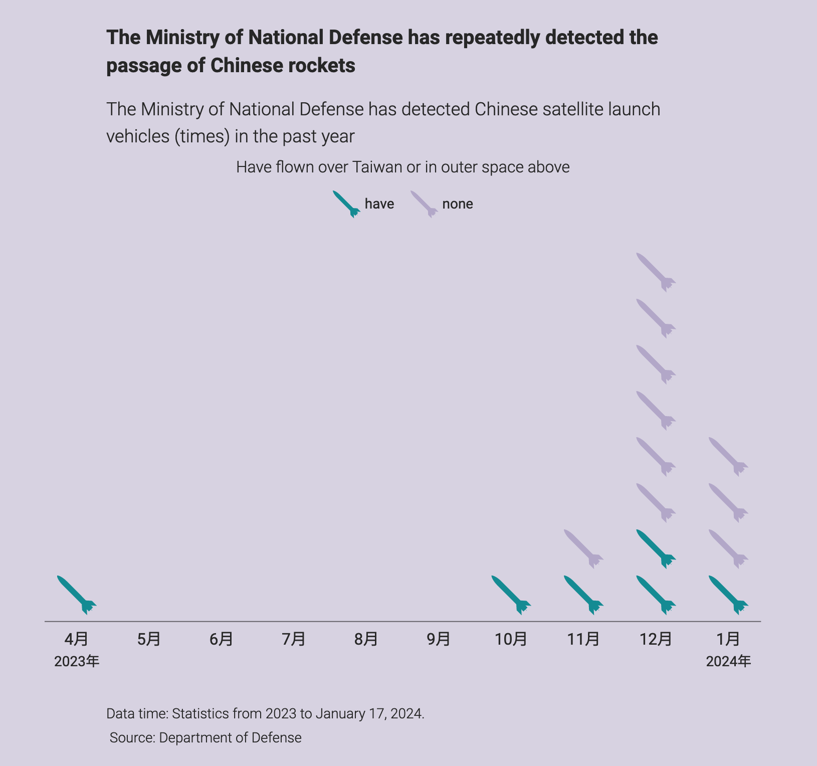
China is developing a multifaceted military, with an even bigger fleet than the US. This questions the possibility of a major shift in the global equilibrium.
Another aspect of a country’s military is the count of warheads, and these are some interesting radar charts to compare the three dimension of nuclear warheads: sea, air, land. China has heavily focused on land-based ballistic missiles.
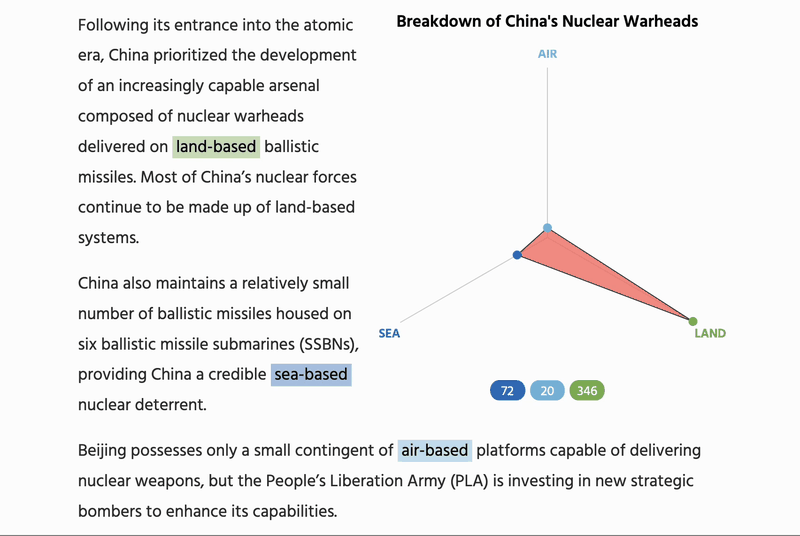 By Jacque Schrag, for ChinaPower
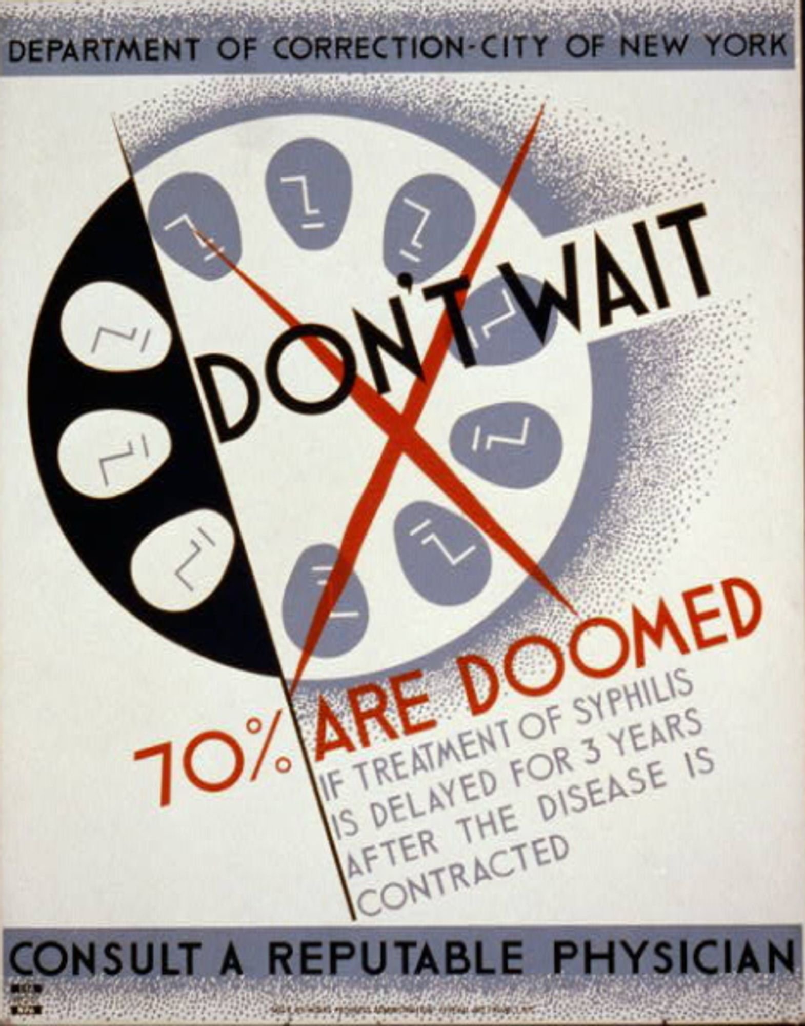
Old School Siphyllis Prevention Posters
Some beautiful health prevention posters found on Bluesky:

By the way, I rejoined the blue place where the viz community is only growing, and can follow me here @guglimat.bsky.social.
Visualizing Sports
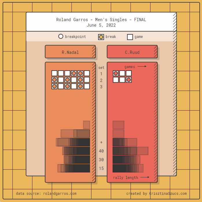
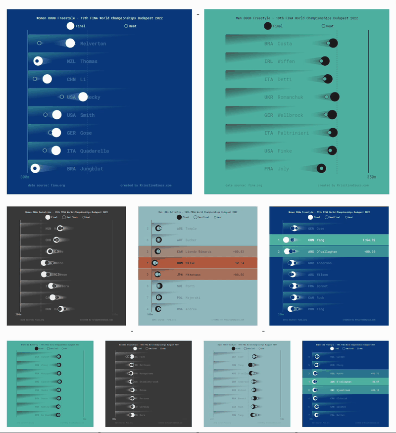
I was very impressed with the unconventional charts created by Krisztina Szűcs for visualizing sports, introducing playful “triangle timelines”:
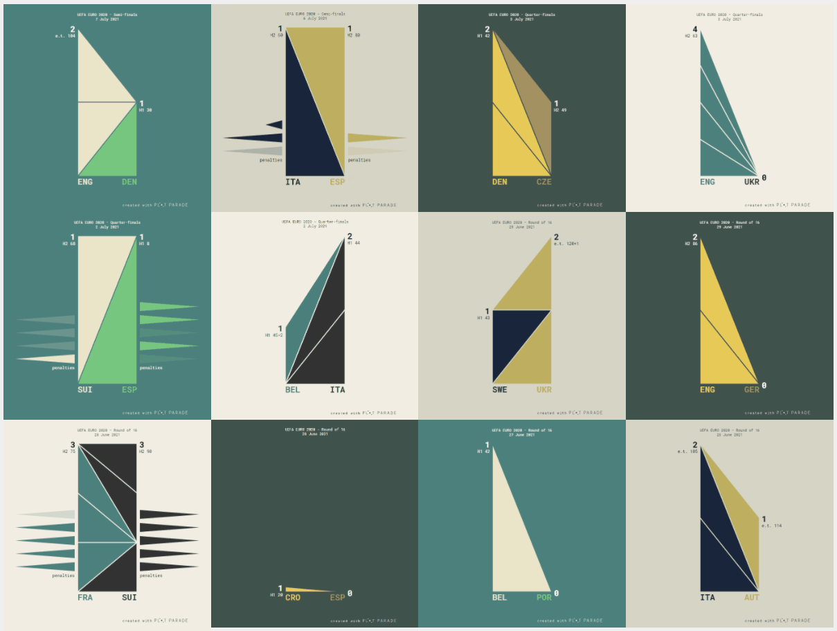
She also devised methods for tennis and swimming:
Le Monde
https://www.lemonde.fr/les-decodeurs/article/2023/04/28/neuf-indicateurs-pour-mesurer-l-urgence-climatique_6148399_4355771.html


How Much Do You Know About Recycling?—The Washington Post
We all try to recycle, but there can be some subtleties we ignore about. A recent piece by the Washington Post reports the ground rules of recycling, with a quiz game to check how much you already know.
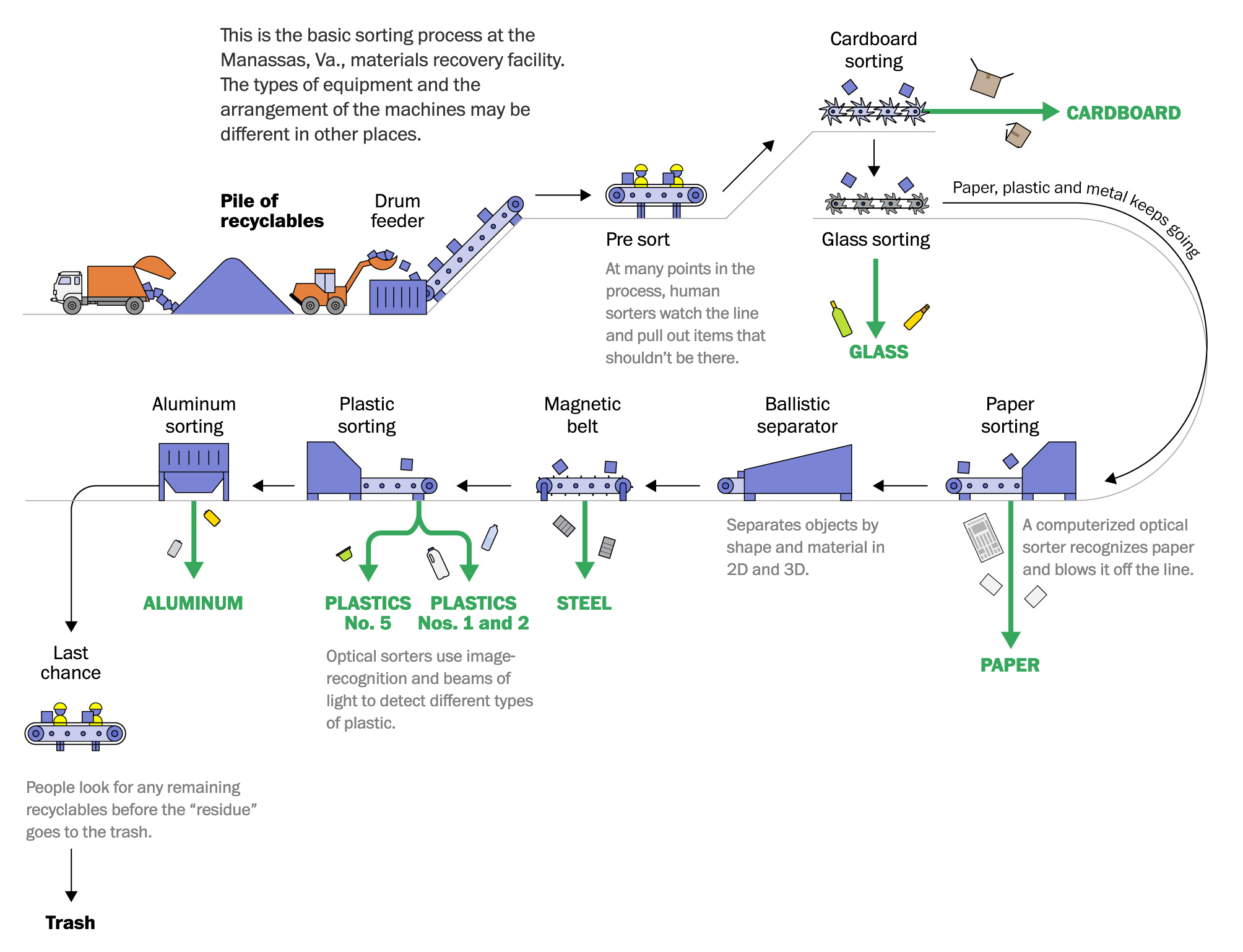 You’re probably recycling wrong. This quiz will help you sort it out., by the Washington Post

See you next week,
Mathieu