How Houthi Attacks Rerouted Maritime Trade
By Mathieu Guglielmino, Jan 22 2024
How Houthi Attacks Rerouted Maritime Trade
Houthis must have felt a hint of pride as they made a tonitruous come back in the news cycle this month. The Iranian-backed militia launched attacks with cheap drones on ships from their positions in Yemen in an attempt to circumvent trade with Israel. As a result, these attacks halted traffic in one of the most crowded trading place of the world, the Red Sea.
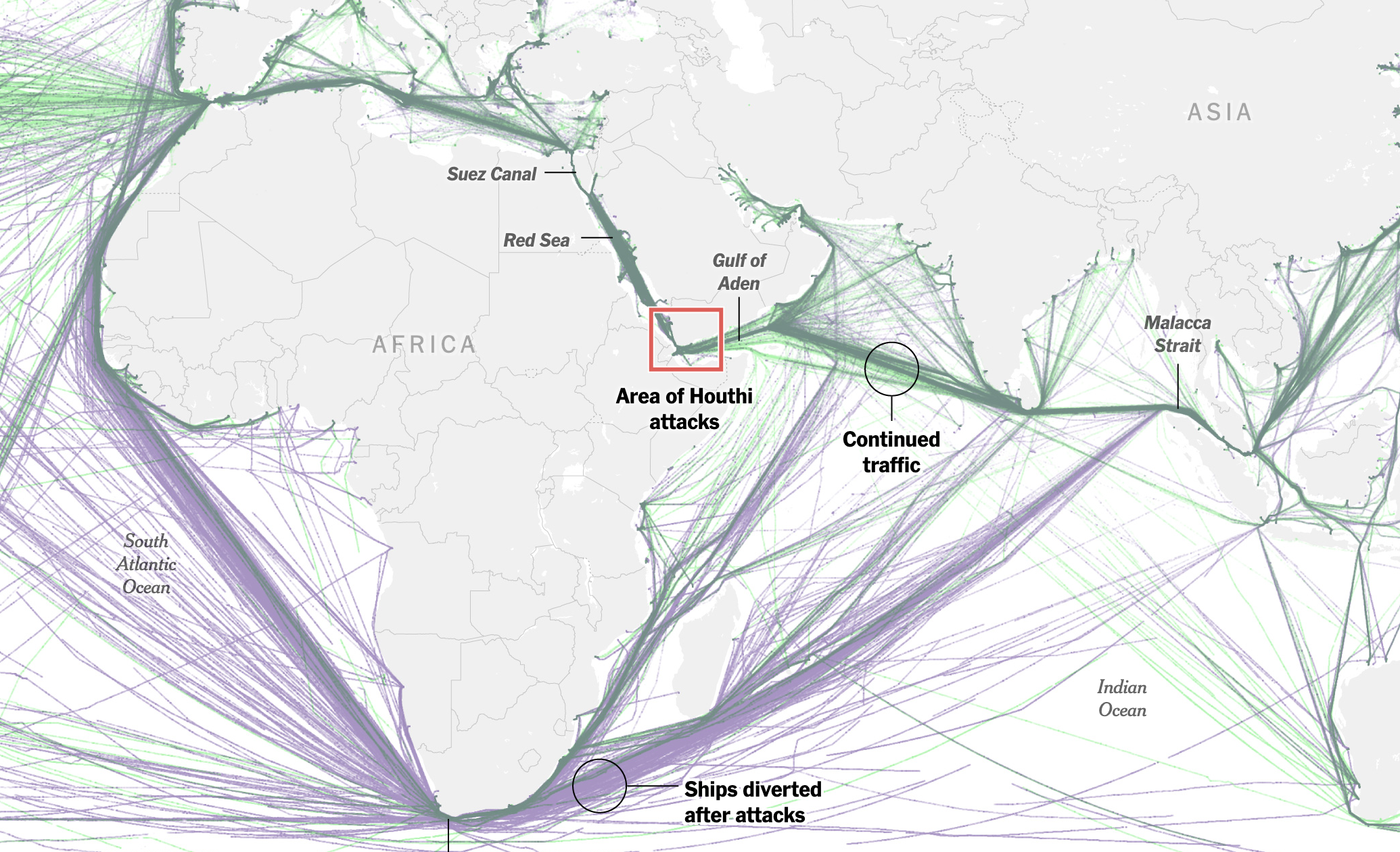
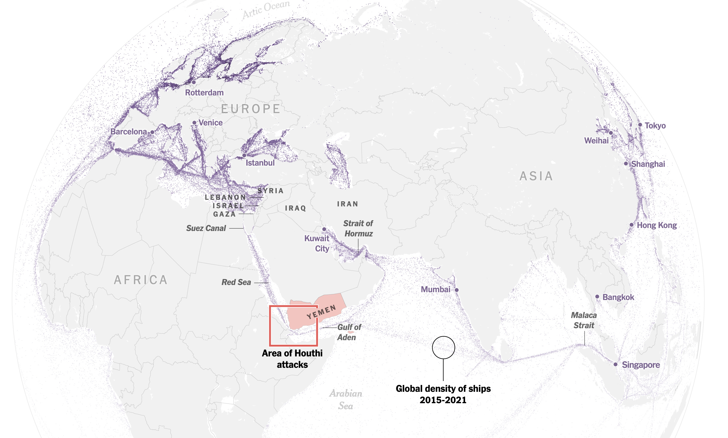
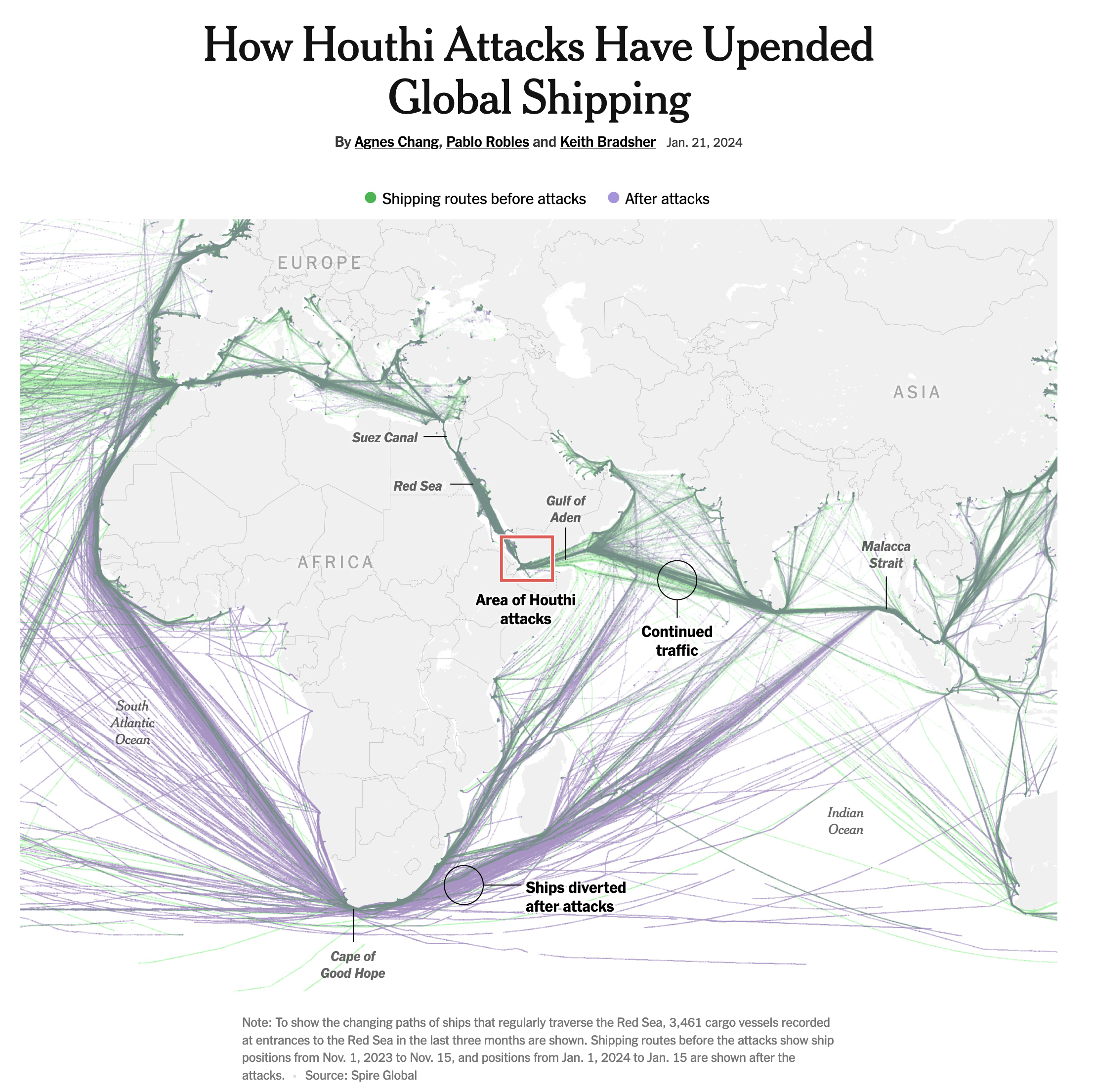 How Houthi Attacks Have Upended Global Shipping, The New-York Times. By Agnes Chang, Pablo Robles and Keith Bradsher
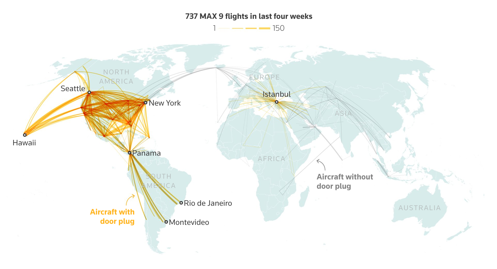
Shadows are an elegant detail of this heavily annotated timeline:
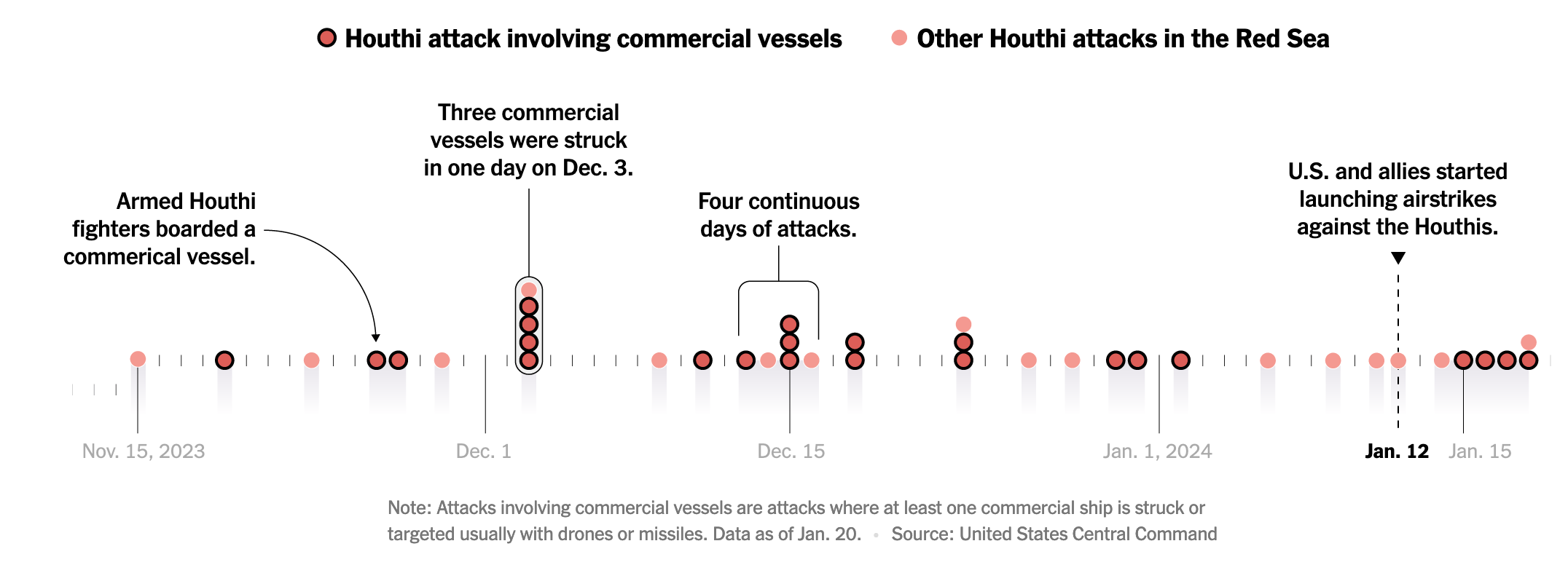 Commercial vessels are doubly emphasized with luminosity (L = 70, vs 50 for others), and a solid black border
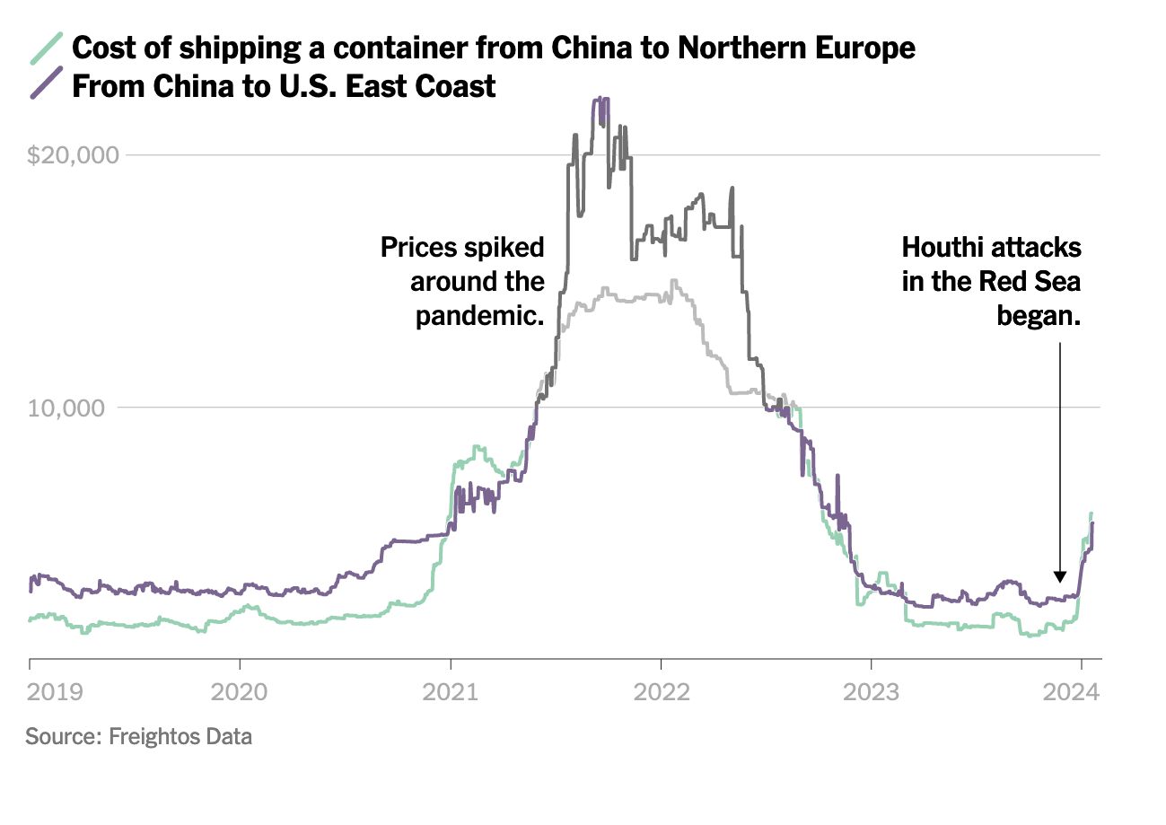 Note: I added the black and white overlay to compare purple and green in shades of grey
Paths and trajectories are traditionally visualized with solid lines, but it is typical in Chang’s maps to use dots instead, which give the display a less cluttered and more organic aspect:
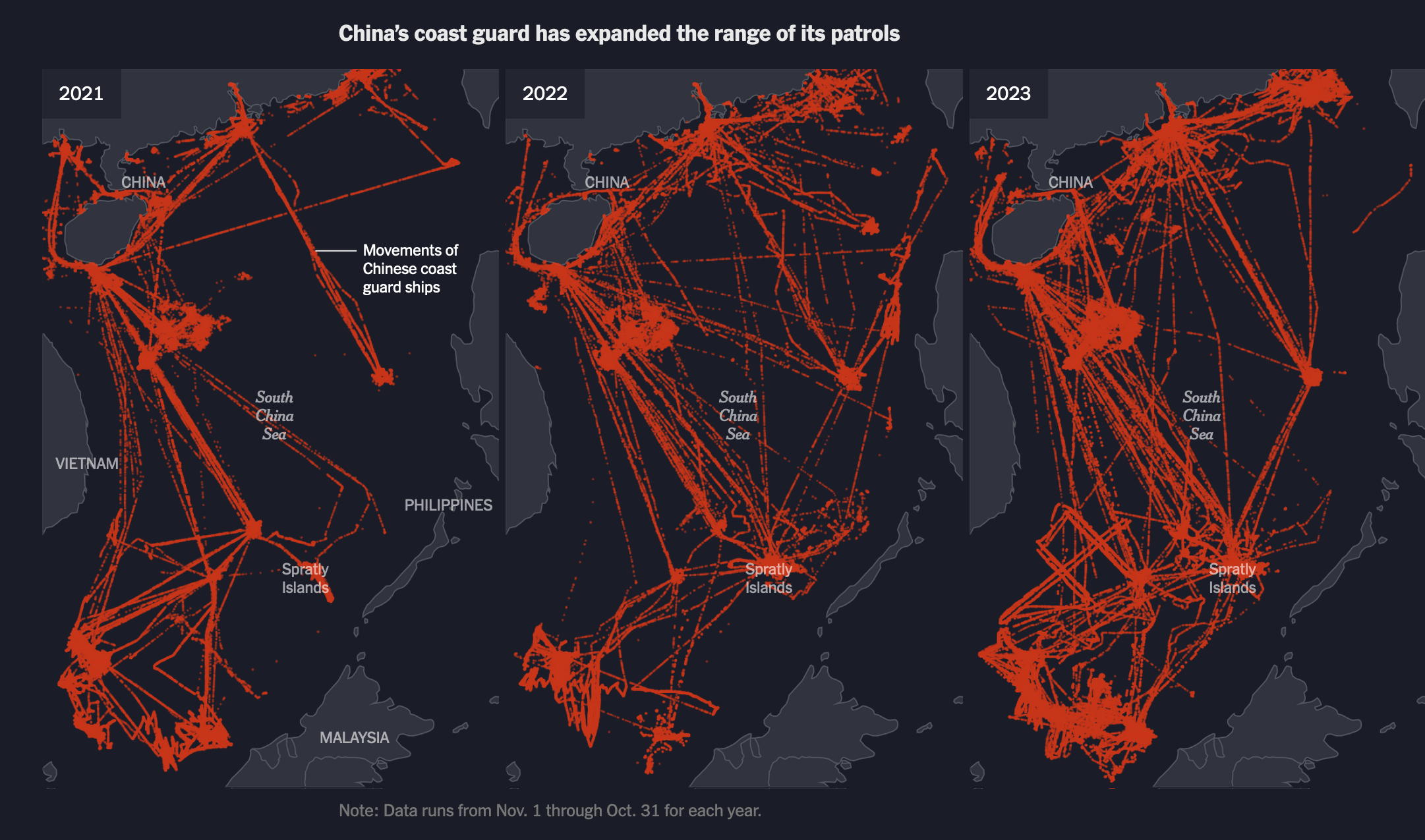 Another map by Agnes Chang in a piece about China’s military in the South-China Sea
The 6th Mass Extinction
I would argue the foundational challenge of our times is not global warming, but the 6th mass extinction that has been happening.
Our species is so central to the actual demise of all living things that this extinction is also called the Anthropocene extinction, by the name of the current geological epoch when human activity started to have a significant impact.
As a detour, it is always enlightening to listen to astrophysicist Aurélien Barreau on the topic, recently questioned on the role science should play in these issues (La science face à la catastrophe écologique, see on Youtube).
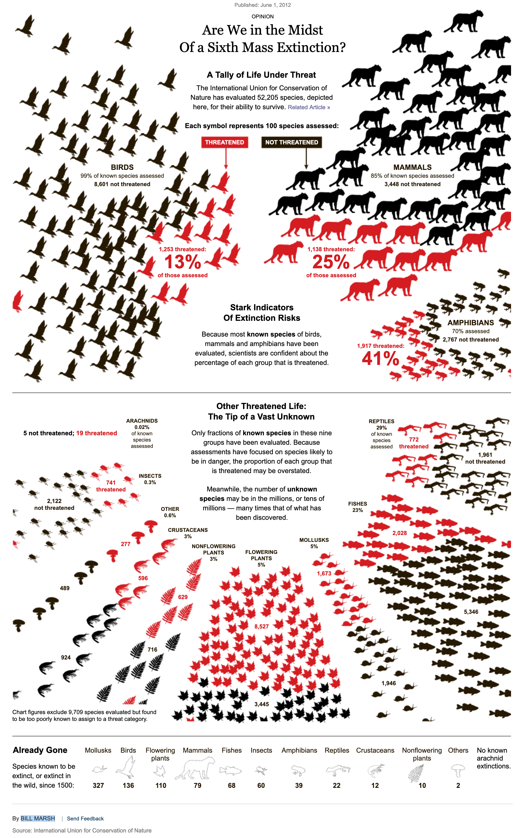 Are We in the Midst Of a Sixth Mass Extincton?, Bill Marsh in The New-York Times (2012)
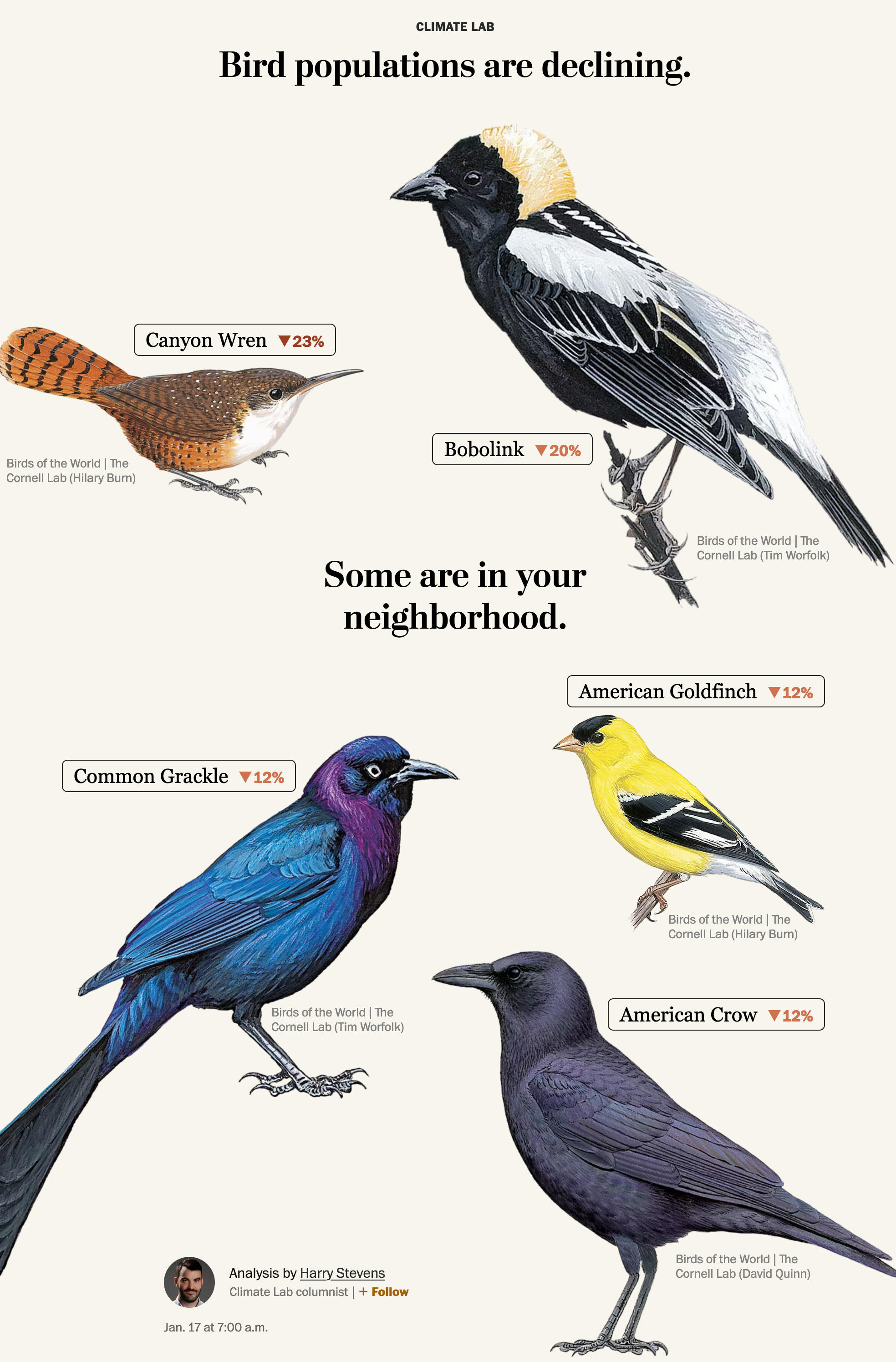
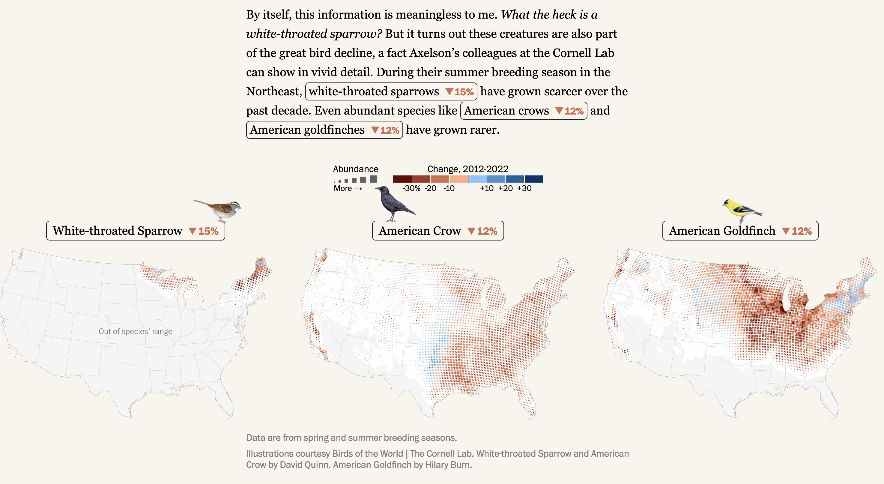
Last week, in his Climate Lab column for the Washington Post, Harry Stevens explored one of the facet of this problem: the decline of birds in the United States, with illustrations, maps, and details-on-demand:
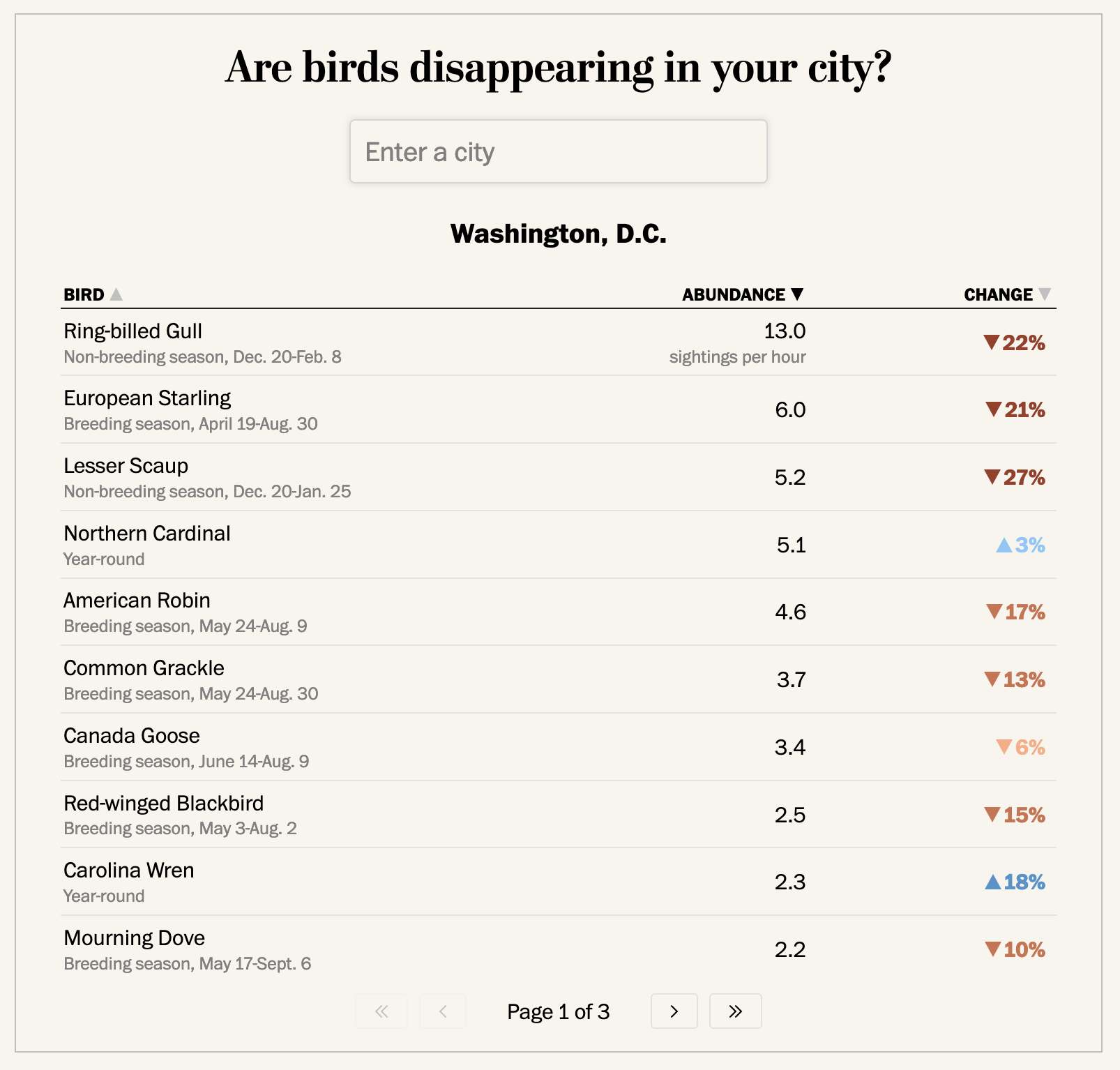 Details-on-demand by city
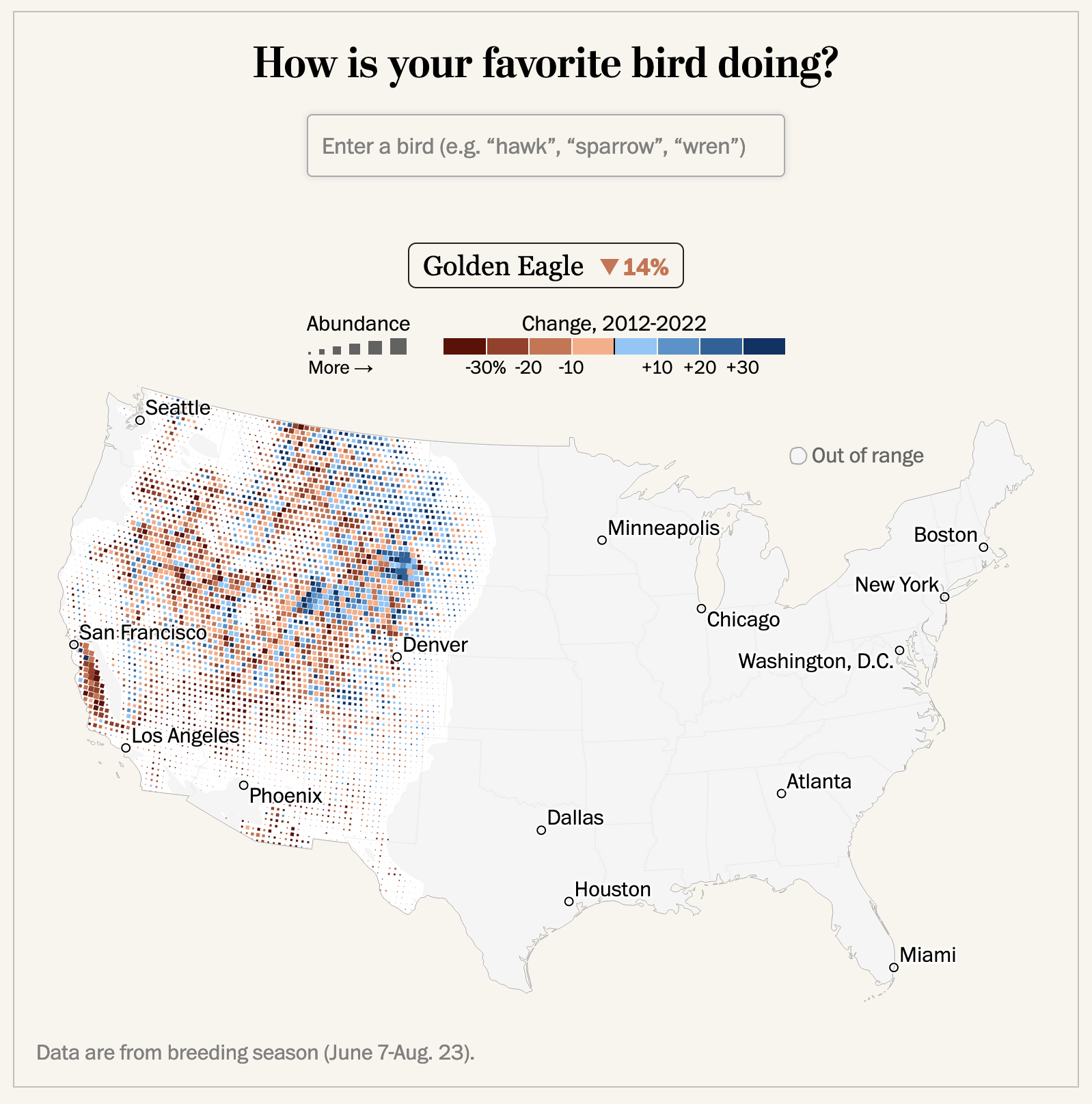 Details-on-demand by bird
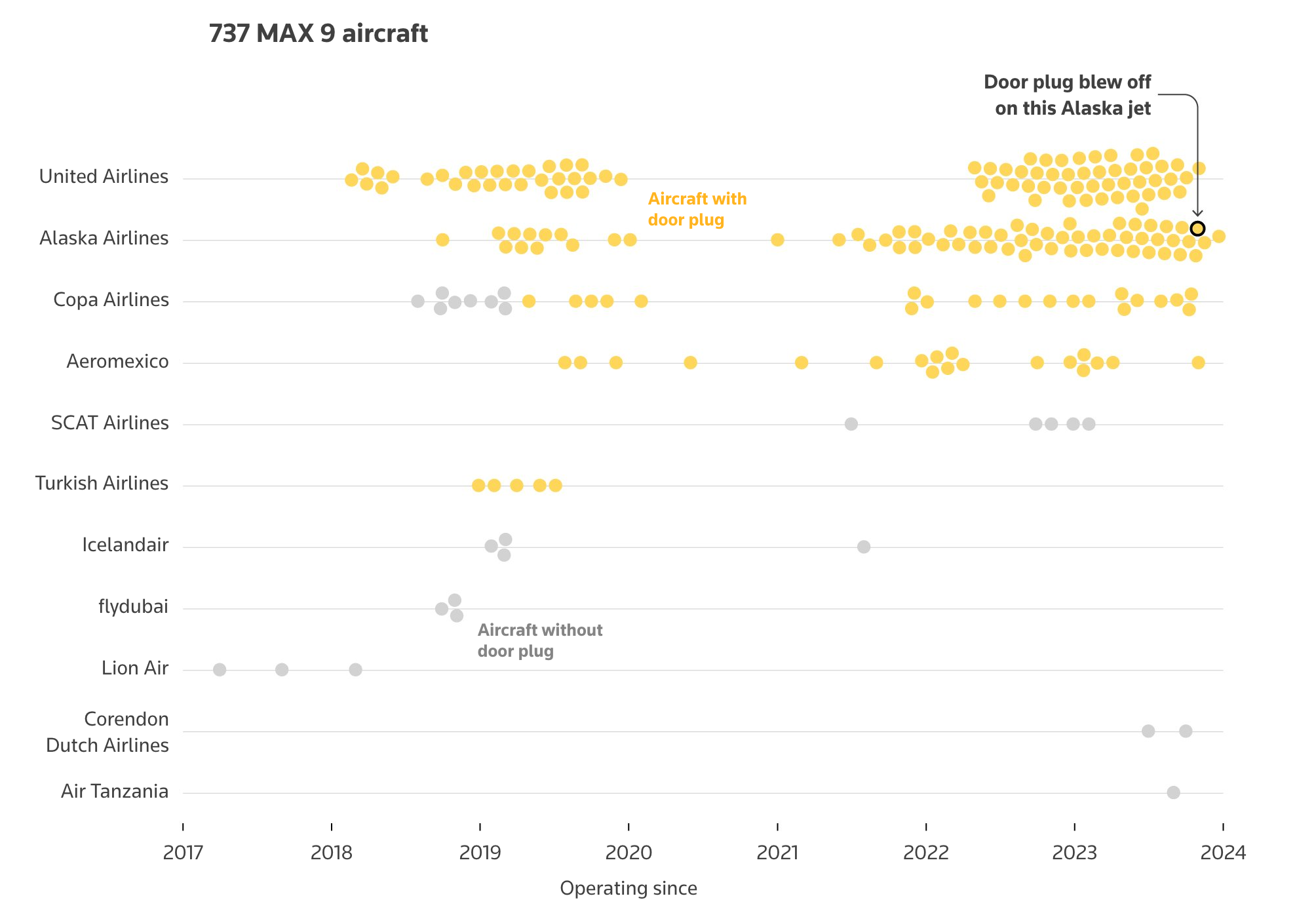
The Door That Went Off a Boeing Airplane
How a panel blew off a Boeing plane in mid-air, Reuters
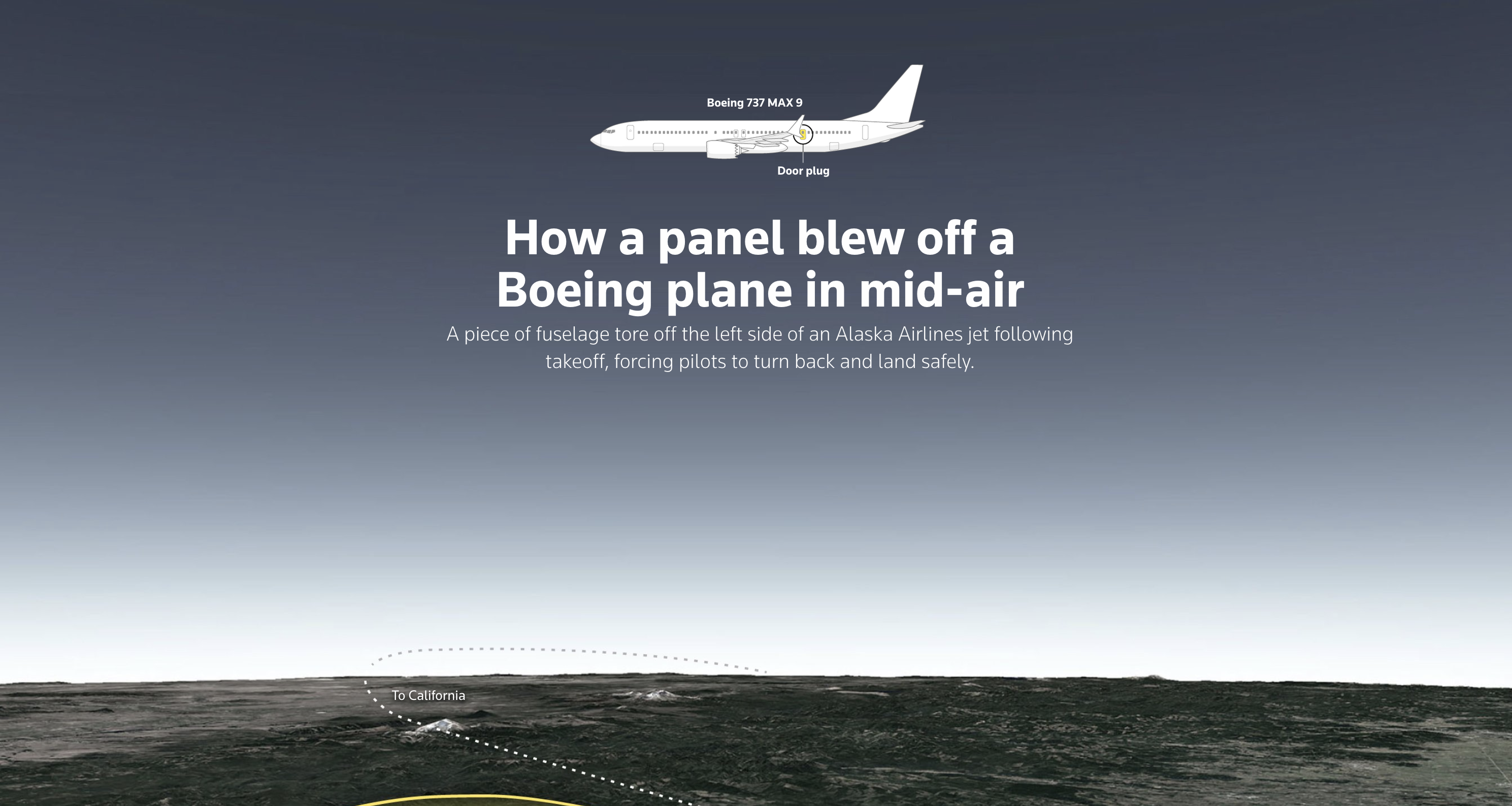 The opening image is a powerful and effective way to introduce the article and capture the viewer’s attention, with many visual techniques:
- Contrast: The image creates a strong contrast between the dark sky and the light horizon skyline, as well as the white plane and text and the dark background. The ground also adds some color and variety to the image, balancing the dark and monochromatic sky,
- Focal point: The plane is the focal point of the image, as it is the largest and most visible element. It is centered horizontally and draws the viewer’s attention,
- Movement: The image suggests movement and direction through the use of a dotted line that traces the plane’s trajectory,
- Depth: The image creates a sense of depth and perspective by showing the textured ground below the plane.
It uses visual elements to create contrast, focus, movement, and depth, and to communicate the main idea and context of the incident. It also balances the visual and textual information, introducing the main elements of the story.
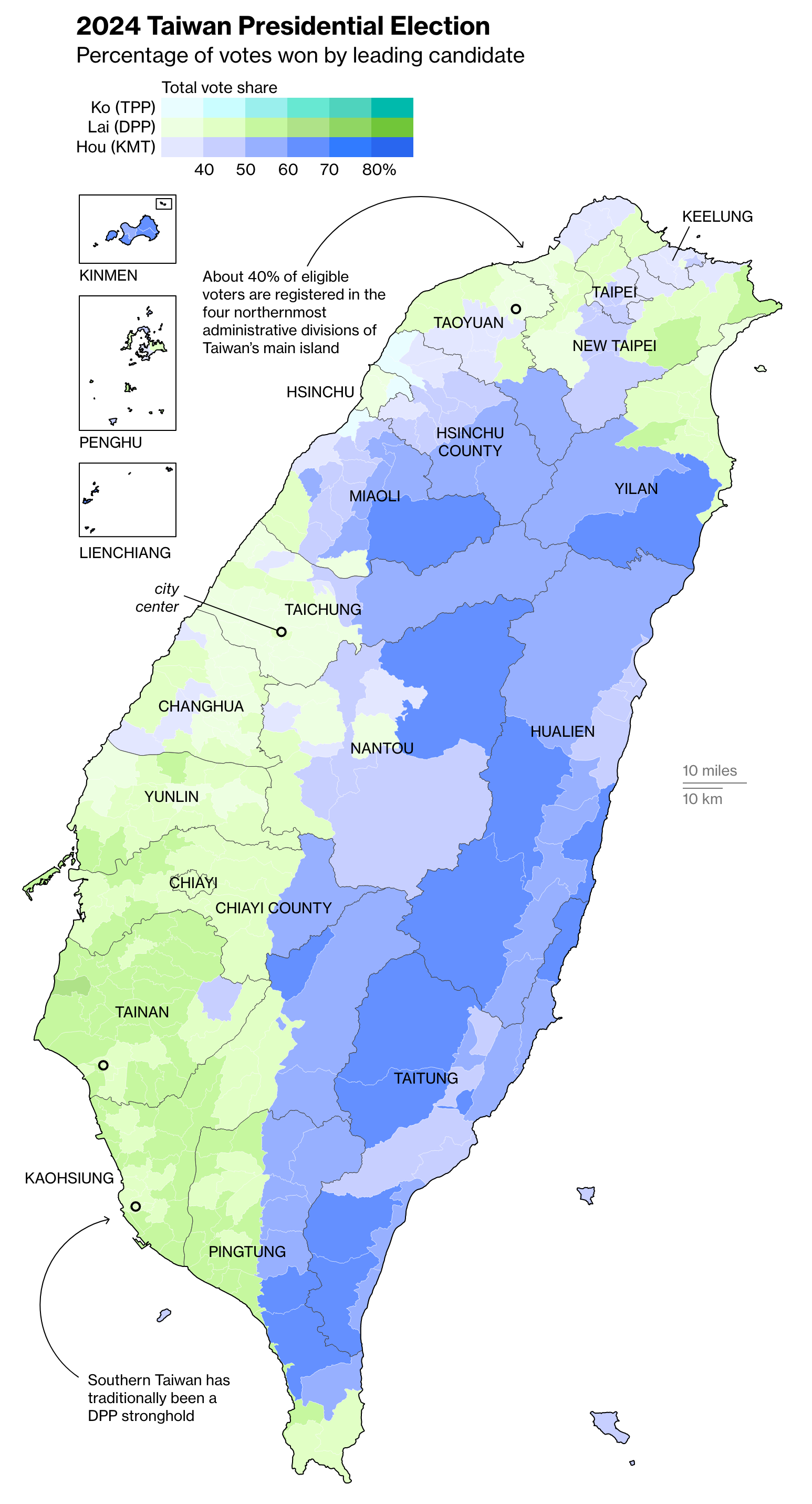
Lai Ching-te Wins Elections in Taiwan
Taiwan Election Live Results, Bloomberg

Draw Your Own Chart
Climate records tumbled ‘like dominoes’ during world’s hottest year, The Financial Times
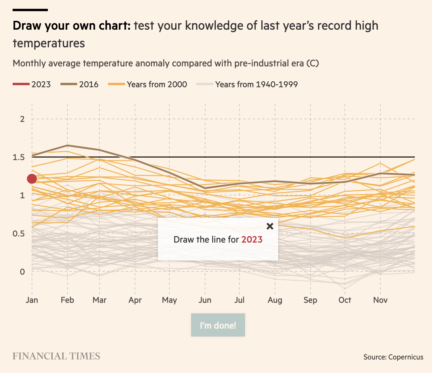 Last week I found out Flourish has a template for “draw the line” charts. Try it out to make your charts interactive!
Good News
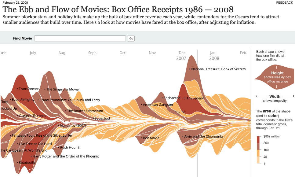 The Ebb and Flow of Movies is a classic piece by The New-York Times
We thought it was all gone forever, didn’t we? When Flash was deprecated in 2017, most of the interactive archives from old days went dark.
All of them? Not all, thanks to a recent update in the New-York Times archives website. That means early iconic articles, such as The Ebb and Flow of Movies, which introduced stream graphs back in 2008, or How Different Groups Spend Their Day , are back online and accessible for all to read.
You can check of these other pieces, shared by Robert Kosara:
- A Year Of Heavy Losses (2008)
- Turning A Corner? (2009)
- The Jobless Rate for People Like You (2009)
- Why Is Her Paycheck Smaller? (2010)
- A Peek Into Netflix Queues (2010)
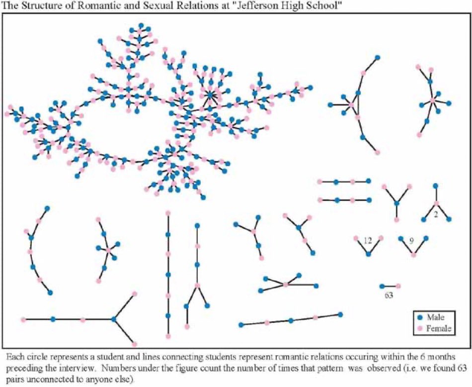
Jefferson High School Fuckgraph
And before you ago, take a look at the lovely Jefferson High School fuckgraph:
Among interesting answers under the initial tweets was the “periodic table of polycules”, which a nice use of “graphlets” to describe romantic relationships:
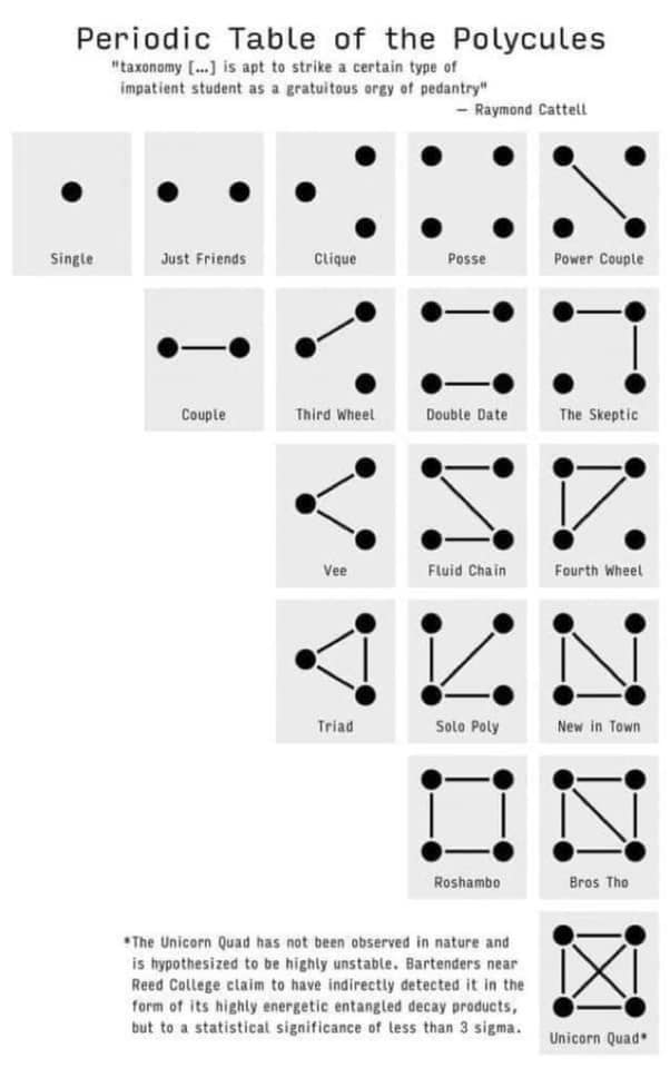
Graphs can describe complex situations efficiently, but we’ll talk about that next week when I explore game design patterns.
See you next week (for more about quest charts),
Mathieu