[VDS Digest] How the Terminal Influences Bloomberg's Visual Identity
By undefined, Jan 8 2024
How Bloomberg’s Terminal Shapes The Brand Visual Identity
I hope everyone’s holidays were as relaxing and nurturing as you all hoped for, and that you’re all set to start a new year of our common era.
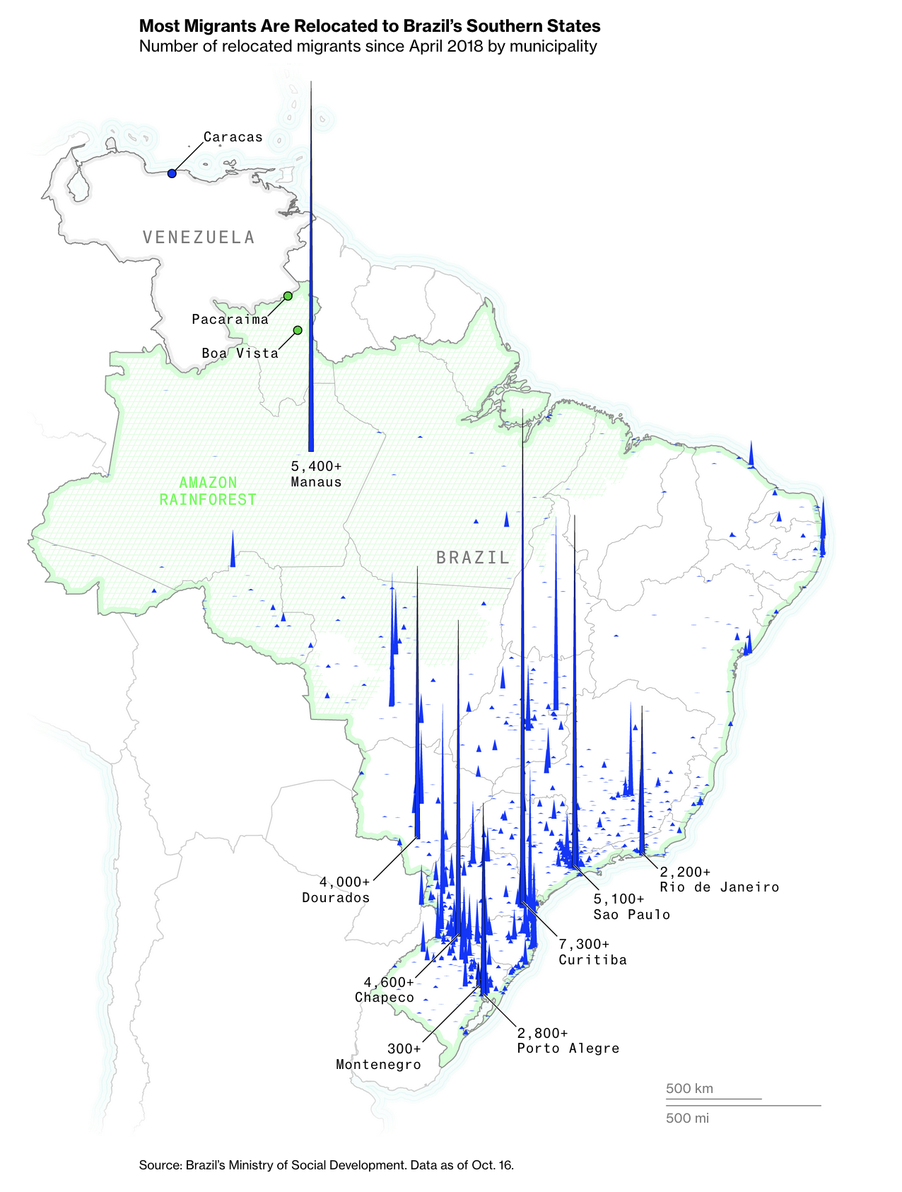
You may recall this map made by Denise Lu for Bloomberg (Brazil Is Embracing the Migrant Crisis That Everyone Else Wants to Avoid, October 2023):
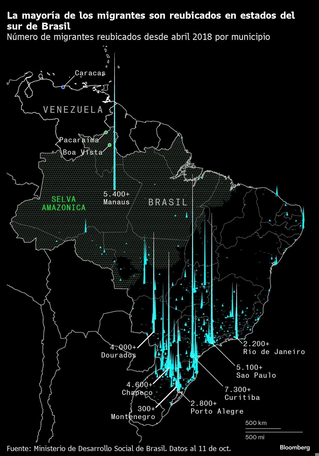
 Well, Denise shared the Terminal version on X, which most of us didn’t yet had the chance to see:
Bloomberg’s Terminal is a piece of software developed by Michael Bloomberg to provide real-time global financial data. It looks very much like a terminal:
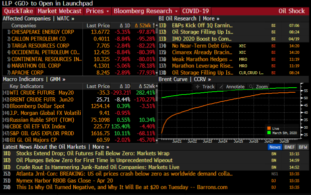 Source: Traders Magazine
If you actually why Bloomberg used to saturated colors, ost of the strong brand identifiers are actually contained in the visual aesthetics of the Terminal, with saturated or dual colors.
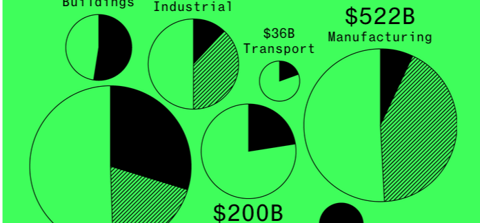
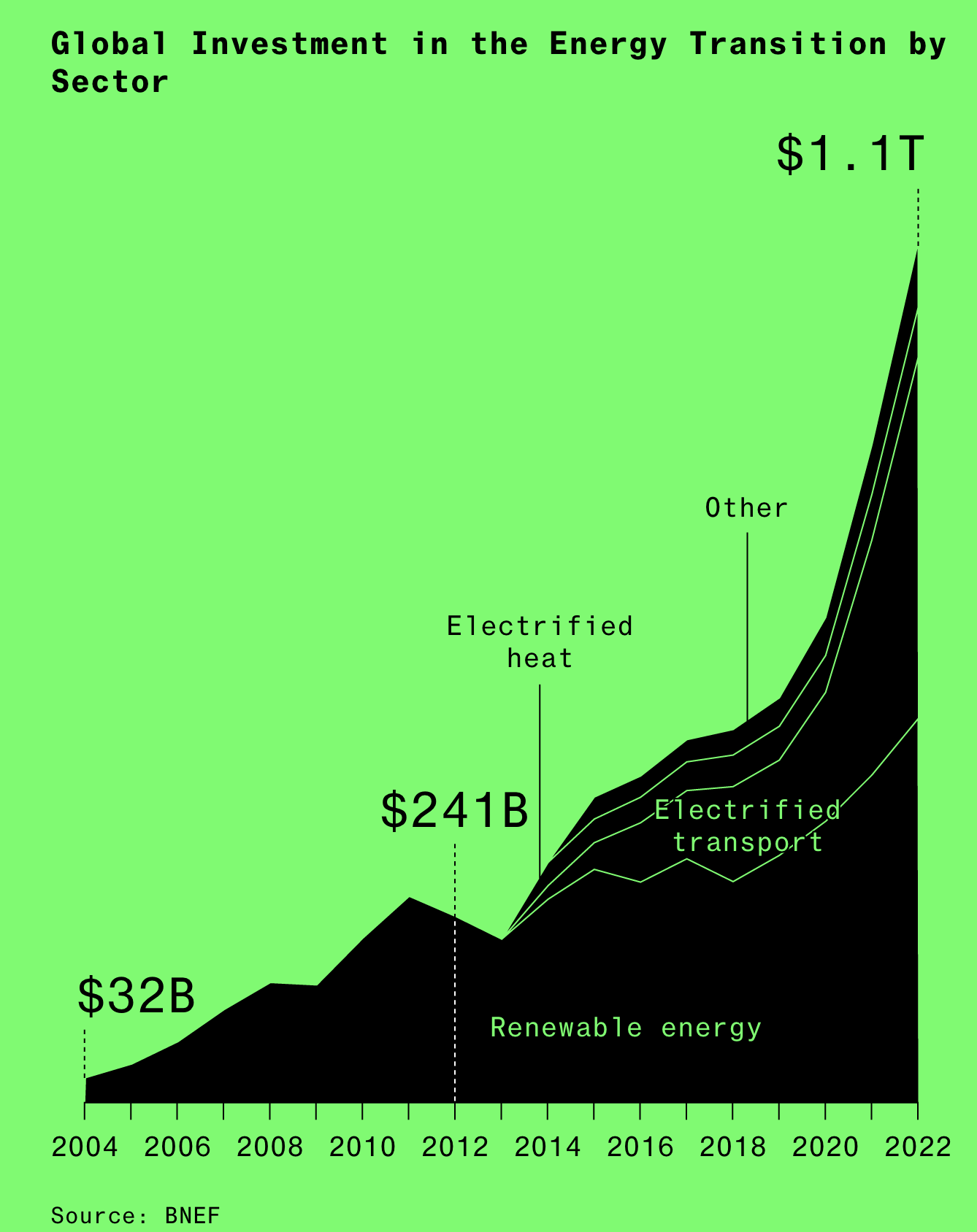
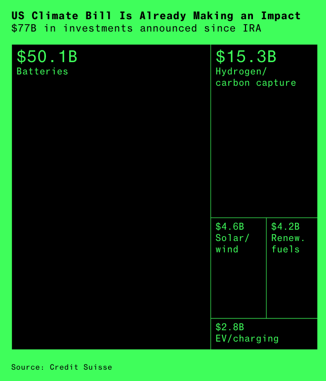
The following charts by Christopher Cannon (How the World Is Spending $1.1 Trillion on Climate Technology) are exemplary of the Terminal visual influence:
And by the way, if you haven’t checked it yet, Bloomberg 2023 Visual Review has an engaging layout!
The Structure of Christmas Movies
Christmas may be behind us, but one year may barely be enough to get ready for the yearly wave of identical movies that is to come for the holidays of 2024.
But how can we be sure all Christmas movies are the same? The New-York Times analyzed 424 Christmas movies.
Spoiler alert: They all have the same structure.
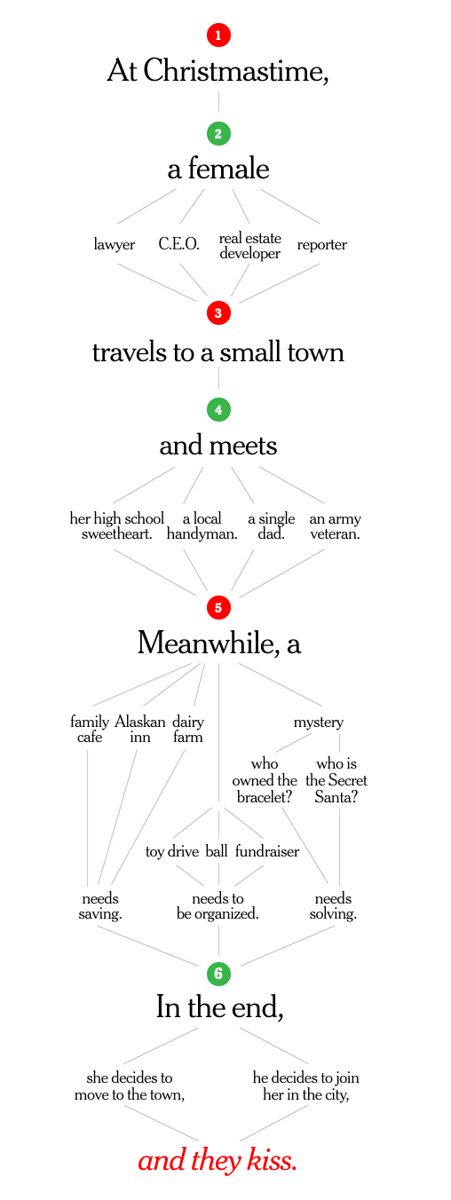 Just How Formulaic Are Hallmark and Lifetime Holiday Movies? We (Over)analyzed 424 of Them.
That stories share structure is probably no news for anyone. I already mentioned here the Hero’s Journey—or monomyth—by Joseph Campbell, which inspired most of Hollywood movies structure:
 However, the structure of Christmas movies is even more structured!
Harry Stevens is Back
Harry Stevens from the Washington Post is back! For the long-awaited come back of his Climate Lab Column after parental leave, he chose a “Draw Your Line” game with 2023 climate data:
 How hot was 2023? Draw your line on the chart (Washington Post)
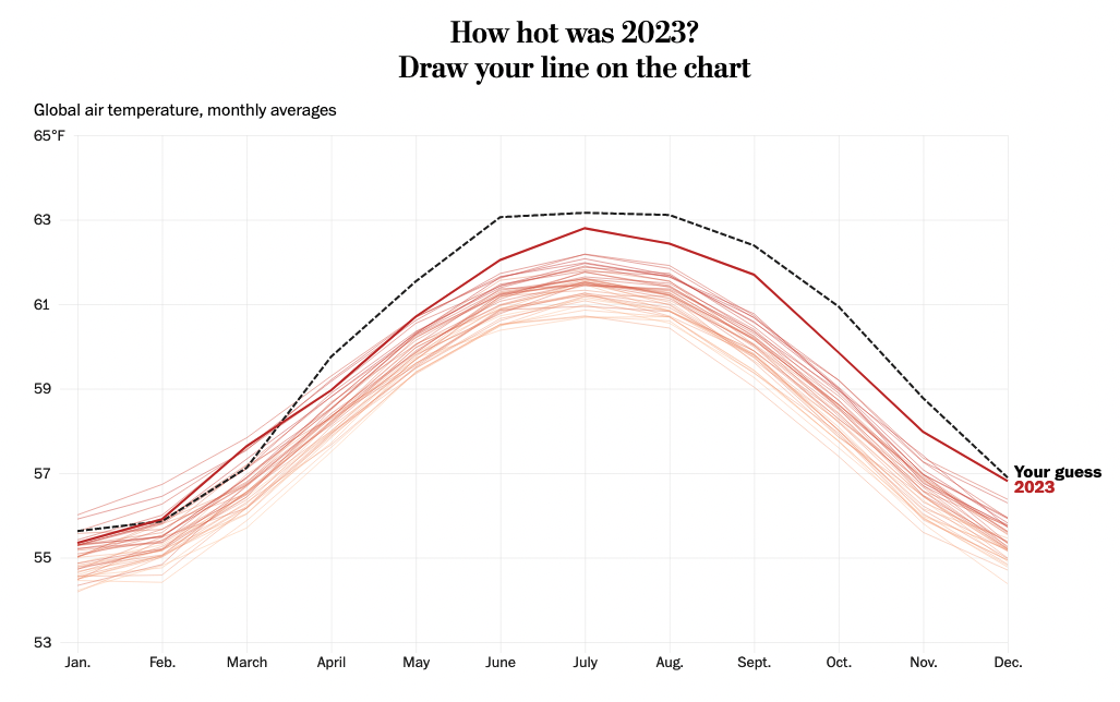 It takes many little things to make a seemingly simple chart-game:
- a signifier to start the action “click and drag from here”,
- highlight remaining zone to complete if the line is interrupted before the end,
- reveal the answer (with or without guessing first)…
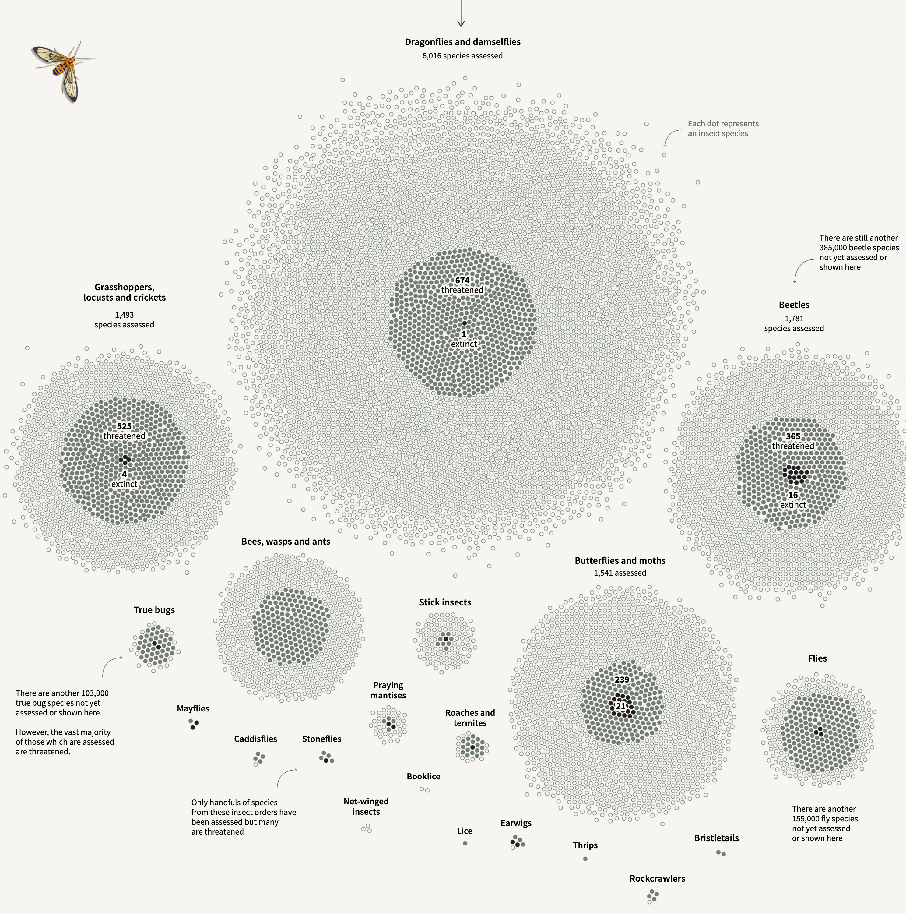
Reuters
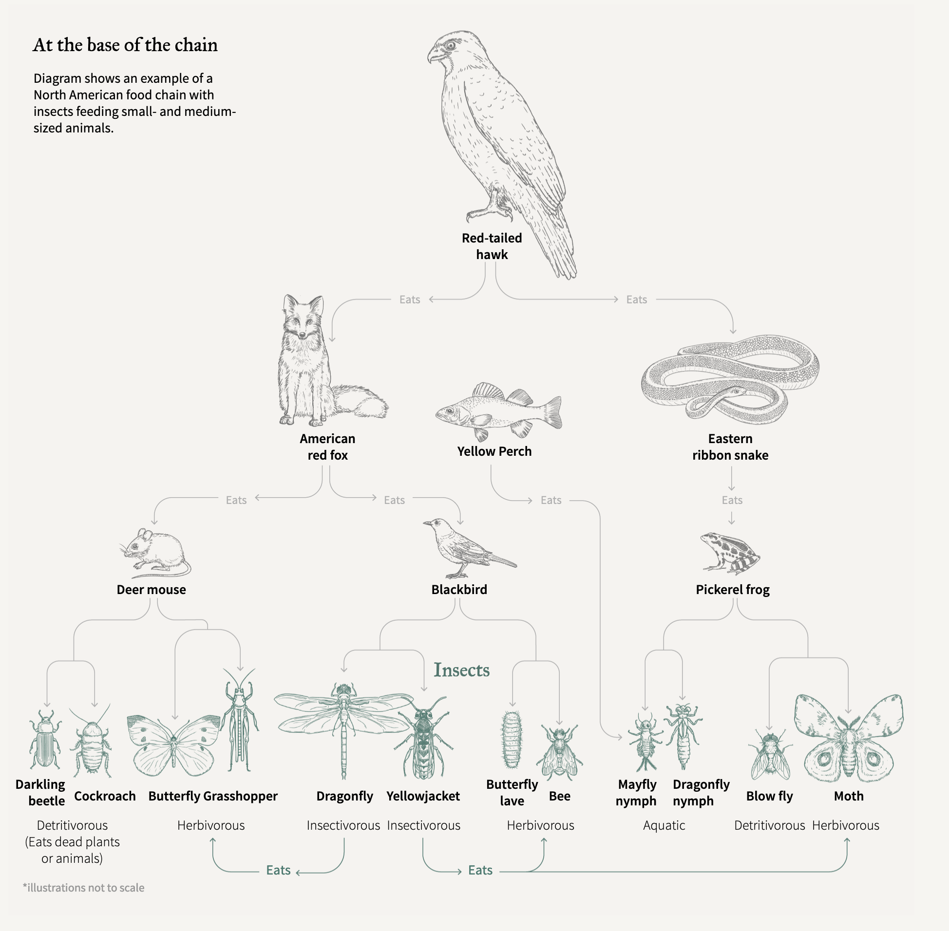
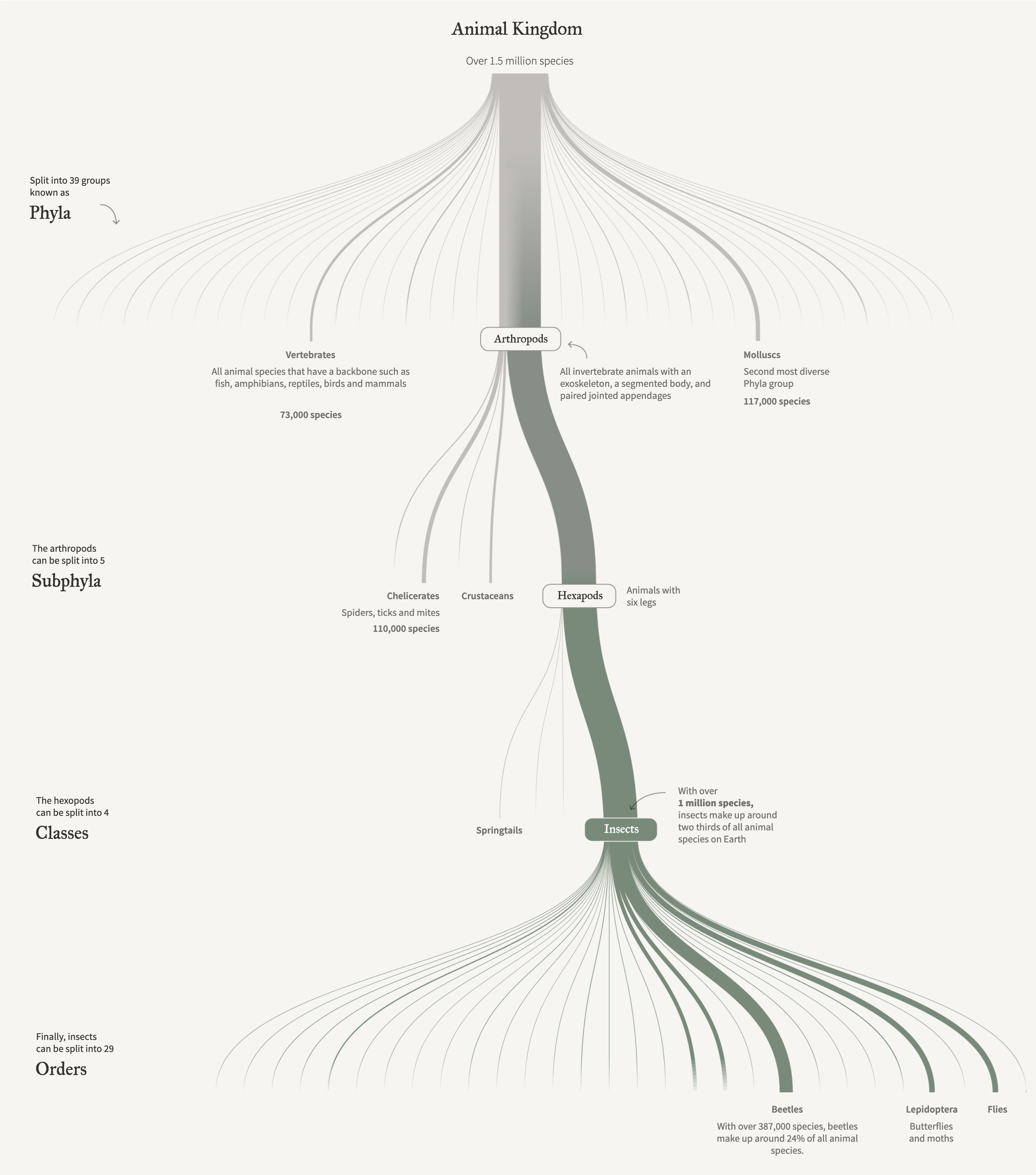
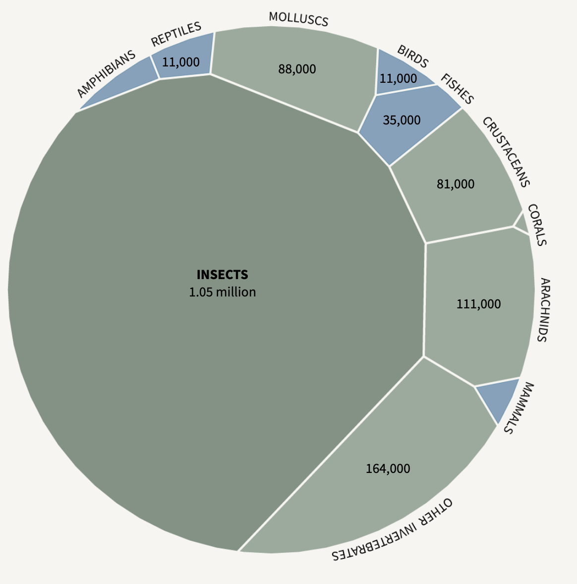
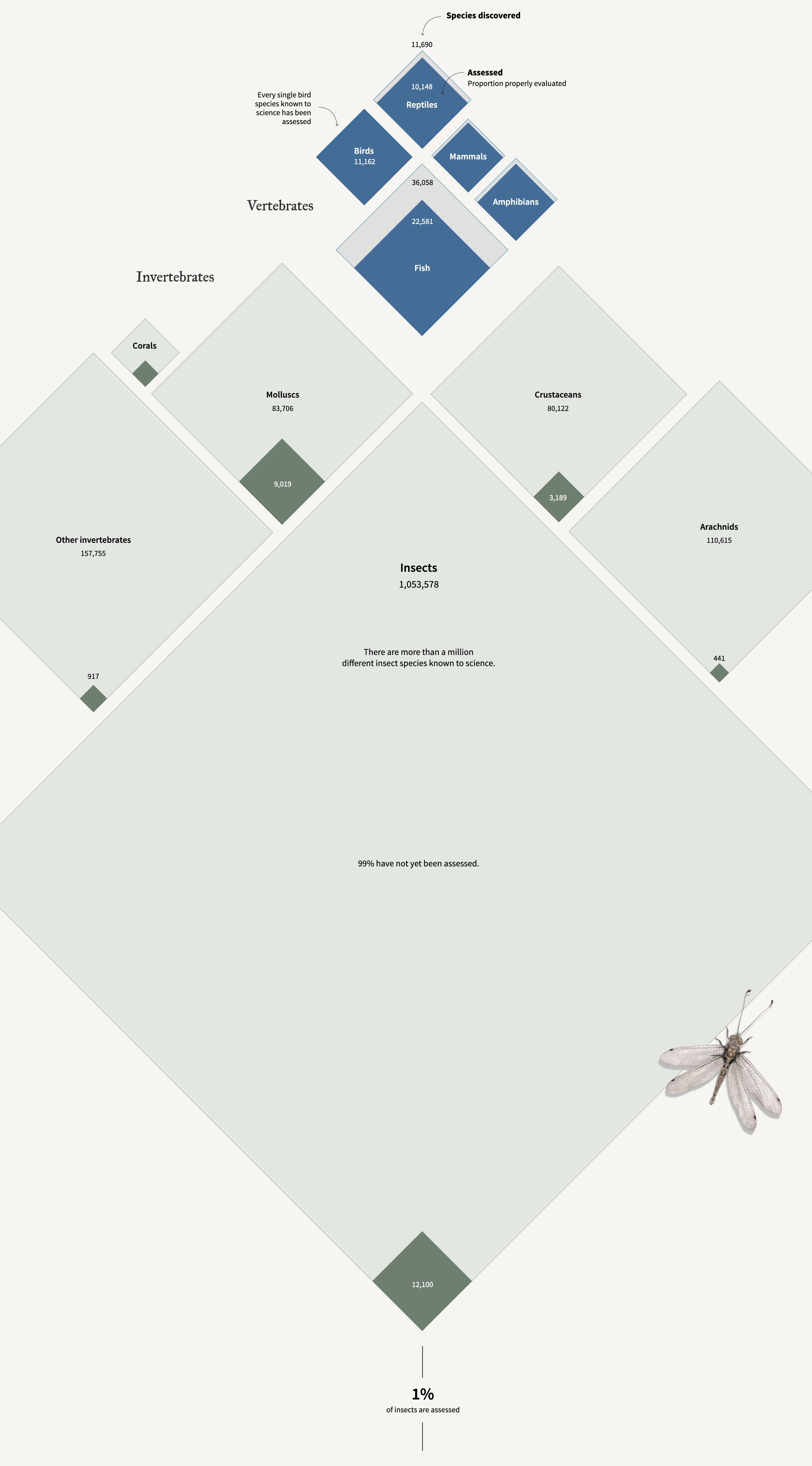
The collapse of insects
Illustrations by Catherine Tai.
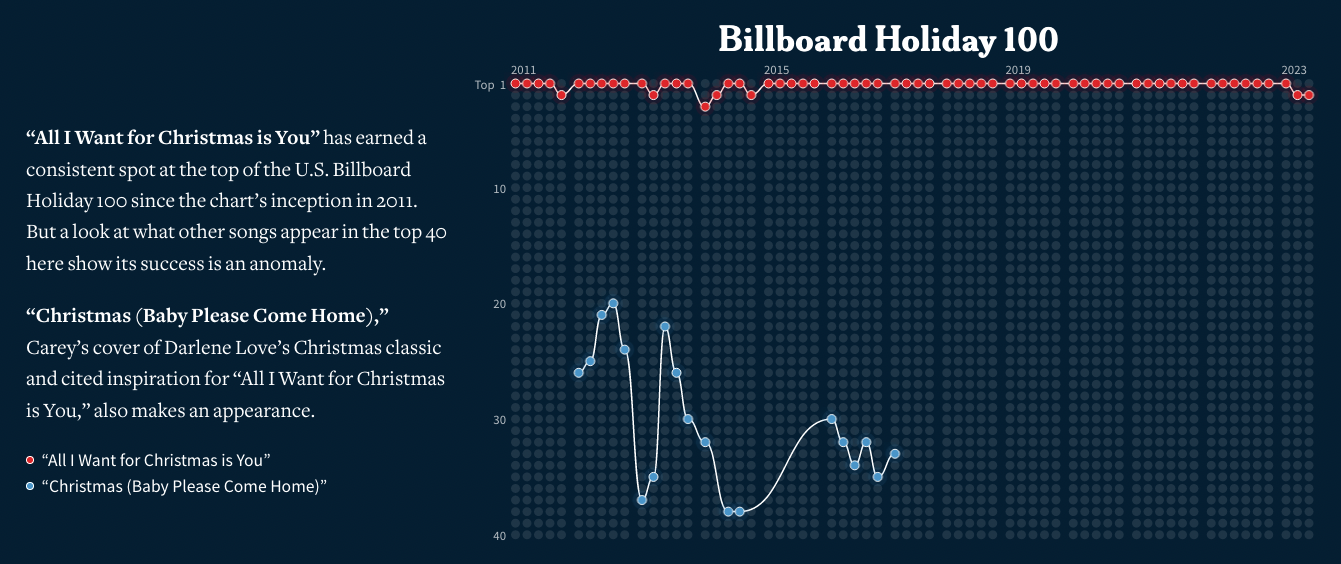
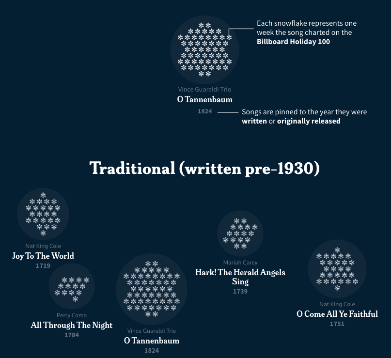
Mariah, It’s time!!! (again)
https://www.reuters.com/graphics/CHRISTMAS-SEASON/MUSIC/byvrrzgjlve/ By Sam Hart Illustrations by Daisy Chung
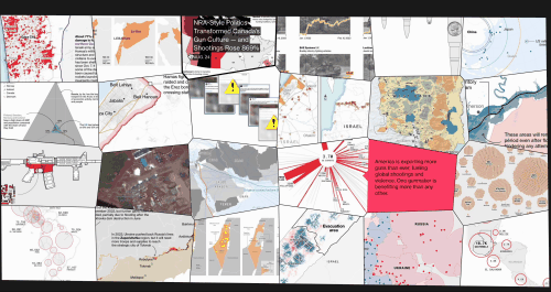
How the US Drives Gun Exports and Fuels Violence Around the World
Graphics by Christopher Cannon
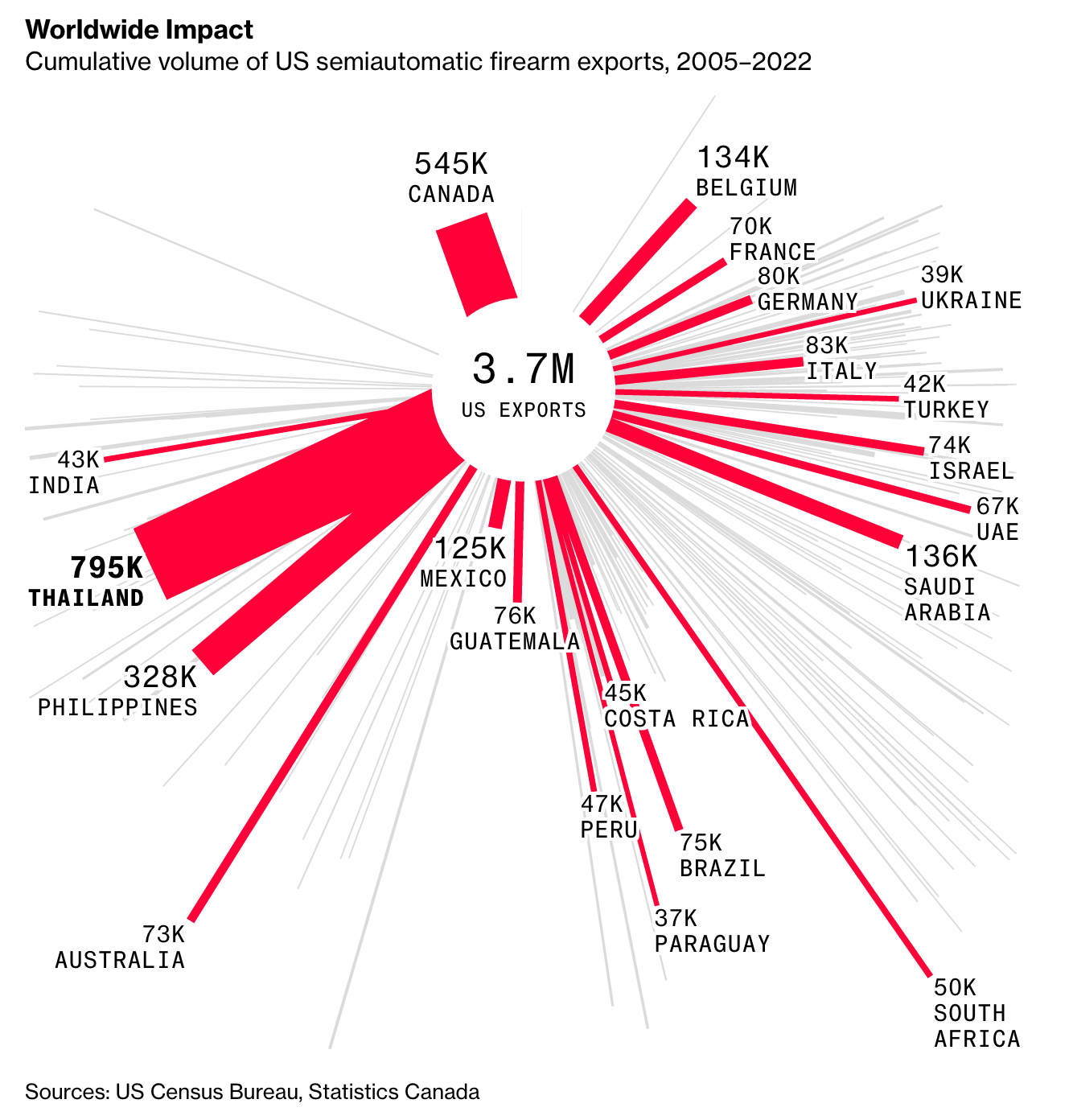 A clever chart that looks like a bullet impact!

See you next week, Mathieu