The Invisible Pandemic
By Mathieu Guglielmino, Oct 2 2023
Golden Buzzer: The Invisible Pandemic
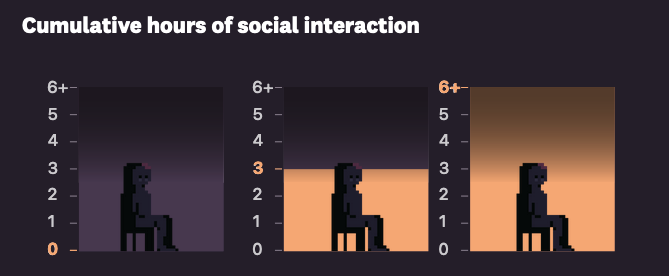
The Invisible Epidemic, by Alvin Chang for The Pudding, is this week most talked-about piece of visual journalism. Exploring data from the American Time Use Survey, Chang skillfully explores how loneliness is shaping the days of US citizens, and what it means to their mental health.
It would be hard to talk about such topics only with dots, squares or lines, right?
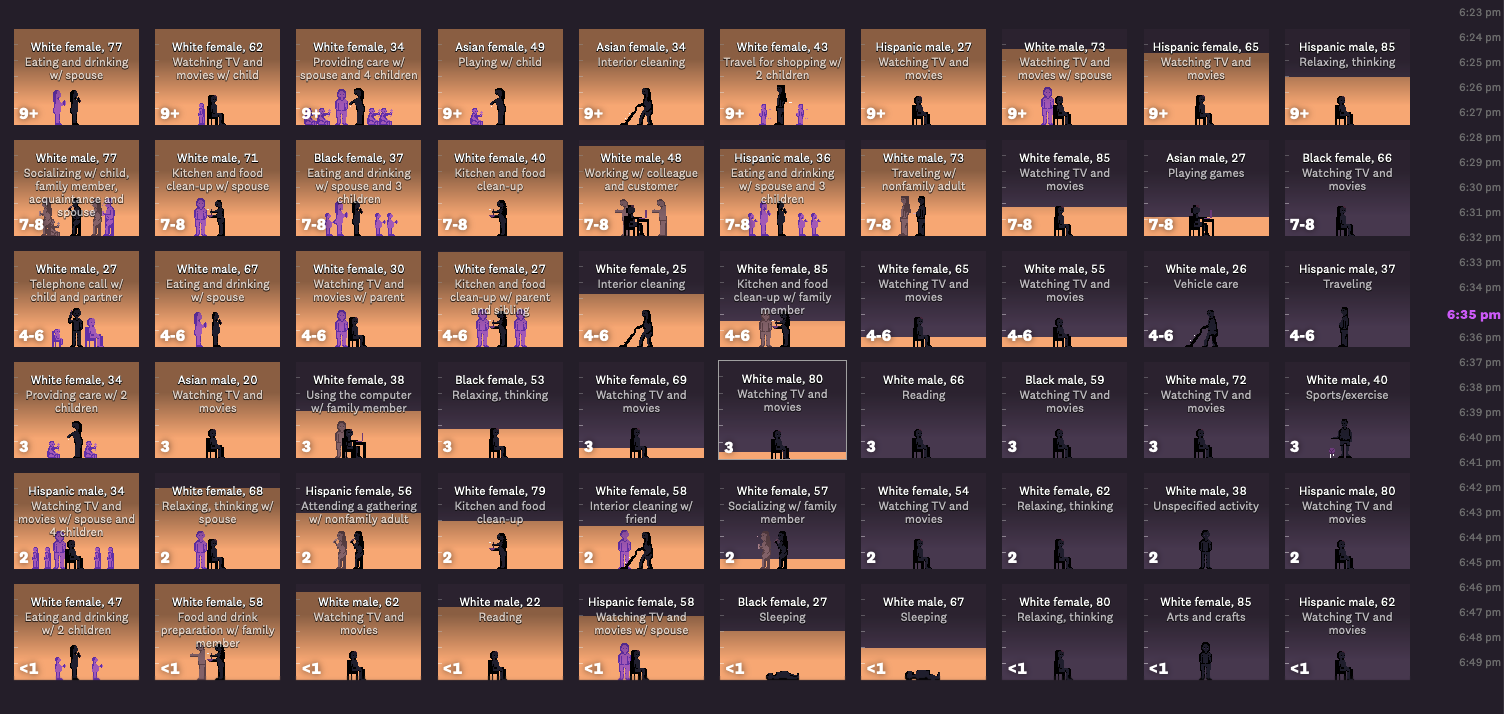
The main visual metaphor for the article is an interactive grid of 60 individuals and their day schedule. Highlighted in orange is the time spent with other people—friends, family, lovers—as the day goes by.
Each activity is illustrated with a specific animation:
The story is alternating between the particular and the general, between people’s schedule and general analyses.
- Starts with Martin, a 62-year-old Hispanic male, trying to sleep
- introduction of the survey & meeting everyone
- Legend explanations
- Negative effects of loneliness
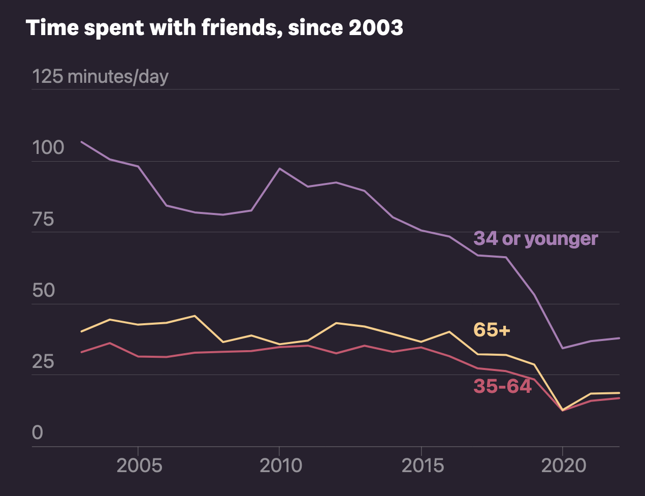
- Time spent since 2000
- Isolation and social ladder (Cantrill ladder)
- Self-reflection
Chang does not fall in the aggregation trap. Each individual is represented and their schedule displayed, minute by minute. This is a wealth of data. This could have been cluttered. This could have feel impersonal.
The grid display time with animations (both the gauge and the silhouettes), and reordering can highlight patterns and correlations:
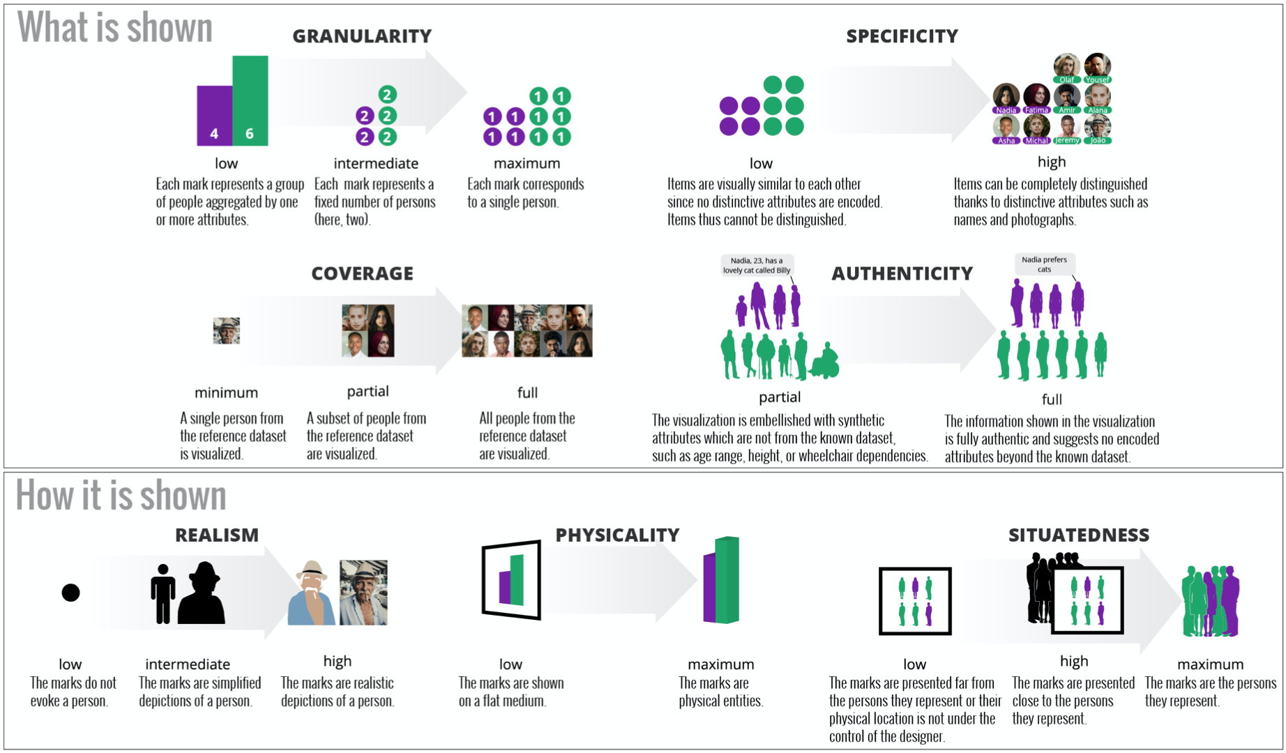
Anthropographics
This story makes a heavy use of silhouettes thumbnails to personify the individuals of the story. Such a technique comes from a long tradition since the isotypes of Otto & Marie Neurath, illustrated by Gerd Arntz:
 Gesellschaft und Wirtschaft (1930)
For example, a 1-dimension example published recently in the Wall Street Journal:
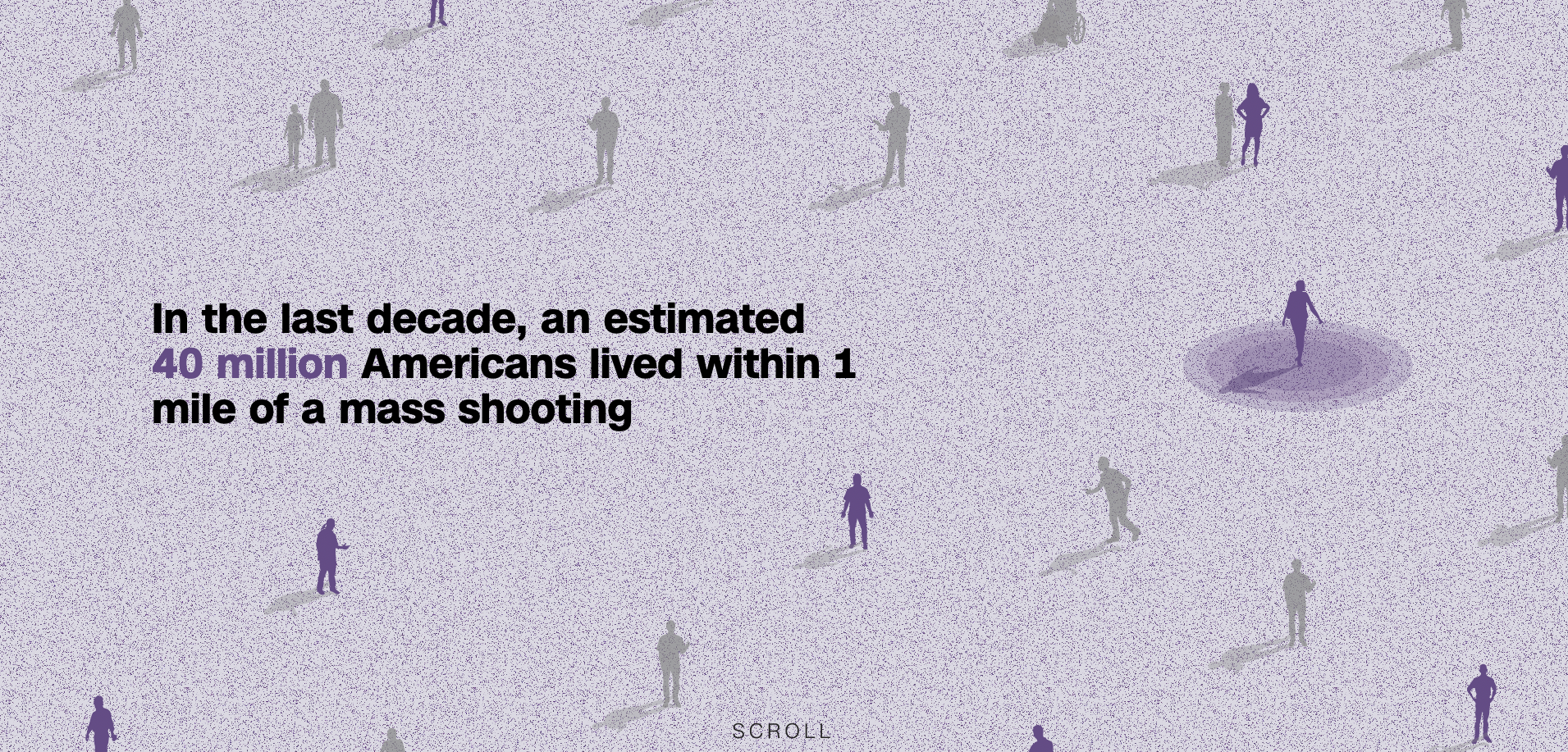
Or the opening illustration for a mass shooting story last week in CNN:
Although this illustration is much more anecdotal, it’s reminiscent of The New-York Times at the height of the pandemic (May 2020) (can you believe it was more than three years ago?):
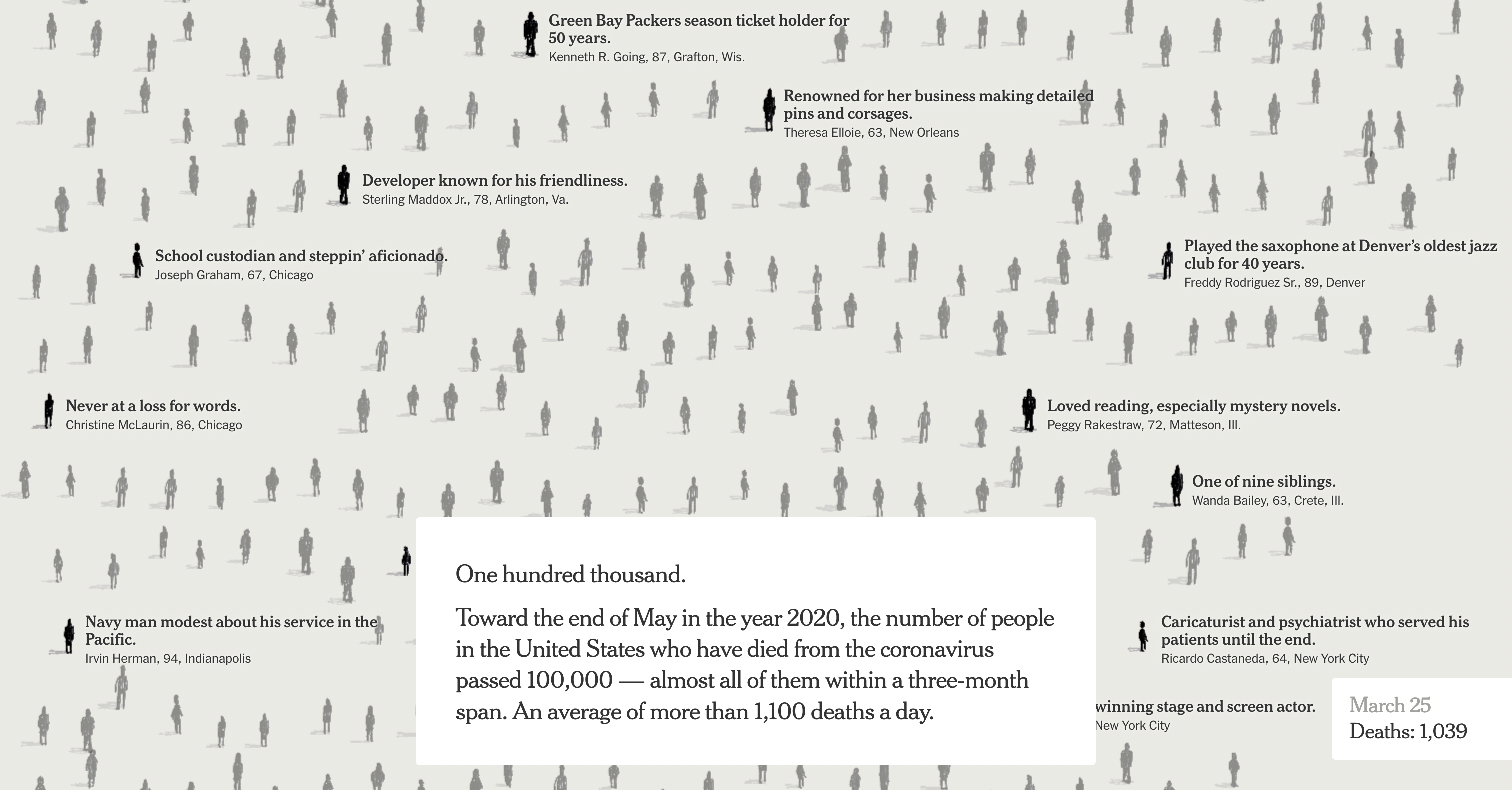 An Incalulable Loss
For designers, empathy is a graal. It creates deeper connections, and as such is much more able to elicit a concret reaction. The design space of “anthropographics” has been explored by Luiz Morais et al.:
In / Out?
How can represent what’s inside, and what’s outside?
In “The Invisible Epidemic”, Chang uses a sort of planetary model, with our relatives gravitating around us, the closest ones at the center.
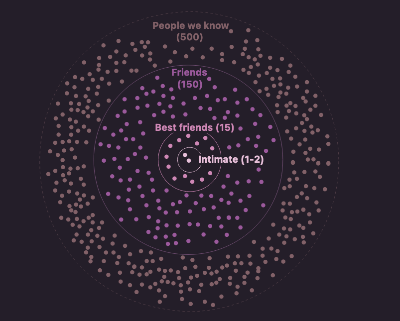
Whenever a story has a clear protagonist, a circular layout may be suited for it has a meaningful “center”, and it’s been so since the oldest known map where Babylonia is at the center of the Universe:

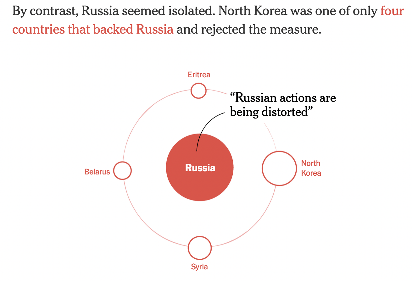
For example, this story by The New-York Times a few months ago is entirely based on a circular metaphor to explore the war allies of Ukraine and Russia:
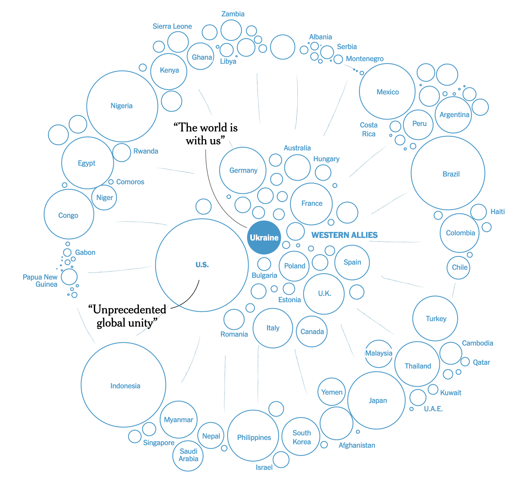 A rather metaphorical boundary between war allies: The West Tried to Isolate Russia. It Didn’t Work. (feb 2023)
Or this week, a research paper on the crossing of six out of nine planetary boundaries:
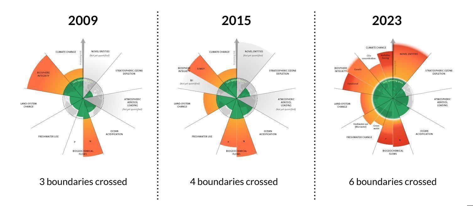 (Images from Azote for Stockholm Resilience Centre, based on analysis in Richardson et al. 2023)
Circular models are better used when something can be considered to be at the center: you, Ukraine, the Earth… Otherwise, you can use the simplest shape to draw a boundary: the line (Le Monde):

Miscellaneous
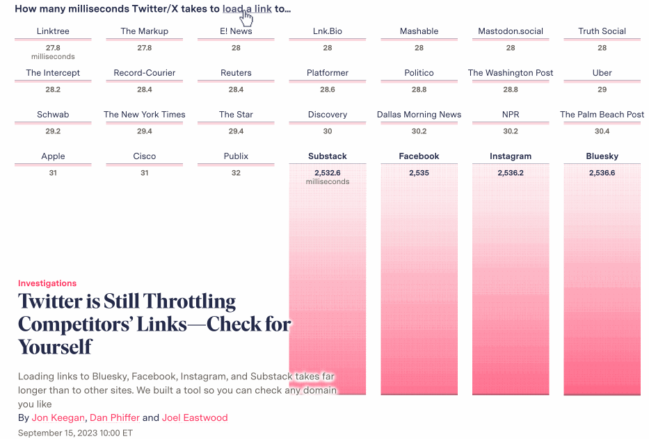
Twitter throttles competitors’ links (The Markup):
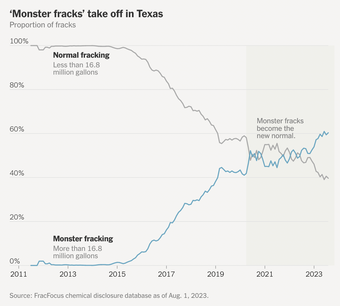
 Fracking Oil And Gas is Devouring American Groundwater (The New-York Times):
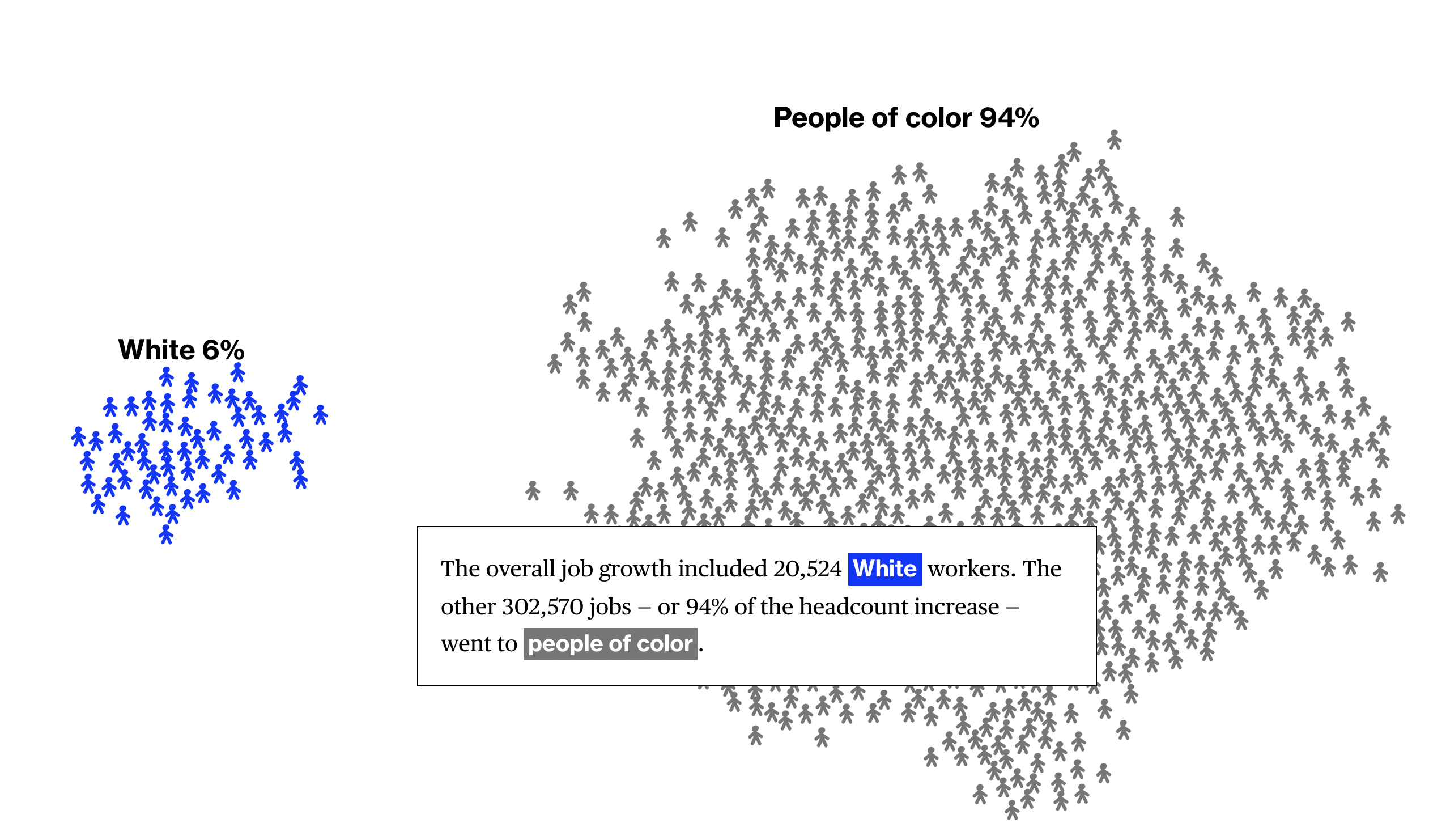
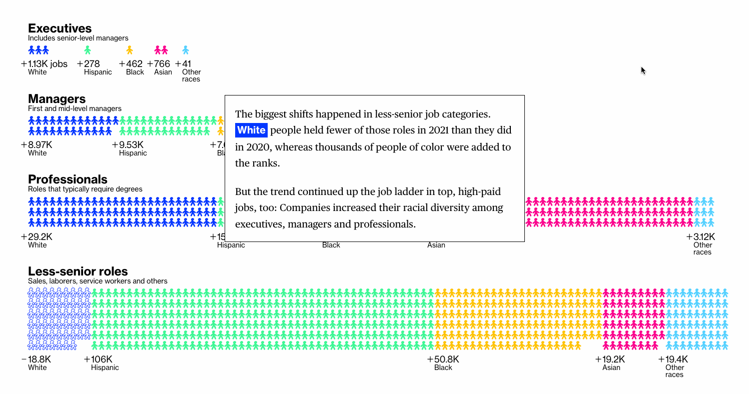
 Corporate America Promised to Hire a Lot More People of Color. It Actually Did. (Bloomberg)
Maps
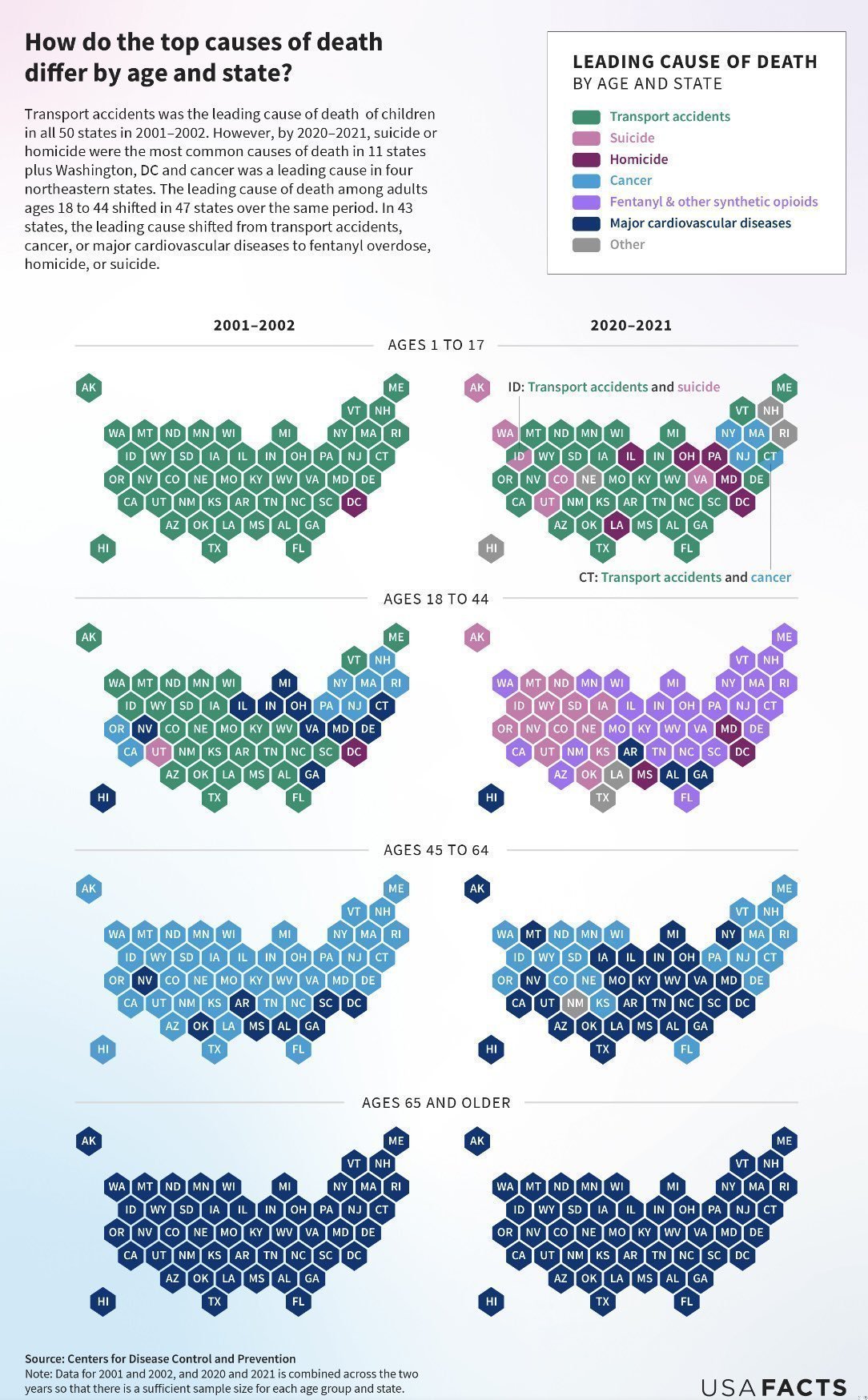
Vu sur Twitter: #usafacts
 Boris Johnson’s Flagship Plan to Fix Britain Is in Trouble (Bloomberg):
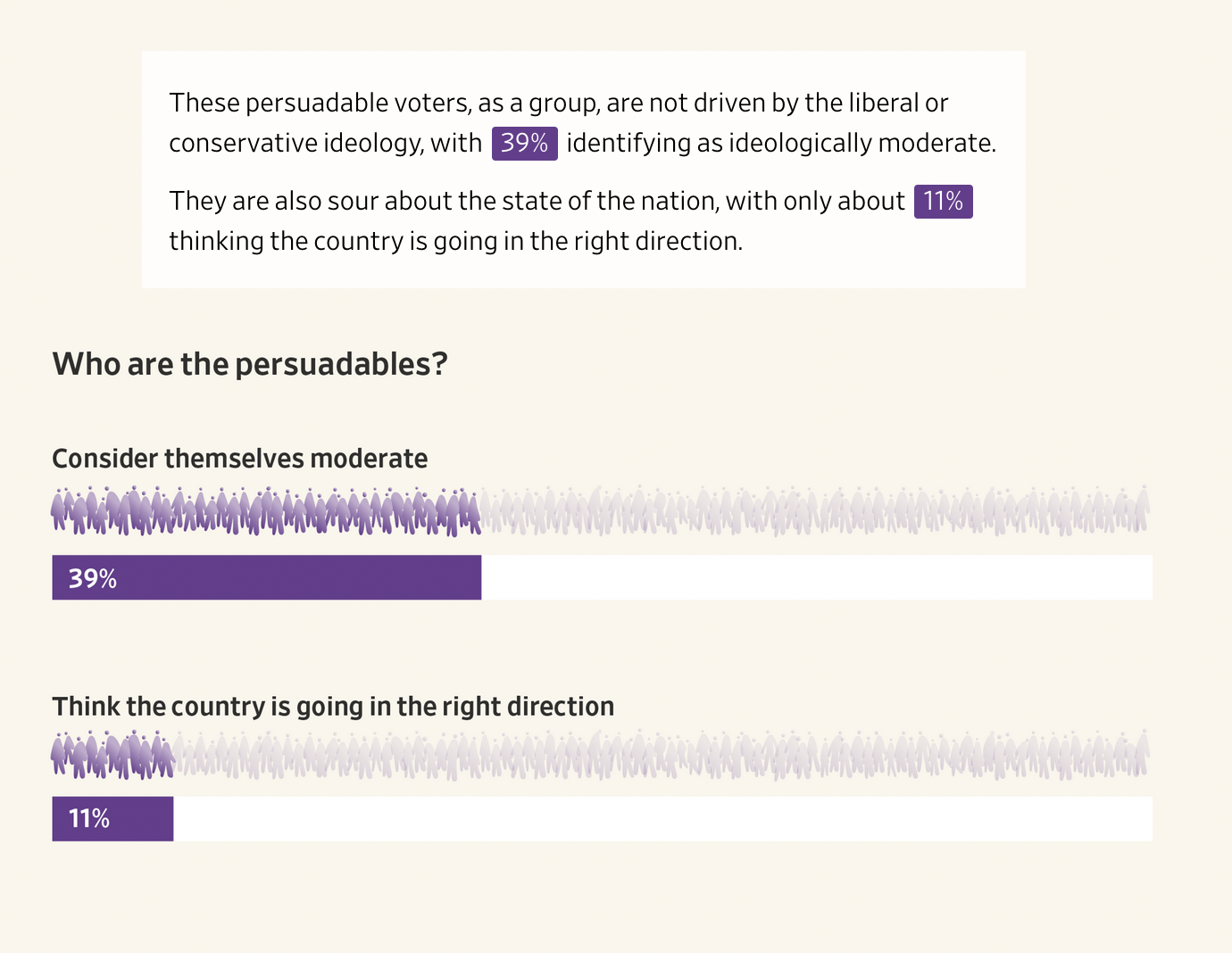
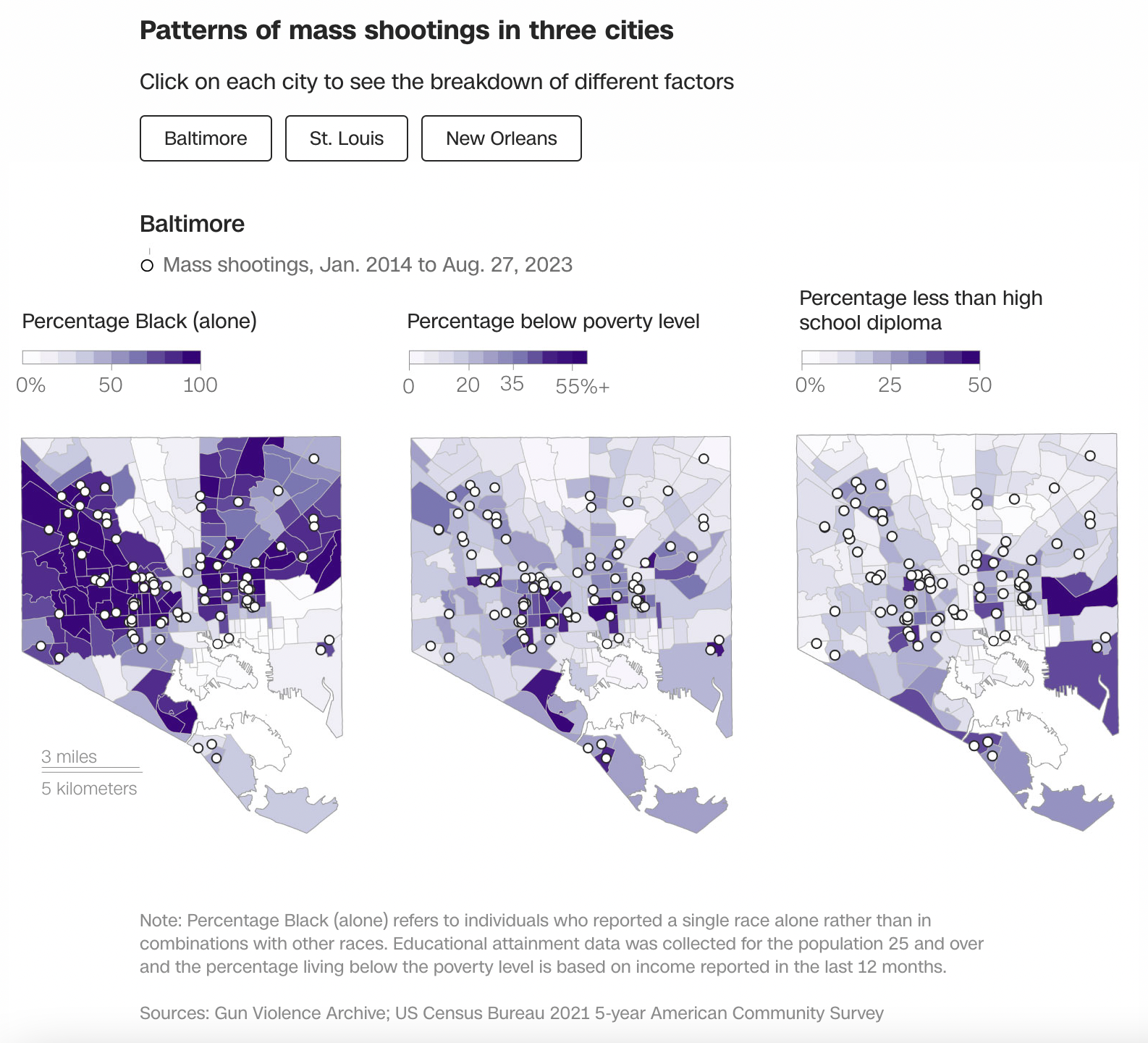
 Americans living near mass shootings (CNN):
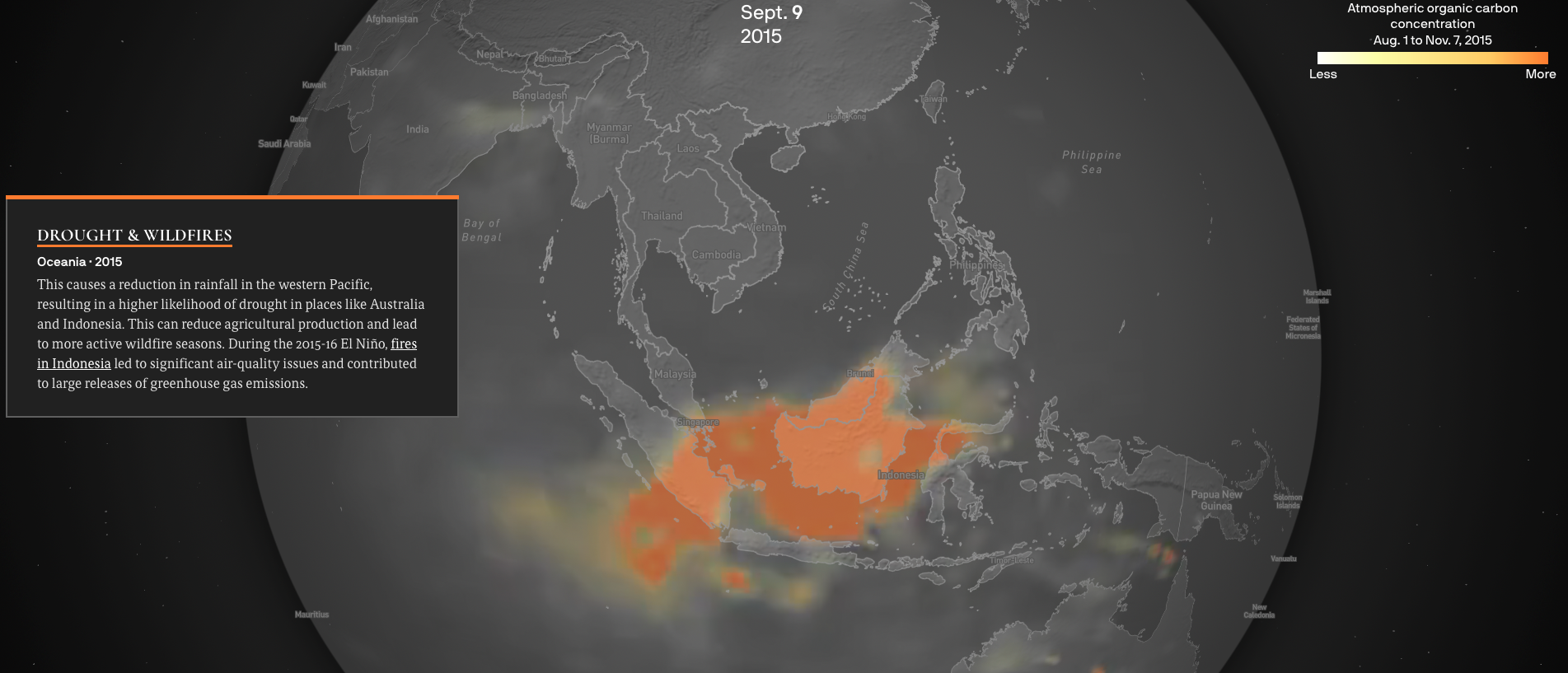
 El Niño’s global impact (Axios):
 Russia is swaying Twitter users outside the West to its side (The Economist, May 2022)

I’m asking YOU!
What do you prefer I do around here:
- A cohesive article with a single thread, using today and yesterday press as illustrations,
- A charts pot-pourri, with many examples but no clear connection between them
I’d love to hear your opinions on that, as I may be trying a few things in the future.